stepper
步骤导航器。当完成一个任务需要多个步骤时,可以使用步骤导航器展示当前进展。
说明: 从API Version 5 开始支持。
权限列表
无
子组件
仅支持<stepper-item>子组件。
属性
样式
使用简写属性设置所有的边框属性,包含边框的宽度,样式,颜色属性,顺序设置为border-width、border-style、border-color,不设置时,各属性值为默认值。 |
||||
|
||||
使用简写属性设置对应位置的边框属性,包含边框的宽度,样式,颜色属性,顺序设置为border-width、border-style、border-color,不设置的值为默认值。 |
||||
border-radius属性是设置元素的外边框圆角半径。设置border-radius时不能单独设置某一个方向的border-[left|top|right|bottom]-width,border-[left|top|right|bottom]-color ,如果要设置color和width,需要将四个方向一起设置(border-width、border-color)。 |
||||
仅支持设置渐变样式,与background-color、background-image不兼容。 |
||||
|
||||
针对重复背景图像样式进行设置,背景图像默认在水平和垂直方向上重复。
|
||||
|
|
|||
|
||||
是否显示元素所产生的框。不可见的框会占用布局(将'display'属性设置为'none'来完全去除框),可选值为:
|
||||
设置组件的拉伸样式,指定父组件容器主轴方向上剩余空间(容器本身大小减去所有flex子元素占用的大小)的分配权重。0为不伸展。 |
||||
|
||||
left|top|right|bottom需要配合position样式使用,来确定元素的偏移位置。
|
事件
方法
设置当前步骤导航器下一步文本按钮的状态,参数中status类型为string,可选值为:
|
示例
<!-- xxx.hml -->
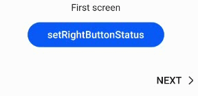
<div class = "container">
<stepper class="stepper" id="mystepper" index="0" onnext="nextclick" onback="backclick">
<stepper-item class ="stepperItem" label="{{label_1}}">
<div class = "stepperItemContent" >
<text class = "text">First screen</text>
</div>
<button type="capsule" class ="button" value="setRightButtonStatus" onclick="setRightButton"></button>
</stepper-item>
<stepper-item class ="stepperItem" label="{{label_2}}">
<div class = "stepperItemContent" >
<text class = "text">Second screen</text>
</div>
<button type="capsule" class ="button" value="setRightButtonStatus" onclick="setRightButton"></button>
</stepper-item>
<stepper-item class ="stepperItem" label="{{label_3}}">
<div class = "stepperItemContent" >
<text class = "text">Third screen</text>
</div>
<button type="capsule" class ="button" value="setRightButtonStatus" onclick="setRightButton"></button>
</stepper-item>
</stepper>
</div>
/* xxx.css */
.container {
  margin-top: 20px;
  flex-direction: column;
  align-items: center;
  height: 300px;
}
.stepperItem {
  flex-direction: column;
  align-items: center;
}
.stepperItemContent {
  color: #0000ff;
  font-size: 50px;
  justify-content: center;
}
.button {
  width: 60%;
  margin-top: 30px;
  justify-content: center;
}
// xxx.js
export default {
  data: {
    label_1:
    {
       prevLabel: 'BACK',
       nextLabel: 'NEXT',
       status: 'normal'
     },
     label_2:
     {
       prevLabel: 'BACK',
       nextLabel: 'NEXT',
       status: 'normal'
     },
     label_3:
     {
        prevLabel: 'BACK',
        nextLabel: 'NEXT',
        status: 'normal'
     },
  },
  setRightButton(e) {
    this.$element('mystepper').setNextButtonStatus({status: 'skip', label: 'SKIP'});
  },
  nextclick(e) {
    var index = {
      pendingIndex: e.pendingIndex
    }
    return index;
  },
  backclick(e) {
    var index = {
        pendingIndex: e.pendingIndex
    }
    return index;
  },
}