piece
An entrance piece that can contain images and text. It is usually used to display receivers, for example, email recipients or message recipients.
Child Components
None
Attributes
In addition to the attributes in Universal Attributes, the following attributes are supported.
| Name | Type | Default Value | Mandatory | Description |
|---|---|---|---|---|
| content | string | - | Yes | Text content of the operational piece. |
| closable | boolean | false | No | Whether to display the delete icon for the operational piece. When users click the delete icon, it triggers the close event. |
| icon | string | - | No | URL of the delete icon for the operational piece. The value can be a local path. |
Styles
Styles in Universal Styles are supported.
NOTE: By default, text and images are placed in the middle of the <piece> component.
Events
In addition to the events in Universal Events, the following events are supported.
| Name | Parameter | Description |
|---|---|---|
| close | - | Triggered when users click the delete icon of the operational piece. You can delete this component by using the if directive. |
Method
Methods in Universal Methods are supported.
Example
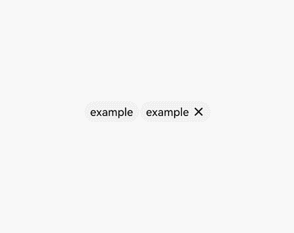
<!-- xxx.hml-->
<div class="container" >
  <piece if="{{first}}" content="example"></piece>
  <piece if="{{second}}" content="example" closable="true" onclose="closeSecond"></piece>
</div>
/* xxx.css */
.container {
  width: 100%;
  height: 100%;
  align-items: center;
  justify-content: center;
}
// xxx.js
export default {
  data: {
    first: true,
    second: true
  },
  closeSecond(e) {
    this.second = false;
  }
}