List
NOTE This component is supported since API version 7. Updates will be marked with a superscript to indicate their earliest API version.
The <List> component provides a list container that presents a series of list items arranged in a column with the same width. It supports presentations of the same type of data in a multiple and coherent row style, for example, images or text.
Required Permissions
None
Child Components
This component contains the child component <ListItem>.
APIs
List(value:{space?: number, initialIndex?: number})
- Parameters
| Name | Type | Mandatory | Default Value | Description |
|---|---|---|---|---|
| space | number | No | 0 | Spacing between list items. |
| initialIndex | number | No | 0 | Item displayed at the beginning of the component when the current list is loaded for the first time, that is, the first item to be displayed. If the configured sequence number is greater than the sequence number of the last item, the setting does not take effect. |
Attributes
| Name | Type | Default Value | Description |
|---|---|---|---|
| listDirection | Axis | Vertical | Direction in which the list items are arranged. For details, see Axis enums. |
| divider | { strokeWidth: Length, color?:Color, startMargin?: Length, endMargin?: Length } |
- | Style of the divider for the list items. By default, there is no divider. strokeWidth: stroke width of the divider. color: color of the divider. startMargin: distance between the divider and the start of the list. endMargin: distance between the divider and the end of the list. |
| editMode | boolean | false | Whether the <List> component is in editable mode. |
| edgeEffect | EdgeEffect | EdgeEffect.Spring | Sliding effect. For details, see EdgeEffect enums. |
| chainAnimation | boolean | false | Whether to display chained animations on this list when it slides or its top and bottom are dragged. The list items are separated with even space, and one item animation starts after the previous animation during basic sliding interactions. The chained animation effect is similar with spring physics. - false: No chained animations are displayed. - true: Chained animations are displayed. |
| multiSelectable8+ | boolean | false | Whether to enable mouse frame selection. - false: The mouse frame selection is disabled. - true: The mouse frame selection is disabled. |
| restoreId8+ | number | - | Migration ID of the component. During application migration, the status of the component is migrated to the component with the same migration ID on the peer end. For a <List> component, the status includes the item serial number displayed at the start position. |
- EdgeEffect enums
| Name | Description |
|---|---|
| Spring | Similar to the physical dynamic effect of a spring. After scrolling to the edge, you can continue to scroll for a distance based on the initial speed or by touching the knob of the scrollbar. After you release your hand, the knob is rebounded. |
| None | No effect after the scroll bar is moved to the edge. |
Events
| Name | Description |
|---|---|
| onItemDelete(index: number) => boolean | Triggered when a list item is deleted. |
| onScrollIndex(firstIndex: number, lastIndex: number) => void | Triggered when the start position and end position of the current list are changed. |
NOTE To enable the editable mode for a list, the following conditions must be met:
editMode is set to true.
The list is bound to the onItemDelete event and the event returns true during event callback.
The editable attribute of ListItem is set to true.
To enable dragging for a list item, the following conditions must be met:
editMode is set to true.
The list item is bound to the onDragStart event and the event returns a floating UI during event callback.
Example
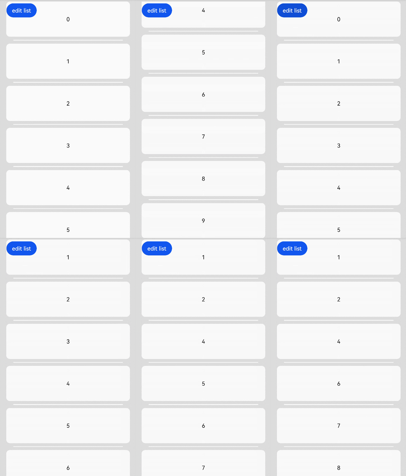
@Entry
@Component
struct ListExample {
  private arr: number[] = [0, 1, 2, 3, 4, 5, 6, 7, 8, 9]
  @State editFlag: boolean = false

  build() {
    Stack({ alignContent: Alignment.TopStart }) {
      Column() {
        List({ space: 20, initialIndex: 0 }) {
          ForEach(this.arr, (item) => {
            ListItem() {
              Text('' + item)
                .width('100%').height(100).fontSize(16)
                .textAlign(TextAlign.Center).borderRadius(10).backgroundColor(0xFFFFFF)
            }.editable(true)
          }, item => item)
        }
        .listDirection(Axis.Vertical) // Arrangement direction
        .divider({ strokeWidth: 2, color: 0xFFFFFF, startMargin: 20, endMargin: 20 }) // Divider line
        .edgeEffect(EdgeEffect.None) // No effect when sliding to the edge
        .chainAnimation(false) // Chained animations are disabled.
        .onScrollIndex((firstIndex: number, lastIndex: number) => {
          console.info('first' + firstIndex)
          console.info('last' + lastIndex)
        })
        .editMode(this.editFlag)
        .onItemDelete((index: number) => {
          console.info(this.arr[index] + 'Delete')
          this.arr.splice(index, 1)
          console.info(JSON.stringify(this.arr))
          this.editFlag = false
          return true
        }).width('90%')
      }.width('100%')

      Button('edit list')
        .onClick(() => {
          this.editFlag = !this.editFlag
        }).margin({ top: 5, left: 20 })
    }.width('100%').height('100%').backgroundColor(0xDCDCDC).padding({ top: 5 })
  }
}
