警告弹窗
说明: 从API Version 7开始支持。后续版本如有新增内容,则采用上角标单独标记该内容的起始版本。
显示警告弹窗组件,可设置文本内容与响应回调。
属性
| 名称 | 参数类型 | 默认值 | 参数描述 |
|---|---|---|---|
| show | value: { AlertDialogParamWithConfirm | AlertDialogParamWithButtons} | - | 定义并显示AlertDialog组件。 |
AlertDialogParamWithConfirm对象说明
| 参数名 | 参数类型 | 必填 | 默认值 | 参数描述 |
|---|---|---|---|---|
| title | string | Resource | 否 | - | 弹窗标题。 |
| message | string | Resource | 是 | - | 弹窗内容。 |
| autoCancel | boolean | 否 | true | 点击遮障层时,是否关闭弹窗。 |
| confirm | { value: string | Resource, fontColor?: Color | number | string | Resource, backgroundColor?: Color | number | string | Resource, action: () => void } |
否 | - | 确认按钮的文本内容、文本色、按钮背景色和点击回调。 |
| cancel | () => void | 否 | - | 点击遮障层关闭dialog时的回调。 |
| alignment | DialogAlignment | 否 | DialogAlignment.Default | 弹窗在竖直方向上的对齐方式。 |
| offset | { dx: Length | Resource, dy: Length | Resource } |
否 | - | 弹窗相对alignment所在位置的偏移量。 |
| gridCount | number | 否 | - | 弹窗容器宽度所占用栅格数。 |
AlertDialogParamWithButtons对象说明
| 参数名 | 参数类型 | 必填 | 默认值 | 参数描述 |
|---|---|---|---|---|
| title | string |& Resource | 否 | - | 弹窗标题。 |
| message | string |& Resource | 是 | - | 弹窗内容。 |
| autoCancel | boolean | 否 | true | 点击遮障层时,是否关闭弹窗。 |
| primaryButton | { value: string | Resource, fontColor?: Color | number | string | Resource, backgroundColor?: Color | number | string | Resource, action: () => void; } |
否 | - | 按钮的文本内容、文本色、按钮背景色和点击回调。 |
| secondaryButton | { value: string | Resource, fontColor?: Color | number | string | Resource, backgroundColor?: Color | number | string | Resource, action: () => void; } |
否 | - | 按钮的文本内容、文本色、按钮背景色和点击回调。 |
| cancel | () => void | 否 | - | 点击遮障层关闭dialog时的回调。 |
| alignment | DialogAlignment | 否 | DialogAlignment.Default | 弹窗在竖直方向上的对齐方式。 |
| offset | { dx: Length | Resource, dy: Length | Resource } |
否 | - | 弹窗相对alignment所在位置的偏移量。 |
| gridCount | number | 否 | - | 弹窗容器宽度所占用栅格数。 |
示例
// xxx.ets
@Entry
@Component
struct AlertDialogExample {
build() {
Column({ space: 5 }) {
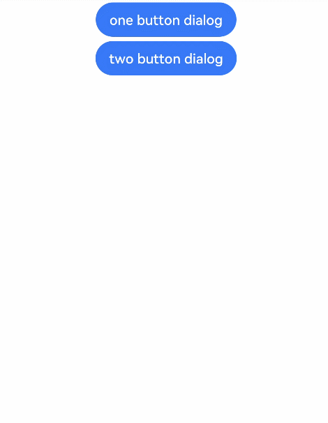
Button('one button dialog')
.onClick(() => {
AlertDialog.show(
{
title: 'title',
message: 'text',
confirm: {
value: 'button',
action: () => {
console.info('Button-clicking callback')
}
},
cancel: () => {
console.info('Closed callbacks')
}
}
)
})
.backgroundColor(0x317aff)
Button('two button dialog')
.onClick(() => {
AlertDialog.show(
{
title: 'title',
message: 'text',
primaryButton: {
value: 'cancel',
action: () => {
console.info('Callback when the first button is clicked')
}
},
secondaryButton: {
value: 'ok',
action: () => {
console.info('Callback when the second button is clicked')
}
},
cancel: () => {
console.info('Closed callbacks')
}
}
)
}).backgroundColor(0x317aff)
}.width('100%').margin({ top: 5 })
}
}