progress
The <progress> component is used to provide a progress bar that displays the progress of content loading or operation processing.
Required Permissions
None
Child Components
Not supported
Attributes
In addition to the attributes in Universal Attributes, the following attributes are supported.
| Name | Type | Default Value | Mandatory | Description |
|---|---|---|---|---|
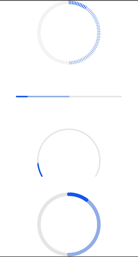
| type | string | horizontal | No | Type of the progress bar, which cannot be changed dynamically. Available values are as follows: -horizontal: linear progress bar -circular: loading progress bar -ring: ring progress bar -scale-ring: ring progress bar with a scale -arc: arc progress bar -eclipse5+: eclipse progress bar |
Different types of progress bars support different attributes.
- When the type is horizontal, ring, or scale-ring, the following attributes are supported.
| Name | Type | Default Value | Mandatory | Description |
|---|---|---|---|---|
| percent | number | 0 | No | Current progress. The value ranges from 0 to 100. |
| secondarypercent | number | 0 | No | Secondary progress. The value ranges from 0 to 100. |
- When the type is ring or scale-ring, the following attributes are supported.
| Name | Type | Default Value | Mandatory | Description |
|---|---|---|---|---|
| clockwise | boolean | true | No | Whether the ring progress bar uses clockwise. |
- When the type is arc or eclipse5+, the following attribute is supported.
| Name | Type | Default Value | Mandatory | Description |
|---|---|---|---|---|
| percent | number | 0 | No | Current progress. The value ranges from 0 to 100. |
Styles
In addition to the styles in Universal Styles, the following styles are supported.
Horizontal progress bar, of which type is horizontal
| Name | Type | Default Value | Mandatory | Description |
|---|---|---|---|---|
| color | <color> | #ff007dff | No | Color of the progress bar |
| stroke-width | <length> | 4px | No | Width of the progress bar |
| background-color | <color> | - | No | Background color of the progress bar |
| secondary-color | <color> | - | No | Color of the secondary progress bar |
Circular progress bar (type is circular)
| Name | Type | Default Value | Mandatory | Description |
|---|---|---|---|---|
| color | <color> | - | No | Color of the dot on the loading progress bar |
Ring or scale-ring progress bar (type is ring or scale-ring)
| Name | Type | Default Value | Mandatory | Description |
|---|---|---|---|---|
| color | <color> | <linear-gradient> | - | No | Color of the ring progress bar. The ring type supports the linear gradient color. NOTE: The linear gradient color supports only two color attribute formats, for example, color = linear-gradient(#ff0000, #00ff00). |
| background-color | <color> | - | No | Background color of the ring progress bar. |
| secondary-color | <color> | - | No | Color of the secondary ring progress bar. |
| stroke-width | <length> | 10px | No | Width of the ring progress bar. |
| scale-width | <length> | - | No | Scale thickness of the ring progress bar with a scale. This style takes effect only when the type is scale-ring. |
| scale-number | number | 120 | No | Number of scales of the ring progress bar with a scale. This style takes effect only when the type is scale-ring. |
Arc progress bar, of which type is arc
| Name | Type | Default Value | Mandatory | Description |
|---|---|---|---|---|
| color | <color> | - | No | Color of the arc progress bar. |
| background-color | <color> | - | No | Background color of the arc progress bar. |
| stroke-width | <length> | 4px | No | Width of the arc progress bar. NOTE: The wider the progress bar is, the closer the progress bar is to the center of the circle. The progress bar is always within the radius. |
| start-angle | <deg> | 240 | No | Start angle of the arc progress bar, which starts from zero o'clock clockwise. The value ranges from 0 to 360 degrees. |
| total-angle | <deg> | 240 | No | Total length of the arc progress bar. The value ranges from –360 to 360. A negative number indicates anticlockwise. |
| center-x | <length> | Half of the width of the arc progress bar | No | Center of the arc progress bar (with the upper left corner of this widget as the coordinate origin). This style must be used together with center-y and radius. |
| center-y | <length> | Half of the height of the arc progress bar | No | Center of the arc progress bar (with the upper left corner of this widget as the coordinate origin). This style must be used together with center-x and radius. |
| radius | <length> | Half of the minimum width and height of the arc progress bar | No | Radius of the arc progress bar. This style must be used together with center-x and center-y. |
type=eclipse5+
| Name | Type | Default Value | Mandatory | Description |
|---|---|---|---|---|
| color | <color> | - | No | Color of the eclipse progress bar. |
| background-color | <color> | - | No | Background color of the eclipse progress bar. |
Events
Events in Universal Events are supported.
Methods
Methods in Universal Methods are supported.
Example
<!--xxx.hml -->
<div class="container">
  <progress class="min-progress" type="scale-ring"  percent= "10" secondarypercent="50"></progress>
  <progress class="min-progress" type="horizontal" percent= "10" secondarypercent="50"></progress>
  <progress class="min-progress" type="arc" percent= "10"></progress>
  <progress class="min-progress" type="ring" percent= "10" secondarypercent="50"></progress>
</div>
/* xxx.css */
.container {
  flex-direction: column;
  height: 100%;
  width: 100%;
  align-items: center;
}
.min-progress {
  width: 300px;
  height: 300px;
}