Flex Layout
NOTE
This attribute is supported since API version 7. Updates will be marked with a superscript to indicate their earliest API version.
This attribute is valid only when the parent component is a Flex component.
Required Permissions
None
Attributes
| Name | Type | Default Value | Description |
|---|---|---|---|
| flexBasis | 'auto' | Length | 'auto' | Base dimension of a component in the main axis of the Flex layout. |
| flexGrow | number | 0 | Percentage of the Flex layout's remaining space that is allocated to the component. |
| flexShrink | number | 1 | Percentage of the Flex layout's shrink size that is allocated to the component. |
| alignSelf | ItemAlign | Auto | Alignment mode, which overwrites the default alignItems configuration in the Flex layout. |
Example
@Entry
@Component
struct FlexExample {
build() {
Column({ space: 5 }) {
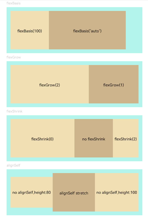
Text('flexBasis').fontSize(9).fontColor(0xCCCCCC).width('90%')
// Base dimension in the main axis
// flexBasis() can be auto (default value), which indicates the original component size. If the value is of the number type, it is similar to .width()/.height(). The value is based on the main axis.
Flex() {
Text('flexBasis(100)')
.flexBasis('100').height(100).lineHeight(70)
.backgroundColor(0xF5DEB3).textAlign(TextAlign.Center)
Text('flexBasis("auto")')
.flexBasis('auto').width('60%').height(100).lineHeight(70)
.backgroundColor(0xD2B48C).textAlign(TextAlign.Center)
}.width('90%').height(120).padding(10).backgroundColor(0xAFEEEE)
Text('flexGrow').fontSize(9).fontColor(0xCCCCCC).width('90%')
// Percentage of the remaining space
// flexGrow() specifies the percentage of the remaining space allocated to the component.
Flex() {
Text('flexGrow(2)')
.flexGrow(2).height(100).lineHeight(70)
.backgroundColor(0xF5DEB3).textAlign(TextAlign.Center)
Text('flexGrow(1)')
.flexGrow(1).height(100).lineHeight(70)
.backgroundColor(0xD2B48C).textAlign(TextAlign.Center)
}.width('90%').height(120).padding(10).backgroundColor(0xAFEEEE)
Text('flexShrink').fontSize(9).fontColor(0xCCCCCC).width('90%')
// flexShrink() specifies the percentage of the shrink size allocated to the component.
// The ratio of text1 is 0, and the default values of other parameters are 1. If the components cannot be completely displayed, the last two components are shrunk proportionally. The first component is not shrunk.
Flex({ direction: FlexDirection.Row }) {
Text('flexShrink(0)')
.flexShrink(0).width('50%').height(100).lineHeight(70)
.backgroundColor(0xF5DEB3).textAlign(TextAlign.Center)
Text('no flexShrink')
.width('40%').height(100).lineHeight(70).backgroundColor(0xD2B48C).textAlign(TextAlign.Center)
Text('flexShrink(2)')
.flexShrink(2).width('40%').height(100) .lineHeight(70)
.backgroundColor(0xF5DEB3).textAlign(TextAlign.Center)
}.width('90%').height(120).padding(10).backgroundColor(0xAFEEEE)
Text('alignSelf').fontSize(9).fontColor(0xCCCCCC).width('90%')
// alignSelf() overwrites the default alignItems configuration in the Flex layout.
Flex({ direction: FlexDirection.Row, alignItems: ItemAlign.Center }) {
Text('no alignSelf,height:80').width('33%').height(80)
.backgroundColor(0xF5DEB3).textAlign(TextAlign.Center)
Text('alignSelf stretch')
.alignSelf(ItemAlign.Stretch).width('33%').height(80).lineHeight(70)
.backgroundColor(0xD2B48C).textAlign(TextAlign.Center)
Text('no alignSelf,height:100').width('34%').height(100)
.backgroundColor(0xF5DEB3).textAlign(TextAlign.Center)
}.width('90%').height(120).padding(10).backgroundColor(0xAFEEEE)
}.width('100%').margin({ top: 5 })
}
}