Span
文本段落,只能作为Text子组件,呈现一段文本信息。
说明:
该组件从API Version 7开始支持。后续版本如有新增内容,则采用上角标单独标记该内容的起始版本。
子组件
无
接口
Span(value: string | Resource)
参数:
| 参数名 | 参数类型 | 必填 | 参数描述 |
|---|---|---|---|
| value | string | Resource | 是 | 文本内容。 |
属性
通用属性方法仅支持通用文本样式,不支持触摸热区设置。
| 名称 | 参数类型 | 描述 |
|---|---|---|
| decoration | { type: TextDecorationType, color?: ResourceColor } |
设置文本装饰线样式及其颜色。 默认值:{ type: TextDecorationType.None color:Color.Black } |
| letterSpacing | number | string | 设置文本字符间距。 |
| textCase | TextCase | 设置文本大小写。 默认值:Normal |
事件
通用事件仅支持点击事件。
说明:
由于Span组件无尺寸信息,因此点击事件返回的ClickEvent对象的target属性无效。
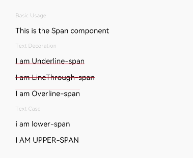
示例
// xxx.ets
@Entry
@Component
struct SpanExample {
  build() {
    Flex({ direction: FlexDirection.Column, alignItems: ItemAlign.Start, justifyContent: FlexAlign.SpaceBetween }) {
      Text('Basic Usage').fontSize(9).fontColor(0xCCCCCC)
      Text() {
        Span('This is the Span component').fontSize(12).textCase(TextCase.Normal)
          .decoration({ type: TextDecorationType.None, color: Color.Red })
      }

      Text('Text Decoration').fontSize(9).fontColor(0xCCCCCC)
      Text() {
        Span('I am Underline-span').decoration({ type: TextDecorationType.Underline, color: Color.Red }).fontSize(12)
      }
      Text() {
        Span('I am LineThrough-span').decoration({ type: TextDecorationType.LineThrough, color: Color.Red }).fontSize(12)
      }
      Text() {
        Span('I am Overline-span').decoration({ type: TextDecorationType.Overline, color: Color.Red }).fontSize(12)
      }

      Text('Text Case').fontSize(9).fontColor(0xCCCCCC)
      Text() {
        Span('I am Lower-span').textCase(TextCase.LowerCase).fontSize(12)
          .decoration({ type: TextDecorationType.None, color: Color.Red })
      }
      Text() {
        Span('I am Upper-span').textCase(TextCase.UpperCase).fontSize(12)
          .decoration({ type: TextDecorationType.None, color: Color.Red })
      }
    }.width('100%').height(250).padding({ left: 35, right: 35, top: 35 })
  }
}