Border
The border attribute is used to set border styles for components.
NOTE
The APIs of this module are supported since API version 7. Updates will be marked with a superscript to indicate their earliest API version.
Attributes
| Name | Type | Description |
|---|---|---|
| border | { width?: Length, color?: ResourceColor, radius?: Length, style?: BorderStyle }s |
Unified border style. |
| borderStyle | BorderStyle | Border style of an element. Default value: BorderStyle.Solid |
| borderWidth | Length | Border width of an element. |
| borderColor | ResourceColor | Border color of an element. |
| borderRadius | Length | Border radius of an element. |
Example
// xxx.ets
@Entry
@Component
struct BorderExample {
build() {
Flex({ justifyContent: FlexAlign.SpaceAround, alignItems: ItemAlign.Center }) {
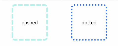
// Dashed border
Text('dashed')
.borderStyle(BorderStyle.Dashed).borderWidth(5).borderColor(0xAFEEEE).borderRadius(10)
.width(120).height(120).textAlign(TextAlign.Center).fontSize(16)
// Dotted border
Text('dotted')
.border({ width: 5, color: 0x317AF7, radius: 10, style: BorderStyle.Dotted })
.width(120).height(120).textAlign(TextAlign.Center).fontSize(16)
}.width('100%').height(150)
}
}