popup
The <popup> component is used to display a pop-up to offer instructions after a user clicks a bound control.
Required Permissions
None
Child Components
All child components are supported. Each <popup> can have only one child component5+.
Attributes
In addition to the attributes in Universal Attributes, the following attributes are supported.
| Name | Type | Default Value | Mandatory | Description |
|---|---|---|---|---|
| target | string | - | Yes | ID of the target element. Dynamic switch is not supported. |
| placement | string | bottom | No | Position of the pop-up. Available values are as follows: - left: The pop-up is displayed on the left of the target item. - right: The pop-up is displayed on the right of the target item. - top: The pop-up is displayed at the top of the target item. - bottom: The pop-up is displayed at the bottom of the target item. - topLeft: The pop-up is displayed on the upper left of the target item. - topRight: The pop-up is displayed on the upper right of the target item. - bottomLeft: The pop-up is displayed on the bottom left of the target item. - bottomRight: The pop-up is displayed on the bottom right of the target item. |
| keepalive5+ | boolean | false | No | Whether to retain this pop-up. - true: The pop-up does not disappear when users tap other areas or switch the page. To hide the pop-up, you need to call the hide method. - false: The pop-up disappears when users tap other areas or switch the page. |
| clickable5+ | boolean | true | No | Whether to display the pop-up when users click the bound control. If this parameter is set to false, the pop-up can be triggered only by a method call. |
| arrowoffset5+ | <length> | 0 | No | Offset of the pop-up arrow. By default, the arrow is centered. A positive value means that the arrow moves along the language direction (LTR or RTL), and a negative value means that the arrow moves along the opposite direction of the language direction. |
NOTE:
- The focusable attribute is not supported.
Styles
In addition to the styles in Universal Styles, the following styles are supported.
| Name | Type | Default Value | Mandatory | Description |
|---|---|---|---|---|
| mask-color | <color> | - | No | Color configuration of the mask layer. By default, the mask layer is completely transparent. |
- Position-related styles are not supported.
Events
In addition to the events in Universal Events, the following events are supported.
| Name | Parameters | Description |
|---|---|---|
| visibilitychange | { visibility: boolean } | Triggered when a pop-up appears or disappears. |
Methods
Only the following methods are supported.
| Name | Parameters | Description |
|---|---|---|
| show5+ | - | Pops up a message. |
| hide5+ | - | Hides a pop-up. |
- Attributes and styles of a <popup> component cannot be dynamically updated.
- Margins of a pop-up take effect depending on its position relative to the target element. For example, if the pop-up is below the target element, only margin-top takes effect; if the pop-up displays on the upper left of the target element, only margin-bottom and margin-right take effect.
- Styles set for the four borders of a pop-up must be the same. If they are different and the border radius is 0, the first configured border style (in the sequence of left, top, right, and bottom) takes effect. Otherwise, the border attribute does not take effect.
- The click event bound to the target element of a pop-up does not take effect.
Example Code
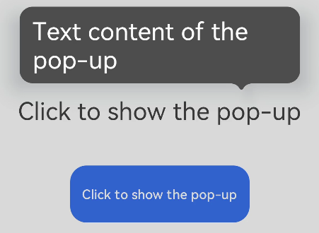
<!-- xxx.hml -->
<div class="container">
  <text id="text">Click to show the pop-up</text>
  <!-- popup supports single child of any type<sup>5+</sup> -->
  <popup id="popup" class="popup" target="text" placement="top" keepalive="true" clickable="true"
    arrowoffset="100px" onvisibilitychange="visibilitychange" onclick="hidepopup">
    <text class="text">Text content of the pop-up</text>
  </popup>
  <button class="button" onclick="showpopup">Click to show the pop-up</button>
</div>
/* xxx.css */
.container {
  flex-direction: column;
  align-items: center;
  padding-top: 200px;
}
.popup {
  mask-color: gray;
}
.text {
  color: white;
}
.button {
  width: 220px;
  height: 70px;
  margin-top: 50px;
}
// xxx.js
import prompt from '@system.prompt'
export default {
  visibilitychange(e) {
    prompt.showToast({
      message: 'visibility change visibility: ' + e.visibility,
        duration: 3000,
    });
  },
  showpopup() {
    this.$element("popup").show();
  },
  hidepopup() {
    this.$element("popup").hide();
  },
}