Gauge
数据量规图表组件,用于将数据展示为环形图表。
说明:
该组件从API Version 8开始支持。后续版本如有新增内容,则采用上角标单独标记该内容的起始版本。
子组件
无
接口
Gauge(options:{value: number, min?: number, max?: number})
参数:
| 参数名 | 参数类型 | 必填 | 参数描述 |
|---|---|---|---|
| value | number | 是 | 当前数据值。 |
| min | number | 否 | 当前数据段最小值。 默认值:0 |
| max | number | 否 | 当前数据段最大值。 默认值:100 |
属性
| 名称 | 参数类型 | 描述 |
|---|---|---|
| value | number | 设置当前数据图表的值。 默认值:0 |
| startAngle | number | 设置起始角度位置,时钟0点为0度,顺时针方向为正角度。 默认值:-150 |
| endAngle | number | 设置终止角度位置,时钟0点为0度,顺时针方向为正角度。 默认值:150 |
| colors | Array<ColorStop> | 设置图表的颜色,支持分段颜色设置。 |
| strokeWidth | Length | 设置环形图表的环形厚度。 |
ColorStop
颜色断点类型,用于描述渐进色颜色断点。
| 名称 | 类型定义 | 描述 |
|---|---|---|
| ColorStop | [ResourceColor, number] | 描述渐进色颜色断点类型,第一个参数为颜色值,第二个参数为0~1之间的比例值。 |
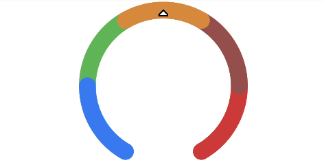
示例
// xxx.ets
@Entry
@Component
struct GaugeExample {
  build() {
    Column() {
      Gauge({ value: 50, min: 0, max: 100 })
        .startAngle(210).endAngle(150)
        .colors([[0x317AF7, 1], [0x5BA854, 1], [0xE08C3A, 1], [0x9C554B, 1], [0xD94838, 1]])
        .strokeWidth(20)
        .width(200).height(200)
    }.width('100%').margin({ top: 5 })
  }
}