尺寸设置
说明:
从API Version 7开始支持。后续版本如有新增内容,则采用上角标单独标记该内容的起始版本。
属性
| 名称 | 参数说明 | 描述 |
|---|---|---|
| width | Length | 设置组件自身的宽度,缺省时使用元素自身内容需要的宽度。 |
| height | Length | 设置组件自身的高度,缺省时使用元素自身内容需要的高度。 |
| size | { width?: Length, height?: Length } |
设置高宽尺寸。 |
| padding | Padding | Length | 设置内边距属性。 参数为Length类型时,四个方向内边距同时生效。 默认值:0 |
| margin | Margin | Length | 设置外边距属性。 参数为Length类型时,四个方向外边距同时生效。 默认值:0 |
| constraintSize | { minWidth?: Length, maxWidth?: Length, minHeight?: Length, maxHeight?: Length } |
设置约束尺寸,组件布局时,进行尺寸范围限制。 默认值: { minWidth: 0, maxWidth: Infinity, minHeight: 0, maxHeight: Infinity } |
| layoutWeight | number | string | 容器尺寸确定时,元素与兄弟节点主轴布局尺寸按照权重进行分配,忽略本身尺寸设置,表示自适应占满剩余空间。 默认值:0 说明: 仅在Row/Column/Flex布局中生效。 |
示例
// xxx.ets
@Entry
@Component
struct SizeExample {
build() {
Column({ space: 10 }) {
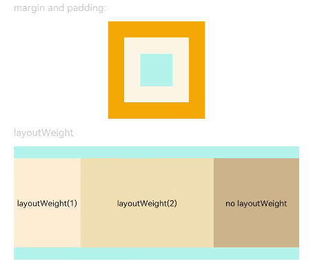
Text('margin and padding:').fontSize(12).fontColor(0xCCCCCC).width('90%')
// 宽度80 ,高度80 ,内外边距20
Row() {
Row() {
Row().size({ width: '100%', height: '100%' }).backgroundColor(0xAFEEEE)
}.width(80).height(80).padding(20).margin(20).backgroundColor(0xFDF5E6)
}.backgroundColor(0xFFA500)
Text('layoutWeight').fontSize(12).fontColor(0xCCCCCC).width('90%')
// 容器尺寸确定时,元素与兄弟节点主轴布局尺寸按照权重进行分配,忽略本身尺寸设置。
Row() {
// 权重1
Text('layoutWeight(1)')
.size({ width: '30%', height: 110 }).backgroundColor(0xFFEFD5).textAlign(TextAlign.Center)
.layoutWeight(1)
// 权重0
Text('layoutWeight(2)')
.size({ width: '30%', height: 110 }).backgroundColor(0xF5DEB3).textAlign(TextAlign.Center)
.layoutWeight(2)
// 权重默认0
Text('no layoutWeight')
.size({ width: '30%', height: 110 }).backgroundColor(0xD2B48C).textAlign(TextAlign.Center)
}.size({ width: '90%', height: 140 }).backgroundColor(0xAFEEEE)
}.width('100%').margin({ top: 5 })
}}