Opacity
NOTE This attribute is supported since API version 7. Updates will be marked with a superscript to indicate their earliest API version.
The attributes described in this topic are used to set the opacity of a component.
Required Permissions
None
Attributes
| Name | Type | Default Value | Description |
|---|---|---|---|
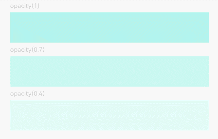
| opacity | number | 1 | Opacity of a component. The value ranges from 0 to 1. The value 1 means opaque, and 0 means completely transparent. |
Example
@Entry
@Component
struct OpacityExample {
  build() {
    Column({ space: 5 }) {
      Text('opacity(1)').fontSize(9).width('90%').fontColor(0xCCCCCC)
      Text().width('90%').height(50).opacity(1).backgroundColor(0xAFEEEE)
      Text('opacity(0.7)').fontSize(9).width('90%').fontColor(0xCCCCCC)
      Text().width('90%').height(50).opacity(0.7).backgroundColor(0xAFEEEE)
      Text('opacity(0.4)').fontSize(9).width('90%').fontColor(0xCCCCCC)
      Text().width('90%').height(50).opacity(0.4).backgroundColor(0xAFEEEE)
    }
    .width('100%')
    .padding({ top: 5 })
  }
}