RowSplit
NOTE This component is supported since API version 7. Updates will be marked with a superscript to indicate their earliest API version.
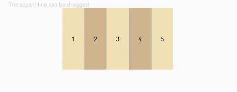
The <RowSplit> lays out child components horizontally and inserts a vertical divider between every two child components.
Required Permissions
None
Child Components
This component can contain child components.
APIs
RowSplit()
Attributes
| Name | Type | Description |
|---|---|---|
| resizeable | boolean | Whether the divider can be dragged. The default value is false. |
Example
@Entry
@Component
struct RowSplitExample {
  build() {
    Column() {
      Text('The second line can be dragged').fontSize(9).fontColor(0xCCCCCC).width('90%')
      RowSplit() {
        Text('1').width('10%').height(100).backgroundColor(0xF5DEB3).textAlign(TextAlign.Center)
        Text('2').width('10%').height(100).backgroundColor(0xD2B48C).textAlign(TextAlign.Center)
        Text('3').width('10%').height(100).backgroundColor(0xF5DEB3).textAlign(TextAlign.Center)
        Text('4').width('10%').height(100).backgroundColor(0xD2B48C).textAlign(TextAlign.Center)
        Text('5').width('10%').height(100).backgroundColor(0xF5DEB3).textAlign(TextAlign.Center)
      }
      .resizeable(true) // The divider can be dragged.
      .width('90%').height(100)
    }.width('100%').margin({ top: 5 })
  }
}