Text
The <Text> component is used to display a piece of textual information.
NOTE
This component is supported since API version 7. Updates will be marked with a superscript to indicate their earliest API version.
Required Permissions
None
Child Components
This component can contain the <Span> child component.
APIs
Text(content?: string | Resource)
Parameters
| Name | Type | Mandatory | Description |
|---|---|---|---|
| content | string | Resource | No | Text content. The content and style set for the <Text> component do not take effect when it contains the <Span> child component. Default value: ' ' |
Attributes
| Name | Type | Description |
|---|---|---|
| textAlign | TextAlign | Text alignment mode of multiple lines of text. Default value: TextAlign.Start |
| textOverflow | {overflow: TextOverflow} | Display mode when the text is too long. Default value: {overflow: TextOverflow.Clip} NOTE Text is truncated at the transition between words. To truncate text in the middle of a word, add \u200B between characters. |
| maxLines | number | Maximum number of lines in the text. Default value: Infinity |
| lineHeight | string | number | Resource | Text line height. If the value is less than or equal to 0, the line height is not limited and the font size is adaptive. If the value of the number type, the unit fp is used. |
| decoration | { type: TextDecorationType, color?: ResourceColor } |
Style and color of the text decorative line. Default value: { type: TextDecorationType.None, color: Color.Black } |
| baselineOffset | number | string | Offset of the text baseline. |
| letterSpacing | number | string | Letter spacing. |
| minFontSize | number | string | Resource | Minimum font size. |
| maxFontSize | number | string | Resource | Maximum font size. |
| textCase | TextCase | Text case. Default value: TextCase.Normal |
NOTE
The <Text> component cannot contain both the text and the child component <Span>. If both of them exist, only the content in <Span> is displayed.
Example
// xxx.ets
@Entry
@Component
struct TextExample1 {
build() {
Flex({ direction: FlexDirection.Column, alignItems: ItemAlign.Start, justifyContent: FlexAlign.SpaceBetween }) {
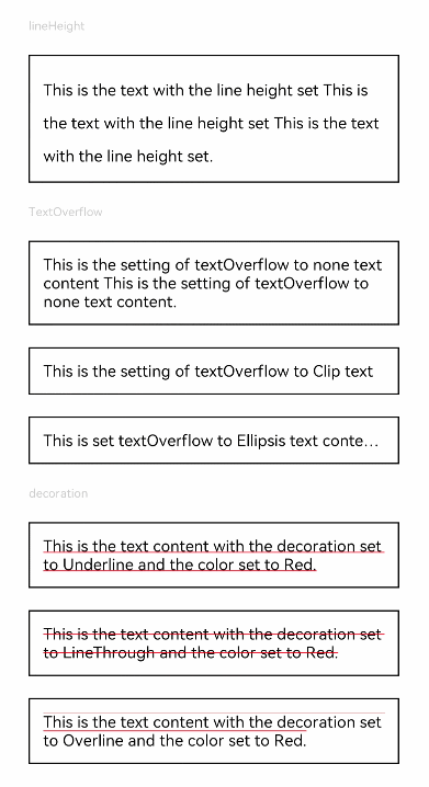
Text('lineHeight').fontSize(9).fontColor(0xCCCCCC)
Text('This is the text with the line height set This is the text with the line height set This is the text with the line height set.')
.lineHeight(25).fontSize(12).border({ width: 1 }).padding(10)
Text('TextOverflow').fontSize(9).fontColor(0xCCCCCC)
Text('This is the setting of textOverflow to none text content This is the setting of textOverflow to none text content.')
.textOverflow({ overflow: TextOverflow.None })
.fontSize(12).border({ width: 1 }).padding(10)
Text('This is the setting of textOverflow to Clip text content This is the setting of textOverflow to Clip text content.')
.textOverflow({ overflow: TextOverflow.Clip })
.maxLines(1).fontSize(12).border({ width: 1 }).padding(10)
Text('This is set textOverflow to Ellipsis text content This is set textOverflow to Ellipsis text content.'.split('').join('\u200B'))
.textOverflow({ overflow: TextOverflow.Ellipsis })
.maxLines(1).fontSize(12).border({ width: 1 }).padding(10)
Text('decoration').fontSize(9).fontColor(0xCCCCCC)
Text('This is the text content with the decoration set to Underline and the color set to Red.')
.decoration({ type: TextDecorationType.Underline, color: Color.Red })
.fontSize(12).border({ width: 1 }).padding(10)
Text('This is the text content with the decoration set to LineThrough and the color set to Red.')
.decoration({ type: TextDecorationType.LineThrough, color: Color.Red })
.fontSize(12).border({ width: 1 }).padding(10)
Text('This is the text content with the decoration set to Overline and the color set to Red.')
.decoration({ type: TextDecorationType.Overline, color: Color.Red })
.fontSize(12).border({ width: 1 }).padding(10)
}.height(600).width(350).padding({ left: 35, right: 35, top: 35 })
}
}
// xxx.ets
@Entry
@Component
struct TextExample2 {
build() {
Flex({ direction: FlexDirection.Column, alignItems: ItemAlign.Start, justifyContent: FlexAlign.SpaceBetween }) {
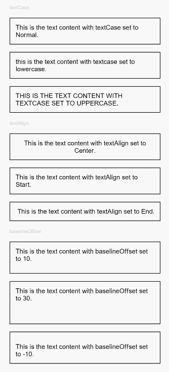
Text('textCase').fontSize(9).fontColor(0xCCCCCC)
Text('This is the text content with textCase set to Normal.')
.textCase(TextCase.Normal)
.fontSize(12).border({ width: 1 }).padding(10).width('100%')
Text('This is the text content with textCase set to LowerCase.')
.textCase(TextCase.LowerCase)
.fontSize(12).border({ width: 1 }).padding(10).width('100%')
Text('This is the text content with textCase set to UpperCase.')
.textCase(TextCase.UpperCase)
.fontSize(12).border({ width: 1 }).padding(10)
Text('textAlign').fontSize(9).fontColor(0xCCCCCC)
Text('This is the text content with textAlign set to Center.')
.textAlign(TextAlign.Center)
.fontSize(12).border({ width: 1 }).padding(10).width('100%')
Text('This is the text content with textAlign set to Start.')
.textAlign(TextAlign.Start)
.fontSize(12).border({ width: 1 }).padding(10).width('100%')
Text('This is the text content with textAlign set to End.')
.textAlign(TextAlign.End)
.fontSize(12).border({ width: 1 }).padding(10).width('100%')
Text('baselineOffset').fontSize(9).fontColor(0xCCCCCC)
Text('This is the text content with baselineOffset set to 10.')
.baselineOffset(10).fontSize(12).border({ width: 1 }).padding(10).width('100%')
Text('This is the text content with baselineOffset set to 30.')
.baselineOffset(30).fontSize(12).border({ width: 1 }).padding(10).width('100%')
Text('This is the text content with baselineOffset set to -10.')
.baselineOffset(-10).fontSize(12).border({ width: 1 }).padding(10).width('100%')
}.height(700).width(350).padding({ left: 35, right: 35, top: 35 })
}
}