switch
说明: 从API version 4开始支持。后续版本如有新增内容,则采用上角标单独标记该内容的起始版本。
开关选择器,通过开关,开启或关闭某个功能。
权限列表
无
子组件
不支持。
属性
除支持通用属性外,还支持如下属性:
| 名称 | 类型 | 默认值 | 必填 | 描述 |
|---|---|---|---|---|
| checked | boolean | false | 否 | 是否选中。 |
| showtext | boolean | false | 否 | 是否显示文本。 |
| texton | string | "On" | 否 | 选中时显示的文本。 |
| textoff | string | "Off" | 否 | 未选中时显示的文本。 |
样式
除支持通用样式外,还支持如下样式:
| 名称 | 类型 | 默认值 | 必填 | 描述 |
|---|---|---|---|---|
| texton-color(Rich) | <color> | #000000 | 否 | 选中时显示的文本颜色。 |
| textoff-color(Rich) | <color> | #000000 | 否 | 未选中时显示的文本颜色。 |
| text-padding(Rich) | number | 0px | 否 | texton/textoff中最长文本两侧距离滑块边界的距离。 |
| font-size(Rich) | <length> | - | 否 | 文本尺寸,仅设置texton和textoff生效。 |
| allow-scale(Rich) | boolean | true | 否 | 文本尺寸是否跟随系统设置字体缩放尺寸进行放大缩小。 > 说明:> 如果在config描述文件中针对ability配置了fontSize的config-changes标签,则应用不会重启而直接生效。 |
| font-style(Rich) | string | normal | 否 | 字体样式,仅设置texton和textoff生效。见text组件font-style的样式属性。 |
| font-weight(Rich) | number | string | normal | 否 | 字体粗细,仅设置texton和textoff生效。见text组件的font-weight的样式属性。 |
| font-family(Rich) | string | sans-serif | 否 | 字体列表,用逗号分隔,每个字体用字体名或者字体族名设置。列表中第一个系统中存在的或者通过自定义字体指定的字体,会被选中作为文本的字体。仅设置texton和textoff生效。 |
事件
除支持通用事件外,还支持如下事件:
| 名称 | 参数 | 描述 |
|---|---|---|
| change | { checked: checkedValue } | 选中状态改变时触发该事件。 |
方法
支持通用方法。
示例
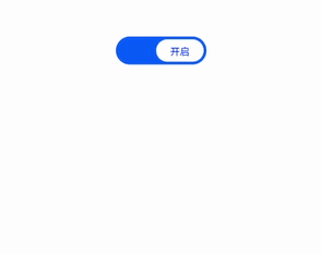
<!-- xxx.hml -->
<div class="container">
  <switch showtext="true" texton="开启" textoff="关闭" checked="true" @change="switchChange">
  </switch>
</div>
/* xxx.css */
.container {
  display: flex;
  justify-content: center;
  align-items: center;
}
switch{
  texton-color:#002aff;
  textoff-color:silver;
  text-padding:20px;
}
// xxx.js
import prompt from '@system.prompt';
export default {
  data: {
    title: 'World'
  },
  switchChange(e){
    console.log(e.checked);
    if(e.checked){
      prompt.showToast({
        message: "打开开关"
      });
    }else{
      prompt.showToast({
        message: "关闭开关"
      });
    }
  }
}