list-item-group
<list-item-group> is a child component of <list> and is used to group items in a list. By default, the width of <list-item-group> is equal to that of <list>.
- To use this component, you must set the columns attribute of the parent component <list> to 1. Otherwise, <list-item-group> is not displayed.
- You can customize the width of each <list-item-group>. However, if you retain the default value stretch of align-items for the parent component <list>, the width of <list-item-group> is equal to that of <list>. You can set align-items to other values rather than stretch to make the customized <list-item-group> width take effect.
Required Permissions
None
Child Components
Only <list-item> are supported.
Attributes
In addition to the attributes in Universal Attributes, the following attributes are supported.
| Name | Type | Default Value | Mandatory | Description |
|---|---|---|---|---|
| type | string | default | No | Type of the list-item-group. A list supports multiple list-item-group types. The same type of list-item-groups should have the same view layout after being rendered. When the type is fixed, replace the if attribute with the show attribute to ensure that the view layout remains unchanged. |
NOTE:
id in the common attributes is used to identify a group. The input parameters of related functions and event information in the list also use id to uniquely identify a group.
Styles
In addition to the styles in Universal Styles, the following styles are supported.
| Name | Type | Default Value | Mandatory | Description |
|---|---|---|---|---|
| flex-direction | string | row | No | Main axis direction of the container. Available values are as follows: - column: Items are placed vertically from top to bottom. - row: Items are placed horizontally from left to right. |
| justify-content | string | flex-start | No | How items are aligned along the main axis of the current row in the container. Available values are as follows: - flex-start: Items are packed towards the start row. - flex-end: Items are packed towards the end row. - center: Items are centered along the row. - space-between: Items are positioned with space between the rows. - space-around: Items are positioned with space before, between, and after the rows. - space-evenly5+: Items are arranged with even space between each two. |
Events
In addition to the events in Universal Events, the following events are supported.
| Name | Parameter | Description |
|---|---|---|
| groupclick | { groupid: string } | Triggered when a group is clicked. groupid: ID of the group that is clicked. |
| groupcollapse | { groupid: string } | Triggered when a group is collapsed. groupid: ID of the group collapsed. If the parameter is not carried or groupid is left empty, all groups are collapsed. |
| groupexpand | { groupid: string } | Triggered when a group is expanded. groupid: ID of the group expanded. If the parameter is not carried or groupid is left empty, all groups are expanded. |
Methods
Methods in Universal Methods are supported.
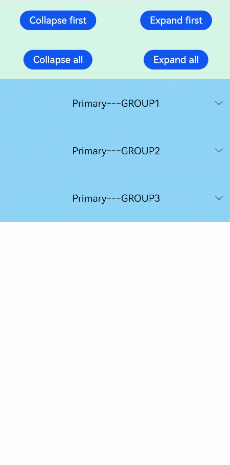
Example
<!-- xxx.hml -->
<div class="doc-page">
  <list style="width: 100%;" id="mylist">
    <list-item class="top-list-item" clickeffect="false">
      <div class="item-div">
        <div class="item-child">
          <button type="capsule" value="Collapse first" onclick="collapseOne"></button>
          <button type="capsule" value="Expand first" onclick="expandOne"></button>
        </div>
        <div class="item-child">
          <button type="capsule" value="Collapse all" onclick="collapseAll"></button>
          <button type="capsule" value="Expand all" onclick="expandAll"></button>
        </div>
      </div>
    </list-item>
    <list-item-group for="listgroup in list" id="{{listgroup.value}}" ongroupcollapse="collapse" ongroupexpand="expand">
      <list-item type="item" style="background-color:#FFF0F5;height:95px;">
        <div class="item-group-child">
          <text>One---{{listgroup.value}}</text>
        </div>
      </list-item>
      <list-item type="item" style="background-color: #87CEFA;height:145px;" primary="true">
        <div class="item-group-child">
          <text>Primary---{{listgroup.value}}</text>
        </div>
      </list-item>
    </list-item-group>
  </list>
</div>
/* xxx.css */
.doc-page {
  flex-direction: column;
}
.top-list-item {
  width:100%;
  background-color:#D4F2E7;
}
.item-div {
  flex-direction:column;
  align-items:center;
  justify-content:space-around;
  height:240px;
}
.item-child {
  width:100%;
  height:60px;
  justify-content:space-around;
  align-items:center;
}
.item-group-child {
  justify-content: center;
  align-items: center;
  width:100%;
}
// xxx.js
import prompt from '@system.prompt';
export default {
  data: {
    direction: 'column',
    list: []
  },
  onInit() {
    this.list = []
    this.listAdd = []
    for (var i = 1; i <= 3; i++) {
      var dataItem = {
        value: 'GROUP' + i,
      };
      this.list.push(dataItem);
    }
  },
  collapseOne(e) {
    this.$element('mylist').collapseGroup({
      groupid: 'GROUP1'
    })
  },
  expandOne(e) {
    this.$element('mylist').expandGroup({
      groupid: 'GROUP1'
    })
  },
  collapseAll(e) {
    this.$element('mylist').collapseGroup()
  },
  expandAll(e) {
    this.$element('mylist').expandGroup()
  },
  collapse(e) {
    prompt.showToast({
      message: 'Close ' + e.groupid
    })
  },
  expand(e) {
    prompt.showToast({
      message: 'Open ' + e.groupid
    })
  }
}