toggle
The <toggle> component allows your user to select from a group of options and may display the selection result in real time. Generally, the option group consists of many toggles.
Required Permissions
None
Child Component
Not supported
Attributes
In addition to the attributes in Universal Attributes, the following attributes are supported.
| Name | Type | Default Value | Mandatory | Description |
|---|---|---|---|---|
| value | string | - | Yes | Text value of the toggle. |
| checked | boolean | false | No | Whether the toggle is selected. |
Styles
In addition to the styles in Universal Styles, the following styles are supported.
| Name | Type | Default Value | Mandatory | Description |
|---|---|---|---|---|
| text-color | <color> | #E5000000 | No | Text color of the toggle. |
| font-size | <length> | 16px | No | Font size of the toggle. |
| allow-scale | boolean | true | No | Whether the font size changes with the system's font size settings. NOTE: If the config-changes tag of fontSize is configured for abilities in the config.json file, the setting takes effect without application restart. |
| font-style | string | normal | No | Font style of the toggle. |
| font-weight | number | string | normal | No | Font weight of the toggle. For details, see font-weight of the text component. |
| font-family | <string> | sans-serif | No | Font family, in which fonts are separated by commas (,). Each font is set using a font name or font family name. The first font in the family or the font specified by Custom Font Styles is used for the text. |
Events
In addition to the events in Universal Events, the following events are supported.
| Name | Parameter | Description |
|---|---|---|
| change | { checked: isChecked } | Triggered when the toggle is selected or unselected. |
Methods
Methods in Universal Methods are supported.
Example
<!-- xxx.hml -->
<div style="flex-direction: column;">
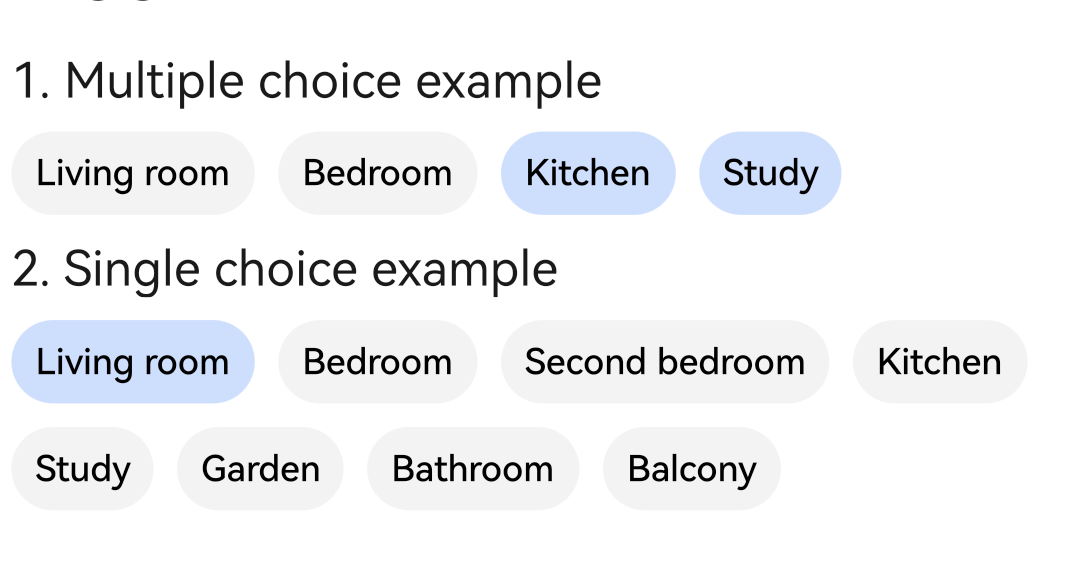
<text class="margin">1. Multiple choice example</text>
<div style="flex-wrap: wrap">
<toggle class="margin" for="{{toggles}}">{{$item}}</toggle>
</div>
<text class="margin">2. Single choice example</text>
<div style="flex-wrap: wrap">
<toggle class="margin" for="{{toggle_list}}" id="{{$item.id}}" checked="{{$item.checked}}"
value="{{$item.name}}" @change="allchange" @click="allclick({{$item.id}})"></toggle>
</div>
</div>
/* xxx.css */
.margin {
margin: 7px;
}
// xxx.js
export default {
data: {
toggle_list: [
{ "id":"1001", "name":"Living room", "checked":true },
{ "id":"1002", "name":"Bedroom", "checked":false },
{ "id":"1003", "name":"Second bedroom", "checked":false },
{ "id":"1004", "name":"Kitchen", "checked":false },
{ "id":"1005", "name":"Study", "checked":false },
{ "id":"1006", "name":"Garden", "checked":false },
{ "id":"1007", "name":"Bathroom", "checked":false },
{ "id":"1008", "name":"Balcony", "checked":false },
],
toggles: ["Living room","Bedroom","Kitchen","Study"],
idx: ""
},
allclick(arg) {
this.idx = arg
},
allchange(e) {
if (e.checked === true) {
for (var i = 0; i < this.toggle_list.length; i++) {
if (this.toggle_list[i].id === this.idx) {
this.toggle_list[i].checked = true
} else {
this.toggle_list[i].checked = false
}
}
}
}
}