SideBarContainer
NOTE This component is supported since API version 8. Updates will be marked with a superscript to indicate their earliest API version.
The <SideBarContainer> component contains a sidebar and content area as its child components. The sidebar is the first child component and can be shown or hidden as needed. The content area is the second child component.
Required Permissions
None
Child Components
Supported
APIs
SideBarContainer( type?: SideBarContainerType )
- Parameters
| Name | Type | Mandatory | Default Value | Description |
|---|---|---|---|---|
| type | SideBarContainerType | No | SideBarContainerType.Embed | Display type of the sidebar. |
- SideBarContainerType enums
| Name | Description |
|---|---|
| Embed | The sidebar is embedded in the component and displayed side by side with the content area. |
| Overlay | The sidebar is displayed overlaid on the content area. |
Attributes
| Name | Type | Default Value | Description |
|---|---|---|---|
| showSideBar | boolean | true | Whether to display the sidebar. |
| controlButton | ButtonStyle | - | Attributes of the sidebar control button. |
| showControlButton | boolean | true | Whether to display the sidebar control button. |
| sideBarWidth | number | 200 | Width of the sidebar. |
| minSideBarWidth | number | 200 | Minimum width of the sidebar. |
| maxSideBarWidth | number | 280 | Maximum width of the sidebar. |
- ButtonStyle
| Name | Type | Mandatory | Default Value | Description |
|---|---|---|---|---|
| left | number | No | 16 | Spacing between the sidebar control button and the left of the container. |
| top | number | No | 48 | Spacing between the sidebar control button and the top of the container. |
| width | number | No | 32 | Width of the sidebar control button. |
| height | number | No | 32 | Height of the sidebar control button. |
| icons | { shown: string | PixelMap | Resource , hidden: string | PixelMap | Resource , switching?: string | PixelMap | Resource } |
No | - | Icons of the sidebar control button. - shown: icon of the control button when the sidebar is shown. - hidden: icon of the control button when the sidebar is hidden. - switching: icon of the control button when the sidebar is switching between the shown and hidden states. |
Events
| Name | Description |
|---|---|
| onChange(callback: (value: boolen) => void) | Triggered when the status of the sidebar switches between shown and hidden. The value true means that the sidebar is shown, and false means that the sidebar is hidden. |
Example
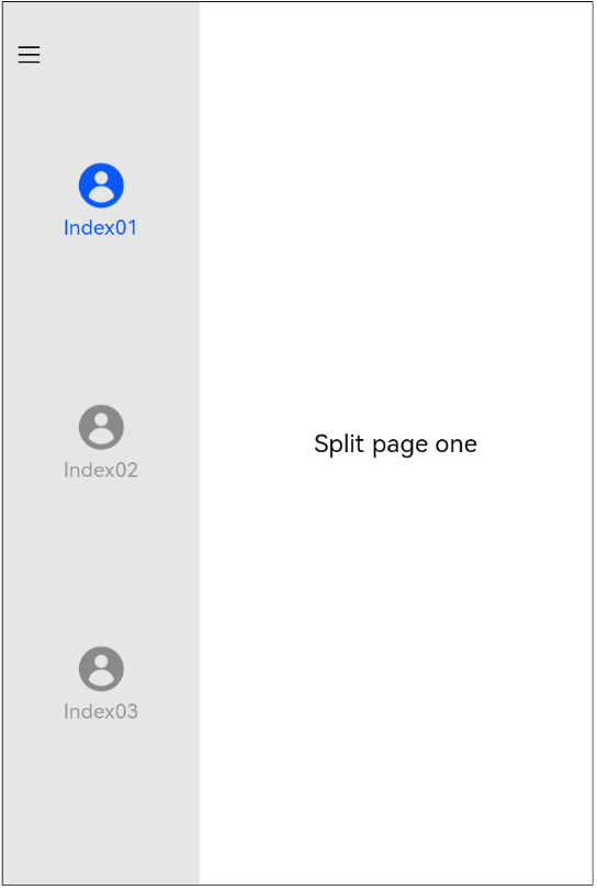
@Entry
@Component
struct SideBarContainerExample {
  normalIcon : Resource = $r("app.media.user")
  selectedIcon: Resource = $r("app.media.userFull")
  @State arr: number[] = [1, 2, 3]
  @State current: number = 1

  build() {
    SideBarContainer(SideBarContainerType.Embed)
    {
      Column() {
        ForEach(this.arr, (item, index) => {
          Column({ space: 5 }) {
            Image(this.current === item ? this.selectedIcon : this.normalIcon).width(64).height(64)
            Text("Index0" + item)
              .fontSize(25)
              .fontColor(this.current === item ? '#0A59F7' : '#999')
              .fontFamily('source-sans-pro,cursive,sans-serif')
          }
          .onClick(() => {
            this.current = item
          })
        }, item => item)
      }.width('100%')
      .justifyContent(FlexAlign.SpaceEvenly)
      .backgroundColor('#19000000')
      RowSplit() {
        Column(){
          Text('Split page one').fontSize(30)
        }.justifyContent(FlexAlign.Center)
        Column(){
          Text('Split page two').fontSize(30)
        }.justifyContent(FlexAlign.Center)
      }.width('100%')
    }
    .sideBarWidth(240)
    .minSideBarWidth(210)
    .maxSideBarWidth(260)
    .onChange((value: boolean) => {
      console.info('status:' + value)
    })
  }
}