Badge
NOTE This component is supported since API version 7. Updates will be marked with a superscript to indicate their earliest API version.
The <Badge> component presents event information on a component.
Required Permissions
None
Child Components
This component supports only one child component.
APIs
Badge(value: {count: number, position?: BadgePosition, maxCount?: number, style?: BadgeStyle})
- Parameters
| Name | Type | Mandatory | Default Value | Description |
|---|---|---|---|---|
| count | number | Yes | - | Number of prompt messages. |
| position | BadgePosition | No | BadgePosition.RightTop | Position to display the badge relative to the parent component. |
| maxCount | number | No | 99 | Maximum number of prompt messages. When the maximum number is reached, only maxCount+ is displayed. |
| style | BadgeStyle | No | - | Style of the <Badge> component, including the text color, text size, badge color, and badge size. |
Badge(value: {value: string, position?: BadgePosition, style?: BadgeStyle})
Creates a <Badge> component based on the string.
- Parameters
| Name | Type | Mandatory | Default Value | Description |
|---|---|---|---|---|
| value | string | Yes | - | String of the content to prompt. |
| position | BadgePosition | No | BadgePosition.RightTop | Display position of the badge. |
| style | BadgeStyle | No | - | Style of the <Badge> component, including the text color, text size, badge color, and badge size. |
- BadgeStyle object
| Name | Type | Mandatory | Default Value | Description |
|---|---|---|---|---|
| color | Color | No | Color.White | Text color. |
| fontSize | number | string | No | 10 | Text size. |
| badgeSize | number | string | Yes | - | Size of the badge. |
| badgeColor | Color | No | Color.Red | Color of the badge. |
- BadgePosition enums
| Name | Description |
|---|---|
| Right | The badge is vertically centered on the right of the parent component. |
| RightTop | The badge is displayed in the upper right corner of the parent component. |
| Left | The badge is vertically centered on the left of the parent component. |
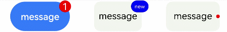
Example
@Entry
@Component
struct BadgeExample {
  @State counts: number = 1
  @State message: string = 'new'

  build() {
    Flex({ justifyContent: FlexAlign.SpaceAround }) {
      Badge({
        count: this.counts,
        maxCount: 99,
        style: { color: 0xFFFFFF, fontSize: 16, badgeSize: 20, badgeColor: Color.Red }
      }) {
        Button('message')
          .onClick(() => {
            this.counts++
          })
          .width(100).height(50).backgroundColor(0x317aff)
      }.width(100).height(50)

      Badge({
        value: this.message,
        style: { color: 0xFFFFFF, fontSize: 9, badgeSize: 20, badgeColor: Color.Blue }
      }) {
        Text('message')
          .width(80).height(50).fontSize(16).lineHeight(37)
          .borderRadius(10).textAlign(TextAlign.Center).backgroundColor(0xF3F4ED)
      }.width(80).height(50)

      Badge({
        value: '',
        position: 1,
        style: { badgeSize: 6, badgeColor: Color.Red }
      }) {
        Text('message')
          .width(90).height(50).fontSize(16).lineHeight(37)
          .borderRadius(10).textAlign(TextAlign.Center).backgroundColor(0xF3F4ED)
      }.width(90).height(50)
    }.width('100%').margin({ top: 5 })
  }
}