Progress
NOTE
This component is supported since API version 7. Updates will be marked with a superscript to indicate their earliest API version.
The <Progress> component is used to provide a progress bar that displays the progress of content loading or an operation.
Required Permissions
None
Child Components
Not supported
APIs
Progress(value: {value: number, total?: number, type?: ProgressType})
Creates a progress bar.
- Parameters
| Name | Type | Mandatory | Default Value | Description |
|---|---|---|---|---|
| value | number | Yes | - | Current progress. |
| total | number | No | 100 | Total progress. |
| type | ProgressType | No | ProgressType.Linear | Type of the progress bar. |
- ProgressType enums
| Name | Description |
|---|---|
| Linear | Linear type. |
| Ring8+ | Ring type without scale. The ring fills up as the progress increases. |
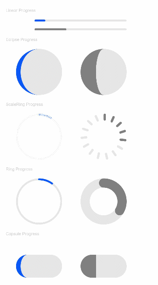
| Eclipse | Eclipse type, which visualizes the progress in a way similar to the moon waxing from new to full. |
| ScaleRing8+ | Ring type with scale, which is similar to the clock scale style. |
| Capsule8+ | Capsule type. At both ends, the progress bar changes from an arc to a straight line and from a straight line to an arc. In the middle part of the capsule, the progress bar moves to the right. |
Attributes
| Name | Type | Default Value | Description |
|---|---|---|---|
| value | number | - | Current progress. |
| color | Color | - | Background color of the progress bar. |
| style8+ | { strokeWidth? : Length, scaleCount? : number, scaleWidth? : Length } |
- | Component style. - strokeWidth: width of the progress bar. - scaleCount: scale count of the circular progress bar. - scaleWidth: scale width of the circular progress bar. If the scale thickness is greater than the progress bar width, the default scale thickness is used. |
Example
// xxx.ets
@Entry
@Component
struct ProgressExample {
  build() {
    Column({ space: 15 }) {
      Text('Linear Progress').fontSize(9).fontColor(0xCCCCCC).width('90%')
      Progress({ value: 10, type: ProgressType.Linear }).width(200)
      Progress({ value: 20, total: 150, type: ProgressType.Linear }).color(Color.Grey).value(50).width(200)

      Text('Eclipse Progress').fontSize(9).fontColor(0xCCCCCC).width('90%')
      Row({ space: 40 }) {
        Progress({ value: 10, type: ProgressType.Eclipse }).width(100)
        Progress({ value: 20, total: 150, type: ProgressType.Eclipse }).color(Color.Grey).value(50).width(100)
      }

      Text('ScaleRing Progress').fontSize(9).fontColor(0xCCCCCC).width('90%')
      Row({ space: 40 }) {
        Progress({ value: 10, type: ProgressType.ScaleRing }).width(100)
        Progress({ value: 20, total: 150, type: ProgressType.ScaleRing })
          .color(Color.Grey).value(50).width(100)
          .style({ strokeWidth: 15, scaleCount: 15, scaleWidth: 5 })
      }

      Text('Ring Progress').fontSize(9).fontColor(0xCCCCCC).width('90%')
      Row({ space: 40 }) {
        Progress({ value: 10, type: ProgressType.Ring }).width(100)
        Progress({ value: 20, total: 150, type: ProgressType.Ring })
          .color(Color.Grey).value(50).width(100)
          .style({ strokeWidth: 20, scaleCount: 30, scaleWidth: 20 })
      }

      Text('Capsule Progress').fontSize(9).fontColor(0xCCCCCC).width('90%')
      Row({ space: 40 }) {
        Progress({ value: 10, type: ProgressType.Capsule }).width(100).height(50)
        Progress({ value: 20, total: 150, type: ProgressType.Capsule })
          .color(Color.Grey)
          .value(50)
          .width(100)
          .height(50)
      }
    }.width('100%').margin({ top: 30 })
  }
}