slider
The <slider> component is used to quickly adjust settings, such as volume and brightness.
Child Components
Not supported
Attributes
In addition to the attributes in Universal Attributes, the following attributes are supported.
| Name | Type | Default Value | Mandatory | Description |
|---|---|---|---|---|
| min | number | 0 | No | Minimum value of the slider. |
| max | number | 100 | No | Maximum value of the slider. |
| step | number | 1 | No | Step of each slide. |
| value | number | 0 | No | Initial value of the slider. |
| mode5+ | string | outset | No | Slider style. Available values are as follows: -outset: The slider is on the sliding bar. -inset: The slider is inside the sliding bar. |
| showsteps5+ | boolean | false | No | Whether to display slider scales. |
| showtips5+ | boolean | false | No | Whether a pop-up is displayed to show the percentage value on the slider. |
Styles
In addition to the styles in Universal Styles, the following styles are supported.
| Name | Type | Default Value | Mandatory | Description |
|---|---|---|---|---|
| color | <color> | #19000000 | No | Background color of the slider. |
| selected-color | <color> | #ff007dff | No | Selected color of the slider. |
| block-color | <color> | #ffffff | No | Slider color. |
Events
In addition to the events in Universal Events, the following events are supported.
| Name | Parameter | Description |
|---|---|---|
| change | ChangeEvent | Triggered when the value changes. |
Table 1 ChangeEvent
| Attribute | Type | Description |
|---|---|---|
| progress(deprecated5+) | string | Current value of the slider. |
| isEnd(deprecated5+) | string | Whether the dragging operation ends. Available values are as follows: -true: The dragging ends. -false: The dragging is in progress. |
| value5+ | number | Current value of the slider. |
| mode5+ | string | Type of the change event. Available values are as follows: -start: The value starts to change. -move: The value is changing with users' dragging. -end: The value stops changing. |
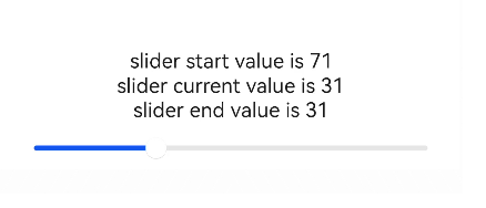
Example
<!-- xxx.hml -->
<div class="container">
  <text>slider start value is {{startValue}}</text>
  <text>slider current value is {{currentValue}}</text>
  <text>slider end value is {{endValue}}</text>
  <slider min="0" max="100" value="{{value}}" onchange="setvalue" ></slider>
</div>
/* xxx.css */
.container {
  flex-direction: column;
  justify-content: center;
  align-items: center;


}
// xxx.js
export default {
  data: {
    value: 0,
    startValue: 0,
    currentValue: 0,
    endValue: 0,
  },
  setvalue(e) {
    if (e.mode == "start") {
      this.value = e.value;
      this.startValue = e.value;
    } else if (e.mode == "move") {
      this.value = e.value;
      this.currentValue = e.value;
    } else if (e.mode == "end") {
      this.value = e.value;
      this.endValue = e.value;
    }
  }
}