TextPicker
NOTE This component is supported since API version 8. Updates will be marked with a superscript to indicate their earliest API version.
The <TextPicker> component allows users to select text from a list of options.
Required Permissions
None
Child Components
None
APIs
TextPicker(value: {range: string[], selected?: number})
Creates a text picker based on the selection range specified by range.
- Parameter
| Name | Type | Mandatory | Default Value | Description |
|---|---|---|---|---|
| range | string[] | Yes | - | Data selection range of the picker. |
| selected | number | No | First element | Index value of the selected item in the array. |
Attributes
| Name | Type | Default Value | Description |
|---|---|---|---|
| defaultPickerItemHeight | Length | - | Default height of a Picker content item element. |
Events
| Name | Description |
|---|---|
| onChange(callback: (value: string, index: number) => void) | Triggered when an item in the picker is selected. - value: text of the selected item. - index: index of the selected item. |
Example
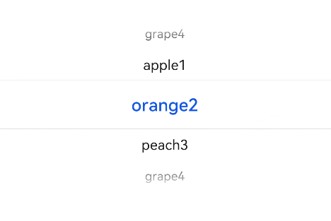
@Entry
@Component
struct TextPickerExample {
  private select: number = 1
  private fruits: string[] = ['apple1', 'orange2', 'peach3', 'grape4']

  build() {
    Column() {
      TextPicker({range: this.fruits, selected: this.select})
        .onChange((value: string, index: number) => {
          console.info('Picker item changed, value: ' + value + ', index: ' + index)
        })
    }
  }
}