Image
The <Image> component is used to render and display local and online images.
NOTE
This component is supported since API version 7. Updates will be marked with a superscript to indicate their earliest API version.
Required Permissions
To use online images, the application must have the ohos.permission.INTERNET permission. For details about how to apply for a permission, see Declaring Permissions.
Child Components
Not supported
APIs
Image(src: string | PixelMap | Resource)
Obtains an image from the specified source for subsequent rendering and display.
Since API version 9, this API is supported in ArkTS widgets.
Parameters
| Name | Type | Mandatory | Description |
|---|---|---|---|
| src | string | PixelMap | Resource | Yes | Image source. Both local and online images are supported. When using an image referenced using a relative path, for example, Image("common/test.jpg"), the <Image> component cannot be called across bundles or modules. Therefore, you are advised to use $r to reference image resources that need to be used globally. - The following image formats are supported: PNG, JPG, BMP, SVG, GIF. - Base64 strings are supported. The value format is data:image/[png|jpeg|bmp|webp];base64,[base64 data], where [base64 data] is a Base64 string. - Strings with the datashare:// prefix are supported, which are used to access the image path provided by a Data ability. - Strings with the file:///data/storage prefix are supported, which are used to read image resources in the files folder in the installation directory of the current application. Ensure that the application has the read permission to the files in the specified path. NOTE - ArkTS widgets support GIF animations, but the animations only play once on display. - ArkTS widgets do not support the strings with the http://, datashare://, or file:///data/storage prefix. - ArkTS widgets do not support the PixelMap type. |
Attributes
In addition to the universal attributes, the following attributes are supported.
| Name | Type | Description |
|---|---|---|
| alt | string | Resource | Placeholder image displayed during loading. Local images are supported. Since API version 9, this API is supported in ArkTS widgets. |
| objectFit | ImageFit | Image scale mode. Default value: ImageFit.Cover Since API version 9, this API is supported in ArkTS widgets. |
| objectRepeat | ImageRepeat | Whether the image is repeated. Default value: ImageRepeat.NoRepeat Since API version 9, this API is supported in ArkTS widgets. NOTE This attribute is not applicable to SVG images. |
| interpolation | ImageInterpolation | Interpolation effect of the image. This attribute is intended to alleviate aliasing that occurs when a low-definition image is zoomed in. Default value: ImageInterpolation.None Since API version 9, this API is supported in ArkTS widgets. NOTE This attribute is not applicable to SVG images. This attribute is not applicable to PixelMap objects. |
| renderMode | ImageRenderMode | Rendering mode of the image. Default value: ImageRenderMode.Original Since API version 9, this API is supported in ArkTS widgets. NOTE This attribute is not applicable to SVG images. |
| sourceSize | { width: number, height: number } |
Size of the decoded image. The original image is decoded into a pixelMap of the specified size, in px. Since API version 9, this API is supported in ArkTS widgets. NOTE This attribute is not applicable to PixelMap objects or SVG images. |
| matchTextDirection | boolean | Whether to display the image in the system language direction. When this parameter is set to true, the image is horizontally flipped in the right-to-left (RTL) language context. Default value: false Since API version 9, this API is supported in ArkTS widgets. |
| fitOriginalSize | boolean | Whether to fit the component to the original size of the image source when the component size is not set. Default value: false Since API version 9, this API is supported in ArkTS widgets. |
| fillColor | ResourceColor | Fill color. This attribute only applies to an SVG image. Once set, the fill color will replace that of the SVG image. Since API version 9, this API is supported in ArkTS widgets. |
| autoResize | boolean | Whether to resize the image source used for drawing based on the size of the display area during image decoding. This resizing can help reduce the memory usage. Default value: true Since API version 9, this API is supported in ArkTS widgets. |
| syncLoad8+ | boolean | Whether to load the image synchronously. By default, the image is loaded asynchronously. During synchronous loading, the UI thread is blocked and the placeholder diagram is not displayed. Default value: false Since API version 9, this API is supported in ArkTS widgets. |
| copyOption9+ | CopyOptions | Whether the image can be copied. (SVG images cannot be copied.) When copyOption is set to a value other than CopyOptions.None, the image can be copied in various manners, such as long pressing, right-clicking, or pressing Ctrl+C. Default value: CopyOptions.None This API is supported in ArkTS widgets. |
| colorFilter9+ | ColorFilter | Color filter of the image. This API is supported in ArkTS widgets. |
NOTE
To use shortcut keys to copy the image, the image must be in focus. To enable the image to gain focus, set both the focusable and focusOnTouch attributes to true.
For SVG images, only the following tags are included in the supported list: svg, rect, circle, ellipse, path, line, polyline, and polygon.
ImageInterpolation
Since API version 9, this API is supported in ArkTS widgets.
| Name | Description |
|---|---|
| None | Interpolation image data is not used. |
| High | The interpolation image data is used at the high level, which may affect the image rendering speed. |
| Medium | The interpolation image data is used at the medium level. |
| Low | The interpolation image data is used at the low level. |
ImageRenderMode
Since API version 9, this API is supported in ArkTS widgets.
| Name | Description |
|---|---|
| Original | The image is rendered based on the original image, including the color. |
| Template | The image is rendered as a template image, and its color is ignored. |
Events
In addition to the universal events, the following events are supported.
| Name | Description |
|---|---|
| onComplete(callback: (event?: { width: number, height: number, componentWidth: number, componentHeight: number, loadingStatus: number }) => void) |
Triggered when an image is successfully loaded. The size of the loaded image is returned. - width: width of the image, in pixels. - height: height of the image, in pixels. - componentWidth: width of the container component, in pixels. - componentHeight: height of the container component, in pixels. - loadingStatus: image loading status. Since API version 9, this API is supported in ArkTS widgets. NOTE The value 1 means that the image is successfully loaded, and 0 means the opposite. |
| onError(callback: (event?: { componentWidth: number, componentHeight: number , message9+: string }) => void) | Triggered when an exception occurs during image loading. - componentWidth: width of the container component, in pixels. - componentHeight: height of the container component, in pixels. Since API version 9, this API is supported in ArkTS widgets. |
| onFinish(event: () => void) | Triggered when the animation playback in the loaded SVG image is complete. If the animation is an infinite loop, this callback is not triggered. Since API version 9, this API is supported in ArkTS widgets. |
Example
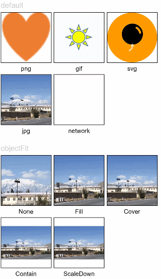
Loading Images
Load and display different types of images and set the scale mode of the images.
@Entry
@Component
struct ImageExample1 {
  private on: string = 'www.example.com'
  @State src: string = this.on

  build() {
    Column() {
      Flex({ direction: FlexDirection.Column, alignItems: ItemAlign.Start }) {
        Text('default').fontSize(16).fontColor(0xcccccc).height(30)
        Row({ space: 5 }) {
          Image($r('app.media.ic_png'))
            .width(110).height(110).border({ width: 1 })
            .overlay('png', { align: Alignment.Bottom, offset: { x: 0, y: 20 } })
          Image($r('app.media.ic_gif'))
            .width(110).height(110).border({ width: 1 })
            .overlay('gif', { align: Alignment.Bottom, offset: { x: 0, y: 20 } })
          Image($r('app.media.ic_svg'))
            .width(110).height(110).border({ width: 1 })
            .overlay('svg', { align: Alignment.Bottom, offset: { x: 0, y: 20 } })
        }
        Row({ space: 5 }) {
          Image($r('app.media.img_example'))
            .width(110).height(110).border({ width: 1 })
            .overlay('jpg', { align: Alignment.Bottom, offset: { x: 0, y: 20 } })
          Image(this.src)
            .width(110).height(110).border({ width: 1 })
            .overlay('network', { align: Alignment.Bottom, offset: { x: 0, y: 20 } })
        }.margin({ top: 25, bottom: 10 })
      }

      Flex({ direction: FlexDirection.Column, alignItems: ItemAlign.Start }) {
        Text('objectFit').fontSize(16).fontColor(0xcccccc).height(30)
        Row({ space: 5 }) {
          Image($r('app.media.img_example'))
            .border({ width: 1 })
            .objectFit(ImageFit.None).width(110).height(110)
            .overlay('None', { align: Alignment.Bottom, offset: { x: 0, y: 20 } })
          Image($r('app.media.img_example'))
            .border({ width: 1 })
            .objectFit(ImageFit.Fill).width(110).height(110)
            .overlay('Fill', { align: Alignment.Bottom, offset: { x: 0, y: 20 } })
          Image($r('app.media.img_example'))
            .border({ width: 1 })
            .objectFit(ImageFit.Cover).width(110).height(110)
            .overlay('Cover', { align: Alignment.Bottom, offset: { x: 0, y: 20 } })
        }
        Row({ space: 5 }) {
          Image($r('app.media.img_example_w250'))
            .border({ width: 1 })
            .objectFit(ImageFit.Contain).width(110).height(110)
            .overlay('Contain', { align: Alignment.Bottom, offset: { x: 0, y: 20 } })
          Image($r('app.media.img_example_w250'))
            .border({ width: 1 })
            .objectFit(ImageFit.ScaleDown).width(110).height(110)
            .overlay('ScaleDown', { align: Alignment.Bottom, offset: { x: 0, y: 20 } })
        }.margin({ top: 25 })
      }
    }.height(320).width(360).padding({ right: 10, top: 10 })
  }
}
Loading Online Images
The default network timeout period is 5 minutes for loading online images. When using an online image, you are advised to use alt to configure the placeholder image displayed during loading. If more flexible network configuration is required, you can use the HTTP tool provided in the SDK to send a network request, and then decode the returned data into PixelMap objects in the <Image> component. For details about image development, see Image Processing. The code snippet is as follows:
// @ts-nocheck
import http from '@ohos.net.http'
import ResponseCode from '@ohos.net.http'
import image from '@ohos.multimedia.image'


@Entry
@Component
struct Index {

  // Create a PixelMap state variable to receive online images.
  @State image: PixelMap = undefined

  build() {
    Column({space: 10}) {
      Button ("Get Online Image")
        .onClick(() => {
          this.httpRequest()
        })
      Image(this.image).height(100).width(100)
    }
    .width('100%')
    .height('100%')
    .padding(10)
  }

  // Request an online image.
  private httpRequest() {
    let httpRequest = http.createHttp()

    httpRequest.request(
      "https://www.example.com/xxx.png",   // Enter a specific URL of the online image.
      (error, data) => {
        if(error) {
          console.log("error code: " + error.code + ", msg: " + error.message)
        } else {
          let code = data.responseCode
          if(ResponseCode.ResponseCode.OK == code) {
            let imageSource = image.createImageSource(data.result)
            let options = {alphaType: 0,                     // Opacity
                           editable: false,                  // Whether the image is editable
                           pixelFormat: 3,                   // Pixel format
                           scaleMode: 1,                     // Scale mode
                           size: {height: 100, width: 100}} // Image size
            imageSource.createPixelMap(options).then((pixelMap) => {
              this.image = pixelMap
            })
          } else {
            console.log("response code: " + code)
          }
        }
      }
    )
  }
}
NOTE
For details about the request mode, timeout, and additional request parameters for loading online images, see request() in the HTTP module.
Setting Attributes
@Entry
@Component
struct ImageExample2 {
build() {
Column({ space: 10 }) {
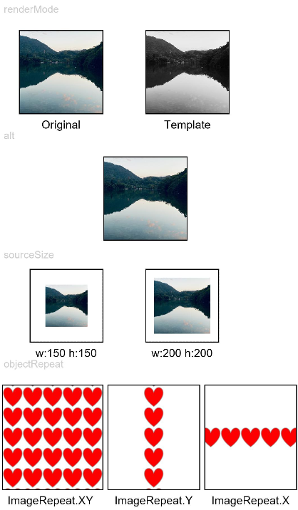
Text('renderMode').fontSize(12).fontColor(0xcccccc).width('96%').height(30)
Row({ space: 50 }) {
Image($r('app.media.img_example'))
.renderMode(ImageRenderMode.Original).width(100).height(100)
.border({ width: 1 })
.overlay('Original', { align: Alignment.Bottom, offset: { x: 0, y: 20 } })
Image($r('app.media.img_example'))
.renderMode(ImageRenderMode.Template).width(100).height(100)
.border({ width: 1 })
.overlay('Template', { align: Alignment.Bottom, offset: { x: 0, y: 20 } })
}
Text('alt').fontSize(12).fontColor(0xcccccc).width('96%').height(30)
Image('')
.alt($r('app.media.Image_none'))
.width(100).height(100).border({ width: 1 })
Text('sourceSize').fontSize(12).fontColor(0xcccccc).width('96%')
Row({ space: 50 }) {
Image($r('app.media.img_example'))
.sourceSize({
width: 150,
height: 150
})
.objectFit(ImageFit.ScaleDown).width('25%').aspectRatio(1)
.border({ width: 1 })
.overlay('w:150 h:150', { align: Alignment.Bottom, offset: { x: 0, y: 20 } })
Image($r('app.media.img_example'))
.sourceSize({
width: 200,
height: 200
})
.objectFit(ImageFit.ScaleDown).width('25%').aspectRatio(1)
.border({ width: 1 })
.overlay('w:200 h:200', { align: Alignment.Bottom, offset: { x: 0, y: 20 } })
}
Text('objectRepeat').fontSize(12).fontColor(0xcccccc).width('96%').height(30)
Row({ space: 5 }) {
Image($r('app.media.ic_health_heart'))
.width(120).height(125).border({ width: 1 })
.objectRepeat(ImageRepeat.XY).objectFit(ImageFit.ScaleDown)
.overlay('ImageRepeat.XY', { align: Alignment.Bottom, offset: { x: 0, y: 20 } })
Image($r('app.media.ic_health_heart'))
.width(110).height(125).border({ width: 1 })
.objectRepeat(ImageRepeat.Y).objectFit(ImageFit.ScaleDown)
.overlay('ImageRepeat.Y', { align: Alignment.Bottom, offset: { x: 0, y: 20 } })
Image($r('app.media.ic_health_heart'))
.width(110).height(125).border({ width: 1 })
.objectRepeat(ImageRepeat.X).objectFit(ImageFit.ScaleDown)
.overlay('ImageRepeat.X', { align: Alignment.Bottom, offset: { x: 0, y: 20 } })
}
}.height(150).width('100%').padding({ right: 10 })
}
}
Invoking Events
@Entry
@Component
struct ImageExample3 {
@State widthValue: number = 0
@State heightValue: number = 0
private on: Resource = $r('app.media.image_on')
private off: Resource = $r('app.media.image_off')
private on2off: Resource = $r('app.media.image_on2off')
private off2on: Resource = $r('app.media.image_off2on')
@State src: Resource = this.on
build() {
Column() {
Row({ space: 20 }) {
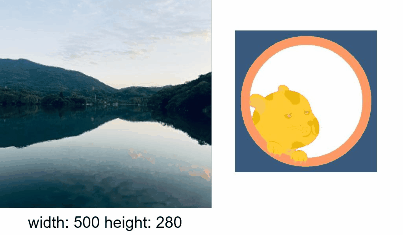
Column() {
Image($r('app.media.img_example1'))
.alt($r('app.media.ic_public_picture'))
.sourceSize({
width: 900,
height: 900
})
.objectFit(ImageFit.Cover)
.height(180).width(180)
// Obtain the size of an image after the image loading is complete.
.onComplete((msg: { width: number,height: number }) => {
this.widthValue = msg.width
this.heightValue = msg.height
})
.onError(() => {
console.log('load image fail')
})
.overlay('\nwidth: ' + String(this.widthValue) + ' height: ' + String(this.heightValue), {
align: Alignment.Bottom,
offset: { x: 0, y: 20 }
})
}
// Add a click event so that a specific image is loaded upon clicking.
Image(this.src)
.width(120).height(120)
.onClick(() => {
if (this.src == this.on || this.src == this.off2on) {
this.src = this.on2off
} else {
this.src = this.off2on
}
})
.onFinish(() => {
if (this.src == this.off2on) {
this.src = this.on
} else {
this.src = this.off
}
})
}
}.width('100%')
}
}
Rendering Sandbox Images
import fileio from '@ohos.fileio';
import fs from '@ohos.file.fs';
import context from '@ohos.app.ability.common';

@Entry
@Component
struct LoadImageExample {
  @State resourcesPath: string = ''
  @State sandboxPath: string = ''
  context: context.UIAbilityContext = getContext(this) as context.UIAbilityContext

  build() {
    Column() {
      Button ('Read Sandbox Image')
        .margin({ bottom: 10, top: 10 })
        .onClick(() => {
          this.sandboxPath = this.context.getApplicationContext().filesDir + '/icon.png'
          console.log(`Read the sandbox image=========>${this.sandboxPath}`)
          let fd = fs.openSync(this.sandboxPath, 0o100)
          console.log(`create file========>${fd}`)
          let srcPath = this.context.bundleCodeDir + '/entry/resources/base/media/icon.png'
          console.log('mySrcpath' + srcPath)
          fileio.copyFileSync(srcPath, this.sandboxPath) // Copy the image to the sandbox path.
          this.sandboxPath = 'file://' + this.context.getApplicationContext().filesDir + '/icon.png'
        })
      Button ('Read Image')
        .margin({ bottom: 10 })
        .onClick(() => {
          this.resourcesPath = 'file://' + this.context.bundleCodeDir + '/entry/resources/base/media/icon.png'
        })
      Text(`Image path: ${this.resourcesPath}`)
        .fontSize(20)
        .margin({ bottom: 10 })
      Image(this.resourcesPath)
        .width(100)
        .height(100)
        .colorFilter([
          0.30, 0.59, 0.11, 0, 0,
          0.30, 0.59, 0.11, 0, 0,
          0.30, 0.59, 0.11, 0, 0,
          0, 0, 0, 1.0, 0
        ])
      Text(`Sandbox image path: ${this.sandboxPath}`)
        .fontSize(20)
        .margin({ bottom: 10 })
      Image(this.sandboxPath)
        .width(100)
        .height(100)
    }
    .width('100%').height('100%')
  }
}
Applying a Filter to an Image
// xxx.ets
@Entry
@Component
struct colorFilterExample {
  @State colorFilterR: number = 0
  @State colorFilterG: number = 0
  @State colorFilterB: number = 0
  @State colorFilterA: number = 0

  build() {
    Row() {
      Column() {
        Image($r('app.media.sky'))
          .width(200)
          .height(200)
        Image($r('app.media.sky'))
          .width(200)
          .height(200)
          .colorFilter([
          this.colorFilterR, 0, this.colorFilterR, 0, 0,
            0, this.colorFilterG, this.colorFilterG, 0, 0,
          this.colorFilterB, 0, this.colorFilterB, 0, 0,
            0, 0, this.colorFilterA, 0, 0
          ])

        Row() {
          Text('R')
          Slider({
            min: 0,
            max: 1,
            step: 0.01
          })
            .onChange((valueR) => {
              this.colorFilterR = valueR
            })
        }

        Row() {
          Text('G')
          Slider({
            min: 0,
            max: 1,
            step: 0.01
          })
            .onChange((valueG) => {
              this.colorFilterG = valueG
            })
        }

        Row() {
          Text('B')
          Slider({
            min: 0,
            max: 1,
            step: 0.01
          })
            .onChange((valueB) => {
              this.colorFilterB = valueB
            })
        }

        Row() {
          Text('A')
          Slider({
            min: 0,
            max: 1,
            step: 0.01
          })
            .onChange((valueA) => {
              this.colorFilterA = valueA
            })
        }
      }.width('90%').alignItems(HorizontalAlign.Center)
    }.height('100%').width('100%').justifyContent(FlexAlign.Center)
  }
}