Rect
The <Rect> component is used to draw a rectangle.
NOTE
This component is supported since API version 7. Updates will be marked with a superscript to indicate their earliest API version.
Child Components
Not supported
APIs
Rect(value?: {width?: string | number,height?: string | number,radius?: string | number | Array<string | number>} | {width?: string | number,height?: string | number,radiusWidth?: string | number,radiusHeight?: string | number})
Since API version 9, this API is supported in ArkTS widgets.
Parameters
| Name | Type | Mandatory | Default Value | Description |
|---|---|---|---|---|
| width | string | number | No | 0 | Width. |
| height | string | number | No | 0 | Height. |
| radius | string | number | Array<string | number> | No | 0 | Radius of the rounded corner. You can set separate radiuses for four rounded corners. |
| radiusWidth | string | number | No | 0 | Width of the rounded corner. |
| radiusHeight | string | number | No | 0 | Height of the rounded corner. |
Attributes
In addition to the universal attributes, the following attributes are supported.
| Name | Type | Default Value | Description |
|---|---|---|---|
| radiusWidth | string | number | 0 | Width of the rounded corner. The width and height are the same when only the width is set. Since API version 9, this API is supported in ArkTS widgets. |
| radiusHeight | string | number | 0 | Height of the rounded corner. The width and height are the same only when the height is set. Since API version 9, this API is supported in ArkTS widgets. |
| radius | string | number | Array<string | number> | 0 | Radius of the rounded corner. You can set separate radiuses for four rounded corners. Since API version 9, this API is supported in ArkTS widgets. |
| fill | ResourceColor | Color.Black | Color of the fill area. Since API version 9, this API is supported in ArkTS widgets. |
| fillOpacity | number | string | Resource | 1 | Opacity of the fill area. Since API version 9, this API is supported in ArkTS widgets. |
| stroke | ResourceColor | - | Stroke color. If this attribute is not set, the component does not have any stroke. Since API version 9, this API is supported in ArkTS widgets. |
| strokeDashArray | Array<Length> | [] | Stroke dashes. Since API version 9, this API is supported in ArkTS widgets. |
| strokeDashOffset | number | string | 0 | Offset of the start point for drawing the stroke. Since API version 9, this API is supported in ArkTS widgets. |
| strokeLineCap | LineCapStyle | LineCapStyle.Butt | Cap style of the stroke. Since API version 9, this API is supported in ArkTS widgets. |
| strokeLineJoin | LineJoinStyle | LineJoinStyle.Miter | Join style of the stroke. Since API version 9, this API is supported in ArkTS widgets. |
| strokeMiterLimit | number | string | 4 | Limit on the ratio of the miter length to the value of strokeWidth used to draw a miter join. The miter length indicates the distance from the outer tip to the inner corner of the miter. NOTE This attribute must be set to a value greater than or equal to 1 and takes effect when strokeLineJoin is set to LineJoinStyle.Miter. Since API version 9, this API is supported in ArkTS widgets. |
| strokeOpacity | number | string | Resource | 1 | Stroke opacity. NOTE The value range is [0.0, 1.0]. If the set value is less than 0.0, 0.0 will be used. If the set value is greater than 1.0, 1.0 will be used. Since API version 9, this API is supported in ArkTS widgets. |
| strokeWidth | Length | 1 | Stroke width. Since API version 9, this API is supported in ArkTS widgets. NOTE The value cannot be a percentage. |
| antiAlias | boolean | true | Whether anti-aliasing is enabled. Since API version 9, this API is supported in ArkTS widgets. |
Example
// xxx.ets
@Entry
@Component
struct RectExample {
  build() {
    Column({ space: 10 }) {
      Text('normal').fontSize(11).fontColor(0xCCCCCC).width('90%')
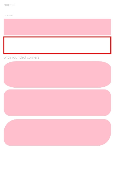
      // Draw a 90% x 50 rectangle.
      Column({ space: 5 }) {
        Text('normal').fontSize(9).fontColor(0xCCCCCC).width('90%')
        // Draw a 90% x 50 rectangle.
        Rect({ width: '90%', height: 50 })
          .fill(Color.Pink)
        // Draw a 90% x 50 rectangle.
        Rect()
          .width('90%')
          .height(50)
          .fillOpacity(0)
          .stroke(Color.Red)
          .strokeWidth(3)

        Text('with rounded corners').fontSize(11).fontColor(0xCCCCCC).width('90%')
        // Draw a 90% x 80 rectangle, with the width and height of its rounded corners being 40 and 20, respectively.
        Rect({ width: '90%', height: 80 })
          .radiusHeight(20)
          .radiusWidth(40)
          .fill(Color.Pink)
        // Draw a 90% x 80 rectangle, with the width and height of its rounded corners being both 20.
        Rect({ width: '90%', height: 80 })
          .radius(20)
          .fill(Color.Pink)
          .stroke(Color.Transparent)
      }.width('100%').margin({ top: 10 })
      // Draw a 90% x 50 rectangle, with the width and height of its rounded corners as follows: 40 for the upper left rounded corner, 20 for the upper right rounded corner, 40 for the lower right rounded corner, and 20 for the lower left rounded corner.
      Rect({ width: '90%', height: 80 })
        .radius([[40, 40], [20, 20], [40, 40], [20, 20]])
        .fill(Color.Pink)
    }.width('100%').margin({ top: 5 })
  }
}
