TextPicker
滑动选择文本内容的组件。
说明:
该组件从API Version 8开始支持。后续版本如有新增内容,则采用上角标单独标记该内容的起始版本。
子组件
无
接口
TextPicker(options?: {range: string[]|Resource, selected?: number, value?: string})
根据range指定的选择范围创建文本选择器。
参数:
| 参数名 | 参数类型 | 必填 | 参数描述 |
|---|---|---|---|
| range | string[] | Resource | 是 | 选择器的数据选择列表。不可设置为空数组,若由正常值动态变化为空数组,则保持当前正常值显示。 |
| selected | number | 否 | 设置默认选中项在数组中的索引值。 默认值:0 |
| value | string | 否 | 设置默认选中项的值,优先级低于selected。 默认值:第一个元素值 |
属性
除支持通用属性外,还支持以下属性:
| 名称 | 参数类型 | 描述 |
|---|---|---|
| defaultPickerItemHeight | number | string | 设置Picker各选择项的高度。 |
事件
除支持通用事件外,还支持以下事件:
| 名称 | 描述 |
|---|---|
| onAccept(callback: (value: string, index: number) => void) | 点击弹窗中的“确定”按钮时触发该回调。 - value: 当前选中项的文本。 - index: 当前选中项的索引值。 说明: 该事件仅在文本滑动选择器弹窗中生效。 |
| onCancel(callback: () => void) | 点击弹窗中的“取消”按钮时触发该回调。 说明: 该事件仅在文本滑动选择器弹窗中生效。 |
| onChange(callback: (value: string, index: number) => void) | 滑动选中TextPicker文本内容后,触发该回调。 - value: 当前选中项的文本。 说明:当显示文本或图片加文本列表时,value值为选中项中的文本值,当显示图片列表时,value值为空。 - index: 当前选中项的索引值。 |
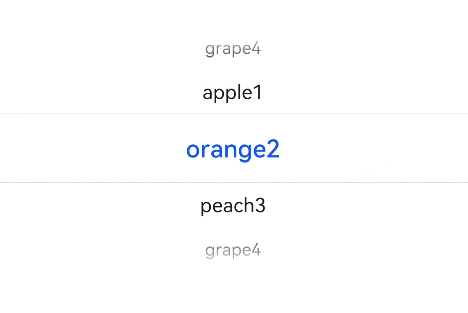
示例
// xxx.ets
@Entry
@Component
struct TextPickerExample {
  private select: number = 1
  private fruits: string[] = ['apple1', 'orange2', 'peach3', 'grape4']

  build() {
    Column() {
      TextPicker({ range: this.fruits, selected: this.select })
        .onChange((value: string, index: number) => {
          console.info('Picker item changed, value: ' + value + ', index: ' + index)
        })
    }
  }
}