Image Effects
Image effects include blur, shadow, and much more.
NOTE
The APIs of this module are supported since API version 7. Updates will be marked with a superscript to indicate their earliest API version.
Attributes
| Name | Type | Default Value | Description |
|---|---|---|---|
| blur | number | - | Applies the content blur effect to the current component. The input parameter is the blur radius. The larger the radius is, the more blurred the content is. If the value is 0, the content is not blurred. Value range: [0, +∞) Since API version 9, this API is supported in ArkTS widgets. |
| backdropBlur | number | - | Applies the background blur effect to the current component. The input parameter is the blur radius. The larger the radius is, the more blurred the background is. If the value is 0, the background is not blurred. Value range: [0, +∞) Since API version 9, this API is supported in ArkTS widgets. |
| shadow | { radius: number | Resource, color?: Color | string | Resource, offsetX?: number | Resource, offsetY?: number | Resource } |
- | Applies a shadow effect to the current component. When the value type is ShadowOptions, the blur radius, shadow color, and offset along the x-axis and y-axis can be specified. Since API version 9, this API is supported in ArkTS widgets. |
| grayscale | number | 0.0 | Converts the input image to grayscale. The value indicates the grayscale conversion ratio. If the input value is 1.0, the image is converted into a grayscale image. If the input value is 0.0, the image does not change. If the input value is between 0.0 and 1.0, the effect changes in linear mode. The unit is percentage. Value range: [0, 1] NOTE A value less than 0 evaluates to the value 0. A value greater than 1 evaluates to the value 1. Since API version 9, this API is supported in ArkTS widgets. |
| brightness | number | 1.0 | Applies a brightness to the current component. The input parameter is a brightness ratio. The value 1 indicates no effects. The value 0 indicates the complete darkness. If the value is less than 1, the brightness decreases. If the value is greater than 1, the brightness increases. A larger value indicates a higher brightness. Value range: [0, +∞) NOTE A value less than 0 evaluates to the value 0. Since API version 9, this API is supported in ArkTS widgets. |
| saturate | number | 1.0 | Applies the saturation effect to the current component. The saturation is the ratio of the chromatic component to the achromatic component (gray) in a color. When the input value is 1, the source image is displayed. When the input value is greater than 1, a higher percentage of the chromatic component indicates a higher saturation. When the input value is less than 1, a higher percentage of the achromatic component indicates a lower saturation. The unit is percentage. Value range: [0, +∞) NOTE A value less than 0 evaluates to the value 0. Since API version 9, this API is supported in ArkTS widgets. |
| contrast | number | 1.0 | Applies the contrast effect to the current component. The input parameter is a contrast value. If the value is 1, the source image is displayed. If the value is greater than 1, a larger value indicates a higher contrast and a clearer image. If the value is less than 1, a smaller value indicates a lower contrast is. If the value is 0, the image becomes all gray. The unit is percentage. Value range: [0, +∞) NOTE A value less than 0 evaluates to the value 0. Since API version 9, this API is supported in ArkTS widgets. |
| invert | number | 0 | Inverts the input image. The input parameter is an image inversion ratio. The value 1 indicates complete inversion, and 0 indicates that the image does not change. The unit is percentage. Value range: [0, 1] NOTE A value less than 0 evaluates to the value 0. Since API version 9, this API is supported in ArkTS widgets. |
| sepia | number | 0 | Converts the image color to sepia. The input parameter is an image conversion ratio. The value 1 indicates the image is completely sepia, and 0 indicates that the image does not change. The unit is percentage. Since API version 9, this API is supported in ArkTS widgets. |
| hueRotate | number | string | '0deg' | Applies the hue rotation effect to the current component. The input parameter is a rotation angle. Value range: (-∞, +∞) NOTE A rotation of 360 degrees leaves the color unchanged. A rotation of 180 degrees and then –180 degrees also leaves the color unchanged. When the data type is number, the value 90 is equivalent to '90deg'. Since API version 9, this API is supported in ArkTS widgets. |
| colorBlend 8+ | Color | string | Resource | - | Applies the color blend effect to the current component. The input parameter is the blended color. Since API version 9, this API is supported in ArkTS widgets. |
ShadowOptions
Provides the shadow attributes, including the blur radius, color, and offset along the x-axis and y-axis.
Since API version 9, this API is supported in ArkTS widgets.
| Name | Type | Mandatory | Description |
|---|---|---|---|
| radius | number | Resource | Yes | Blur radius of the shadow. Value range: [0, +∞) NOTE A value less than 0 evaluates to the value 0. |
| color | Color | string | Resource | No | Color of the shadow. The default color is black. |
| offsetX | number | Resource | No | Offset of the shadow along the x-axis. The default value is 0. |
| offsetY | number | Resource | No | Offset of the shadow along the y-axis. The default value is 0. |
Example
Example 1
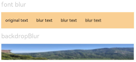
Use blur to add the content blur effect and backdropBlur to add the background blur effect.
// xxx.ets
@Entry
@Component
struct BlurEffectsExample {
  build() {
    Column({ space: 10 }) {
      // Blur the font.
      Text('font blur').fontSize(15).fontColor(0xCCCCCC).width('90%')
      Flex({ alignItems: ItemAlign.Center }) {
        Text('original text').margin(10)
        Text('blur text')
          .blur(1).margin(10)
        Text('blur text')
          .blur(2).margin(10)
        Text('blur text')
          .blur(3).margin(10)
      }.width('90%').height(40)
      .backgroundColor(0xF9CF93)


      // Blur the background.
      Text('backdropBlur').fontSize(15).fontColor(0xCCCCCC).width('90%')
      Text()
        .width('90%')
        .height(40)
        .fontSize(16)
        .backdropBlur(3)
        .backgroundImage('/pages/attrs/image/image.jpg')
        .backgroundImageSize({ width: 1200, height: 160 })
    }.width('100%').margin({ top: 5 })
  }
}
Example 2
Apply different image effects.
// xxx.ets
@Entry
@Component
struct ImageEffectsExample {
build() {
Column({ space: 10 }) {
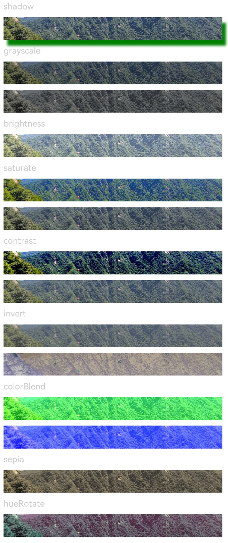
// Apply the shadow effect.
Text('shadow').fontSize(15).fontColor(0xCCCCCC).width('90%')
Image($r('app.media.image'))
.width('90%')
.height(40)
.shadow({ radius: 10, color: Color.Green, offsetX: 20, offsetY: 30 })
// Apply the grayscale effect. The grayscale value ranges from 0 to 1. The closer the grayscale value is to 1, the more obvious the grayscale effect is.
Text('grayscale').fontSize(15).fontColor(0xCCCCCC).width('90%')
Image($r('app.media.image')).width('90%').height(40).grayscale(0.3)
Image($r('app.media.image')).width('90%').height(40).grayscale(0.8)
// Apply the brightness effect. The value 1 indicates no effects. If the value is less than 1, the brightness decreases. If the value is greater than 1, the brightness increases.
Text('brightness').fontSize(15).fontColor(0xCCCCCC).width('90%')
Image($r('app.media.image')).width('90%').height(40).brightness(1.2)
// Apply the saturation effect. If the value is 1, the source image is displayed.
Text('saturate').fontSize(15).fontColor(0xCCCCCC).width('90%')
Image($r('app.media.image')).width('90%').height(40).saturate(2.0)
Image($r('app.media.image')).width('90%').height(40).saturate(0.7)
// Apply the contrast effect. If the value is 1, the source image is displayed. If the value is greater than 1, a larger value indicates a higher contrast and a clearer image. If the value is less than 1, a smaller value indicates a lower contrast is.
Text('contrast').fontSize(15).fontColor(0xCCCCCC).width('90%')
Image($r('app.media.image')).width('90%').height(40).contrast(2.0)
Image($r('app.media.image')).width('90%').height(40).contrast(0.8)
// Invert the image.
Text('invert').fontSize(15).fontColor(0xCCCCCC).width('90%')
Image($r('app.media.image')).width('90%').height(40).invert(0.2)
Image($r('app.media.image')).width('90%').height(40).invert(0.8)
// Apply the color blend effect.
Text('colorBlend').fontSize(15).fontColor(0xCCCCCC).width('90%')
Image($r('app.media.image')).width('90%').height(40).colorBlend(Color.Green)
Image($r('app.media.image')).width('90%').height(40).colorBlend(Color.Blue)
// Convert the image color to sepia.
Text('sepia').fontSize(15).fontColor(0xCCCCCC).width('90%')
Image($r('app.media.image')).width('90%').height(40).sepia(0.8)
// Apply the hue rotation effect.
Text('hueRotate').fontSize(15).fontColor(0xCCCCCC).width('90%')
Image($r('app.media.image')).width('90%').height(40).hueRotate(90)
}.width('100%').margin({ top: 5 })
}
}