Tabs
The <Tabs> component is a container component that allows users to switch between content views through tabs. Each tab page corresponds to a content view.
NOTE
This component is supported since API version 7. Updates will be marked with a superscript to indicate their earliest API version.
Child Components
Only the <TabContent> child component is supported.
APIs
Tabs(value?: {barPosition?: BarPosition, index?: number, controller?: TabsController})
Parameters
| Name | Type | Mandatory | Description |
|---|---|---|---|
| barPosition | BarPosition | No | Position of the <Tabs> component. Default value: BarPosition.Start |
| index | number | No | Initial tab index. Default value: 0 NOTE A value less than 0 evaluates to the default value. The value ranges from 0 to the number of <TabContent> subnodes minus 1. When this parameter is set to different values, the slide animation for tab switching is enabled by default. To disable the animation, set animationDuration to 0. |
| controller | TabsController | No | Tab controller. |
BarPosition
| Name | Description |
|---|---|
| Start | If the vertical attribute is set to true, the tab is on the left of the container. If the vertical attribute is set to false, the tab is on the top of the container. |
| End | If the vertical attribute is set to true, the tab is on the right of the container. If the vertical attribute is set to false, the tab is at the bottom of the container. |
Attributes
In addition to the universal attributes, the following attributes are supported.
| Name | Type | Description |
|---|---|---|
| vertical | boolean | Whether to use vertical tabs. The value true means to use vertical tabs, and false means to use horizontal tabs. Default value: false |
| scrollable | boolean | Whether the tabs are scrollable. The value true means that the tabs are scrollable, and false means the opposite. Default value: true |
| barMode | BarMode | Tab bar layout mode. For details, see BarMode. Default value: BarMode.Fixed |
| barWidth | number | Length8+ | Width of the tab bar. NOTE A value less than 0 or greater than the width of the <Tabs> component evaluates to the default value. |
| barHeight | number | Length8+ | Height of the tab bar. NOTE A value less than 0 or greater than the width of the <Tabs> component evaluates to the default value. |
| animationDuration | number | Duration of the slide animation for tab switching. If this parameter is set, the tab switching animation is played when the user switches between tabs by sliding or clicking. If this parameter is not set, the tab switching animation is played only when the user switches between tabs by sliding. Default value: 300 NOTE A value less than 0 or in percentage evaluates to the default value. |
BarMode
| Name | Description |
|---|---|
| Scrollable | The width of each tab is determined by the actual layout. The tabs are scrollable in the following case: In horizontal layout, the total width exceeds the tab bar width; in horizontal layout, the total height exceeds the tab bar height. |
| Fixed | The width of each tab is determined by equally dividing the number of tabs by the bar width (or bar height in the vertical layout). |
Events
In addition to the universal events, the following events are supported.
| Name | Description |
|---|---|
| onChange(event: (index: number) => void) | Triggered when a tab is switched. - index: index of the active tab. The index starts from 0. This event is triggered when any of the following conditions is met: 1. The <TabContent> component supports sliding, and the user slides on the tab bar. 2. The Controller API is called. 3. The attribute value is updated using a state variable. 4. A tab is clicked. |
TabsController
Defines a tab controller, which is used to control switching of tabs. One TabsController cannot control multiple <Tabs> components.
Objects to Import
controller: TabsController = new TabsController()
changeIndex
changeIndex(value: number): void
Switches to the specified tab.
Parameters
| Name | Type | Mandatory | Description |
|---|---|---|---|
| value | number | Yes | Index of the tab. The value starts from 0. NOTE If this parameter is set to a value less than 0 or greater than the maximum number, the event will be invalid. |
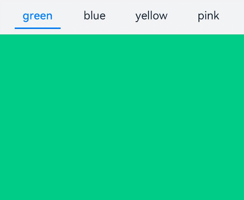
Example
// xxx.ets
@Entry
@Component
struct TabsExample {
  @State fontColor: string = '#182431'
  @State selectedFontColor: string = '#007DFF'
  @State currentIndex: number = 0
  private controller: TabsController = new TabsController()

  @Builder TabBuilder(index: number, name: string) {
    Column() {
      Text(name)
        .fontColor(this.currentIndex === index ? this.selectedFontColor : this.fontColor)
        .fontSize(16)
        .fontWeight(this.currentIndex === index ? 500 : 400)
        .lineHeight(22)
        .margin({ top: 17, bottom: 7 })
      Divider()
        .strokeWidth(2)
        .color('#007DFF')
        .opacity(this.currentIndex === index ? 1 : 0)
    }.width('100%')
  }

  build() {
    Column() {
      Tabs({ barPosition: BarPosition.Start, controller: this.controller }) {
        TabContent() {
          Column().width('100%').height('100%').backgroundColor('#00CB87')
        }.tabBar(this.TabBuilder(0, 'green'))

        TabContent() {
          Column().width('100%').height('100%').backgroundColor('#007DFF')
        }.tabBar(this.TabBuilder(1, 'blue'))

        TabContent() {
          Column().width('100%').height('100%').backgroundColor('#FFBF00')
        }.tabBar(this.TabBuilder(2, 'yellow'))

        TabContent() {
          Column().width('100%').height('100%').backgroundColor('#E67C92')
        }.tabBar(this.TabBuilder(3, 'pink'))
      }
      .vertical(false)
      .barMode(BarMode.Fixed)
      .barWidth(360)
      .barHeight(56)
      .animationDuration(400)
      .onChange((index: number) => {
        this.currentIndex = index
      })
      .width(360)
      .height(296)
      .margin({ top: 52 })
      .backgroundColor('#F1F3F5')
    }.width('100%')
  }
}