GridRow
The <GridRow> component is used in a grid layout, together with its child component <GridCol>.
NOTE
This component is supported since API version 9. Updates will be marked with a superscript to indicate their earliest API version.
Child Components
This component can contain the <GridCol> child component.
APIs
GridRow(option?: {columns?: number | GridRowColumnOption, gutter?: Length | GutterOption, breakpoints?: BreakPoints, direction?: GridRowDirection})
Since API version 9, this API is supported in ArkTS widgets.
Parameters
| Name | Type | Mandatory | Description |
|---|---|---|---|
| gutter | Length | GutterOption | No | Gutter of the grid layout. x indicates the horizontal direction. |
| columns | number | GridRowColumnOption | No | Number of columns in the grid layout. |
| breakpoints | BreakPoints | No | Array of breakpoints for the breakpoint value and the corresponding reference based on the window or container size. |
| direction | GridRowDirection | No | Arrangement direction of the grid layout. |
GutterOption
Since API version 9, this API is supported in ArkTS widgets.
| Name | Type | Mandatory | Description |
|---|---|---|---|
| x | Length | GridRowSizeOption | No | Gutter in the horizontal direction. |
| y | Length | GridRowSizeOption | No | Gutter in the vertical direction. |
GridRowColumnOption
Describes the numbers of grid columns for different device width types.
Since API version 9, this API is supported in ArkTS widgets.
| Name | Type | Mandatory | Description |
|---|---|---|---|
| xs | number | No | Device of the minimum size. |
| sm | number | No | Small-sized device. |
| md | number | No | Medium-sized device. |
| lg | number | No | Large-sized device. |
| xl | number | No | Extra-large-sized device. |
| xxl | number | No | Ultra-large-sized device. |
GridRowSizeOption
Describes the gutter sizes for different device width types.
Since API version 9, this API is supported in ArkTS widgets.
| Name | Type | Mandatory | Description |
|---|---|---|---|
| xs | Length | No | Device of the minimum size. |
| sm | Length | No | Small-sized device. |
| md | Length | No | Medium-sized device. |
| lg | Length | No | Large-sized device. |
| xl | Length | No | Extra-large-sized device. |
| xxl | Length | No | Ultra-large-sized device. |
BreakPoints
Since API version 9, this API is supported in ArkTS widgets.
| Name | Type | Mandatory | Description |
|---|---|---|---|
| value | Array<string> | No | Array of monotonically increasing breakpoints. Default value: ["320vp", "520vp", "840vp"] |
| reference | BreakpointsReference | No | Breakpoint switching reference. |
  // Enable the xs, sm, and md breakpoints.
  breakpoints: {value: ["100vp", "200vp"]}
  // Enable four breakpoints: xs, sm, md, and lg. The breakpoint range must be monotonically increasing.
  breakpoints: {value: ["320vp", "520vp", "840vp"]}
  // Enable five breakpoints: xs, sm, md, lg, and xl. The number of breakpoint ranges cannot exceed the number of breakpoints minus 1.
  breakpoints: {value: ["320vp", "520vp", "840vp", "1080vp"]}
BreakpointsReference
Since API version 9, this API is supported in ArkTS widgets.
| Name | Description |
|---|---|
| WindowSize | The window is used as a reference. |
| ComponentSize | The container is used as a reference. |
GridRowDirection
Since API version 9, this API is supported in ArkTS widgets.
| Name | Description |
|---|---|
| Row | Grid elements are arranged in the row direction. |
| RowReverse | Grid elements are arranged in the reverse row direction. |
A grid supports a maximum of six breakpoints: xs, sm, md, lg, xl and xxl, whose names cannot be changed. Assume that the input array is [n0, n1, n2, n3, n4], then the value ranges of breakpoints are as follows.
| Breakpoint | Value Range |
|---|---|
| xs | [0, n0) |
| sm | [n0, n1) |
| md | [n1, n2) |
| lg | [n2, n3) |
| xl | [n3, n4) |
| xxl | [n4, INF) |
NOTE
- Grid elements can be arranged only in the Row or RowReverse direction, but not in the Column or ColumnReverse direction.
- The location and size of a grid child component can be calculated only based on span and offset. If the span values of child components add up to a number greater than the allowed number of columns, the grid will automatically wraps lines.
- If the span value of a single child component exceeds the maximum number of columns, the maximum number of columns is used.
- If a child component takes up more than the total number of columns according to its offset and span settings, it will be placed in a new row.
- Below is the display effect of Item1: GridCol({span: 6}), Item2: GridCol({ span: 8, offset:11}).
| 1 | 2 | 3 | 4 | 5 | 6 | 7 | 8 | 9 | 10 | 11 | 12 |
|---|---|---|---|---|---|---|---|---|---|---|---|
| $\circ$ | $\circ$ | $\circ$ | $\circ$ | $\circ$ | $\circ$ | - | - | - | - | - | - |
| - | - | - | - | - | |||||||
| $\circ$ | $\circ$ | $\circ$ | $\circ$ | $\circ$ | $\circ$ | $\circ$ | $\circ$ |
Attributes
The universal attributes are supported.
Events
onBreakpointChange
onBreakpointChange(callback: (breakpoints: string) => void)
Since API version 9, this API is supported in ArkTS widgets.
Parameters
| Name | Type | Mandatory | Description |
|---|---|---|---|
| breakpoints | string | Yes | Breakpoint change. The value can be "xs", "sm", "md", "lg", "xl", or "xxl". |
Example
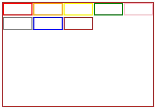
// xxx.ets
@Entry
@Component
struct GridRowExample {
  @State bgColors: Color[] = [Color.Red, Color.Orange, Color.Yellow, Color.Green, Color.Pink, Color.Grey, Color.Blue, Color.Brown]
  @State currentBp: string = 'unknown'

  build() {
    Column() {
      GridRow({
        columns: 5,
        gutter: { x: 5, y: 10 },
        breakpoints: { value: ["400vp", "600vp", "800vp"],
          reference: BreakpointsReference.WindowSize },
        direction: GridRowDirection.Row
      }) {
        ForEach(this.bgColors, (color) => {
          GridCol({ span: { xs: 1, sm: 2, md: 3, lg: 4 } }) {
            Row().width("100%").height("20vp")
          }.borderColor(color).borderWidth(2)
        })
      }.width("100%").height("100%")
      .onBreakpointChange((breakpoint) => {
        this.currentBp = breakpoint
      })
    }.width('80%').margin({ left: 10, top: 5, bottom: 5 }).height(200)
    .border({ color: '#880606', width: 2 })
  }
}