Navigation
Generally, the <Navigation> component functions as the root container of a page and supports three display modes: single-page, column, and adaptive. In addition, <Navigation> provides attributes to set the title bar, toolbar, and navigation bar of a page.
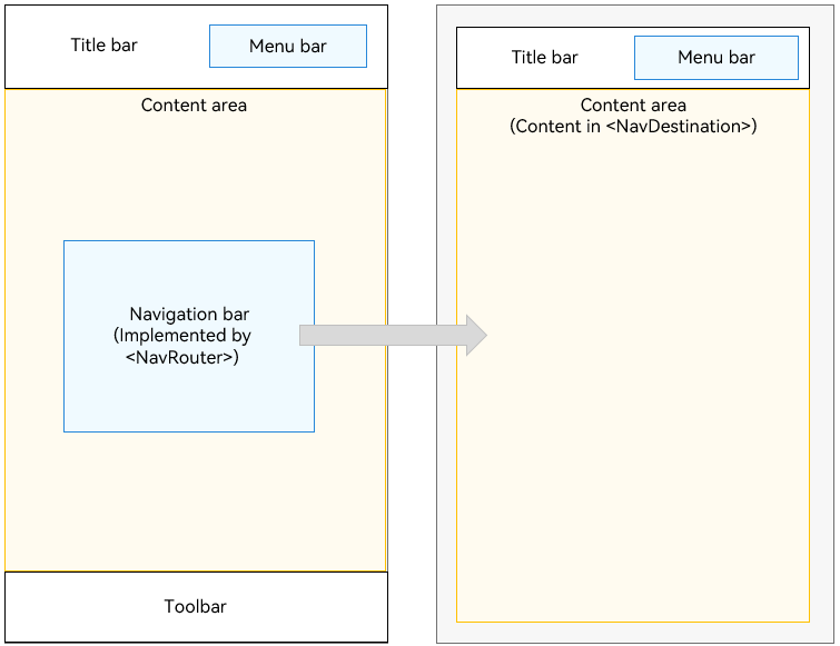
The pages of the Navigation component include the home page and content page. The home page consists of the title bar, content area, and toolbar. You can use the <NavRouter> child component in the content area to implement the navigation bar function. The content page displays the content of the <NavDestination> child component.
<NavRouter> is a special child component used together with <Navigation>. It provides default processing logic for responding to clicks, eliminating the need for manual logic definition. <NavRouter> has only two root nodes. The second root node is <NavDestination>. <NavDestination> is a special child component used together with <NavRouter> to display the content page of the <Navigation> component. When the user clicks the <NavRouter> component, the corresponding <NavDestination> content area is displayed.
Setting the Page Display Mode
The <Navigation> component uses the mode attribute to set the page display mode.
-
Adaptive Mode By default, the <Navigation> component is in adaptive mode. In this case, the mode attribute is NavigationMode.Auto. In adaptive mode, when the device width is greater than 520 vp, the <Navigation> component uses the column mode. Otherwise, the <Navigation> component uses the single-page mode.
Navigation() { ... } .mode(NavigationMode.Auto) -
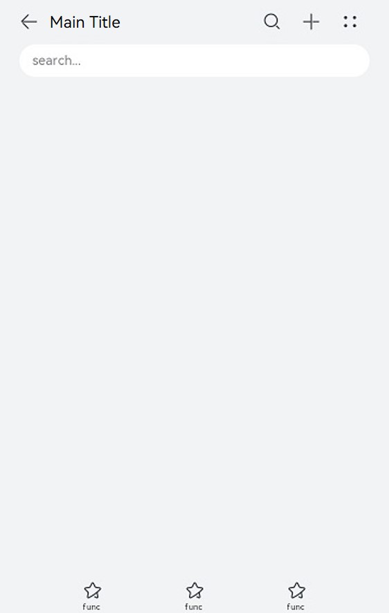
Single-page mode
Figure 1 Single-page mode
Set mode to NavigationMode.Stack so that the <Navigation> component is displayed on a single page.
Navigation() {
  ...
}
.mode(NavigationMode.Stack)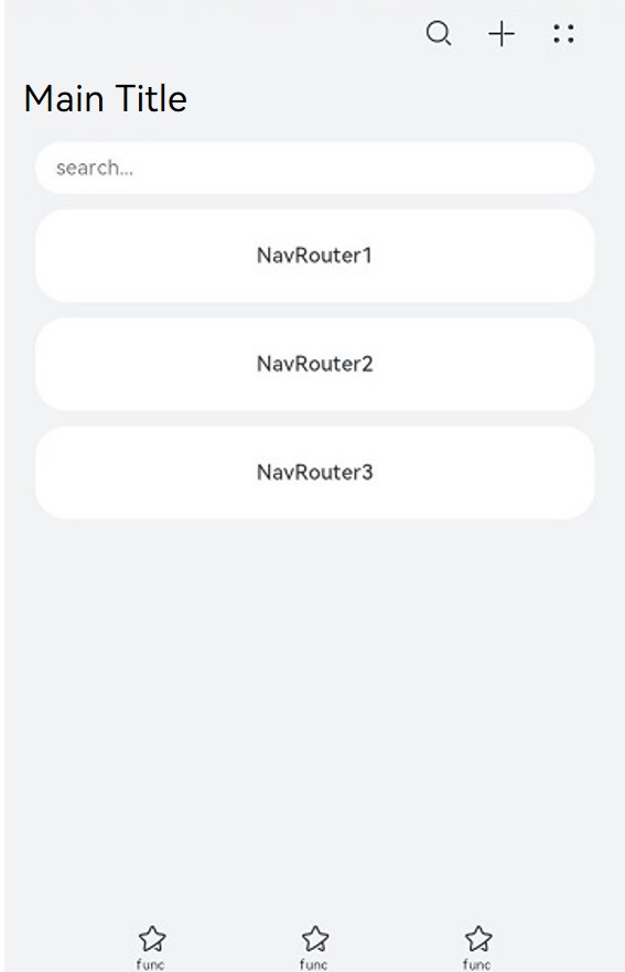
-
Column mode
Figure 2 Column mode
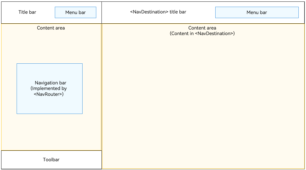
Set mode to NavigationMode.Split so that the <Navigation> component is displayed in columns.
@Entry
@Component
struct NavigationExample {
  private arr: number[] = [1, 2, 3];

  build() {
    Column() {
      Navigation() {
        TextInput({ placeholder: 'search...' })
          .width("90%")
          .height(40)
          .backgroundColor('#FFFFFF')

        List({ space: 12 }) {
          ForEach(this.arr, (item) => {
            ListItem() {
              NavRouter() {
                Text("NavRouter" + item)
                  .width("100%")
                  .height(72)
                  .backgroundColor('#FFFFFF')
                  .borderRadius(24)
                  .fontSize(16)
                  .fontWeight(500)
                  .textAlign(TextAlign.Center)
                NavDestination() {
                  Text("NavDestinationContent" + item)
                }
                .title("NavDestinationTitle" + item)
              }
            }
          }, item => item)
        }
        .width("90%")
        .margin({ top: 12 })
      }
      .title ("Main Title")
      .mode(NavigationMode.Split)
      .menus([
        {value: "", icon: "./image/ic_public_search.svg", action: ()=> {}},
        {value: "", icon: "./image/ic_public_add.svg", action: ()=> {}},
        {value: "", icon: "./image/ic_public_add.svg", action: ()=> {}},
        {value: "", icon: "./image/ic_public_add.svg", action: ()=> {}},
        {value: "", icon: "./image/ic_public_add.svg", action: ()=> {}}
      ])
      .toolBar({items: [
        {value: "func", icon: "./image/ic_public_highlights.svg", action: ()=> {}},
        {value: "func", icon: "./image/ic_public_highlights.svg", action: ()=> {}},
        {value: "func", icon: "./image/ic_public_highlights.svg", action: ()=> {}}
      ]})
    }
    .height('100%')
    .width('100%')
    .backgroundColor('#F1F3F5')
  }
}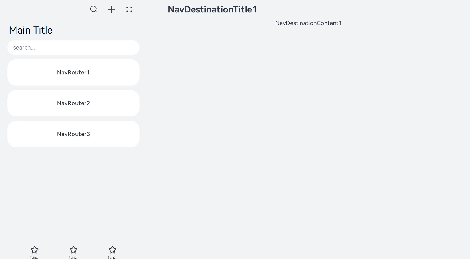
Setting the Title Bar Mode
The title bar is on the top of the page and is used to display the page name and operation entry. The <Navigation> component uses the titleMode attribute to set the title bar mode.
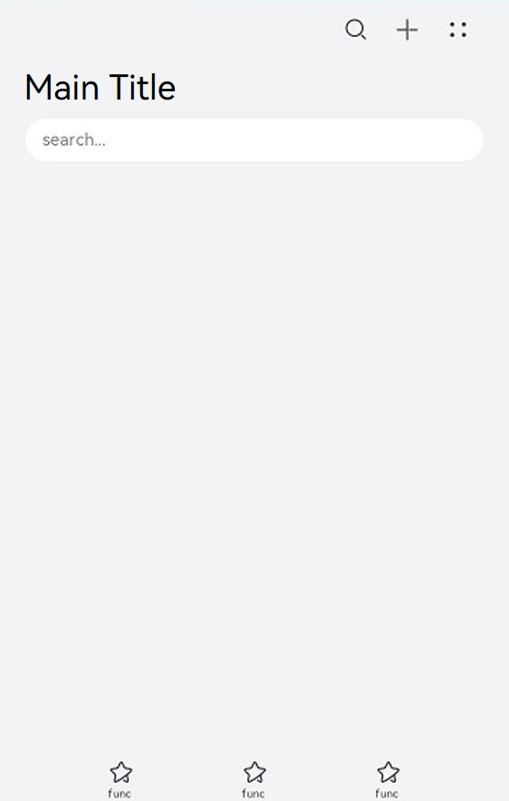
- Mini mode
Applicable when the title of a level-1 page does not need to be highlighted.
Figure 3 Title bar in Mini mode
Navigation() {
  ...
}
.titleMode(NavigationTitleMode.Mini)
- Full mode
Applicable when the title of a level-1 page needs to be highlighted.
Figure 4 Title bar in Full mode
Navigation() {
  ...
}
.titleMode(NavigationTitleMode.Full)
Setting the Menu Bar
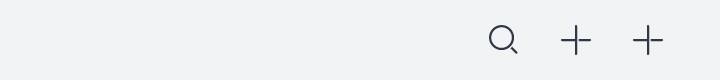
The menu bar is in the upper right corner of the <Navigation> component. You can set the menu bar through the menus attribute, which supports two parameter types: Array<NavigationMenuItem> and CustomBuilder. When the Array<NavigationMenuItem> type is used, a maximum of three icons can be displayed in portrait mode and a maximum of five icons can be displayed in landscape mode. Extra icons will be placed in the automatically generated More icons.
Figure 5 Menu bar with three icons
Navigation() {
  ...
}
.menus([{value: "", icon: "./image/ic_public_search.svg", action: ()=>{}},
        {value: "", icon: "./image/ic_public_add.svg", action: ()=>{}},
        {value: "", icon: "./image/ic_public_add.svg", action: ()=>{}}])
Figure 6 Menu bar with four icons
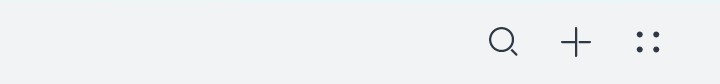
Navigation() {
  ...
}
.menus([{value: "", icon: "./image/ic_public_search.svg", action: ()=>{}},
        {value: "", icon: "./image/ic_public_add.svg", action: ()=>{}},
        {value: "", icon: "./image/ic_public_add.svg", action: ()=>{}},
        {value: "", icon: "./image/ic_public_add.svg", action: ()=>{}}])
Setting the Toolbar
The toolbar is located at the bottom of the <Navigation> component. You can set the toolbar through the toolBar attribute.
Figure 7 Toolbar

Navigation() {
  ...
}
.toolBar({items:[
        {value: "func", icon: "./image/ic_public_highlights.svg", action: ()=>{}},
        {value: "func", icon: "./image/ic_public_highlights.svg", action: ()=>{}},
        {value: "func", icon: "./image/ic_public_highlights.svg", action: ()=>{}}]})