Shape Clipping
Shape clipping changes the visible portion of a component through clipping or masking.
NOTE
The APIs of this module are supported since API version 7. Updates will be marked with a superscript to indicate their earliest API version.
Attributes
| Name | Type | Description |
|---|---|---|
| clip | Circle | Ellipse | Path | Rect | boolean | Clip mode. If the value is a shape, the component is clipped based on the specified shape. If the value is of the Boolean type, it specifies whether to clip the component based on the edge outline of the parent container. Default value: false Since API version 9, this API is supported in ArkTS widgets. |
| mask | Circle | Ellipse | Path | Rect | Mask of the specified shape to add to the component. Since API version 9, this API is supported in ArkTS widgets. |
Example
// xxx.ets
@Entry
@Component
struct ClipAndMaskExample {
build() {
Column({ space: 15 }) {
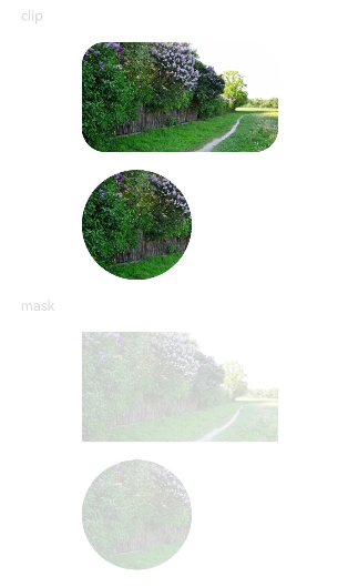
Text('clip').fontSize(12).width('75%').fontColor('#DCDCDC')
Row() {
Image($r('app.media.testImg')).width('500px').height('280px')
}
.clip(true) // If clip is not set to true, the image is not confined by the rounded corners of the <Row> component and may extend beyond the <Row> component.
.borderRadius(20)
// Clip the image based on a circle with a diameter of 280 px.
Image($r('app.media.testImg'))
.clip(new Circle({ width: '280px', height: '280px' }))
.width('500px').height('280px')
Text('mask').fontSize(12).width('75%').fontColor('#DCDCDC')
// Add a 500 px x 280 px square mask to the image.
Image($r('app.media.testImg'))
.mask(new Rect({ width: '500px', height: '280px' }).fill(Color.Gray))
.width('500px').height('280px')
// Add a 280 px x 280 px circular mask to the image.
Image($r('app.media.testImg'))
.mask(new Circle({ width: '280px', height: '280px' }).fill(Color.Gray))
.width('500px').height('280px')
}
.width('100%')
.margin({ top: 15 })
}
}