GridItem
The <GridItem> component provides a single item in a grid.
NOTE
This component is supported since API version 7. Updates will be marked with a superscript to indicate their earliest API version.
Child Components
Supported
APIs
GridItem()
Attributes
| Name | Type | Description |
|---|---|---|
| rowStart | number | Start row number of the component. |
| rowEnd | number | End row number of the component. |
| columnStart | number | Start column number of the component. |
| columnEnd | number | End column number of the component. |
| forceRebuild(deprecated) | boolean | Whether to re-create the component when it is being built. This API is deprecated since API version 9. Whether to re-create the component is automatically determined based on the component attributes and child component changes. No manual configuration is required. Default value: false |
| selectable8+ | boolean | Whether the current grid item is selectable by the mouse. NOTE This attribute takes effect only when mouse frame selection is enabled for the parent <Grid> container. Default value: true |
NOTE
Rules for setting rowStart, rowEnd, columnStart, and columnEnd:
The valid value range of rowStart and rowEnd is 0 to the total number of rows minus 1. The valid value range of columnStart and columnEnd is 0 to the total number of columns minus 1.
Settings outside of the valid ranges do not take effect.
In the grid that has both columnTemplate and rowTemplate set, a grid item takes up the specified number of rows (rowEnd – rowStart + 1) or columns (columnEnd – columnStart + 1), depending on whether rowStart/rowEnd or columnStart/columnEnd is set.
In the grid that has only columnTemplate set, a grid item takes up the specified number of columns.
In the grid that has only rowTemplate set, a grid item takes up the specified number of rows.
In the grid that has neither columnTemplate nor rowTemplate set, the row and column number attributes do not work.
Events
| Name | Description |
|---|---|
| onSelect(event: (isSelected: boolean) => void)8+ | Triggered when the selected state of the grid item changes. isSelected: returns true if the grid item is being selected by the mouse; returns false otherwise. |
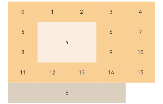
Example
// xxx.ets
@Entry
@Component
struct GridItemExample {
  @State numbers: string[] = Array.apply(null, { length: 16 }).map(function (item, i) {
    return i.toString()
  })

  build() {
    Column() {
      Grid() {
        GridItem() {
          Text('4')
            .fontSize(16)
            .backgroundColor(0xFAEEE0)
            .width('100%')
            .height('100%')
            .textAlign(TextAlign.Center)
        }.rowStart(1).rowEnd(2).columnStart(1).columnEnd(2) // Set valid row and column numbers.

        ForEach(this.numbers, (item) => {
          GridItem() {
            Text(item)
              .fontSize(16)
              .backgroundColor(0xF9CF93)
              .width('100%')
              .height('100%')
              .textAlign(TextAlign.Center)
          }
        }, item => item)

        GridItem() {
          Text('5')
            .fontSize(16)
            .backgroundColor(0xDBD0C0)
            .width('100%')
            .height('100%')
            .textAlign(TextAlign.Center)
        }.columnStart(1).columnEnd(4) // Set only the column numbers. The layout does not start from the first column.
      }
      .columnsTemplate('1fr 1fr 1fr 1fr 1fr')
      .rowsTemplate('1fr 1fr 1fr 1fr 1fr')
      .width('90%').height(300)
    }.width('100%').margin({ top: 5 })
  }
}