stepper
NOTE
This component is supported since API version 5. Updates will be marked with a superscript to indicate their earliest API version.
The <stepper> component provides a step navigator. When multiple steps are required to complete a task, you can use the <stepper> component to navigate your users through the whole process.
Required Permissions
None
Child Components
Only the <stepper-item> component is supported.
NOTE
Steps in the <stepper> are sorted according to the sequence of its <stepper-item> child components.
Attributes
In addition to the universal attributes, the following attributes are supported.
| Name | Type | Default Value | Description |
|---|---|---|---|
| index | number | - | Index of the <stepper-item> child component that is currently displayed. |
Styles
The universal styles are supported.
NOTE
By default, the <stepper> component fills entire space of its container. To optimize user experience, it is recommended that the container should be as large as the application window in size, or should be the root component.
Events
In addition to the universal events, the following events are supported.
| Name | Parameter | Description |
|---|---|---|
| finish | - | Triggered when the last step on the navigator is complete. |
| skip | - | Triggered when users click the skip button, which works only if you have called setNextButtonStatus method to allow users to skip all steps. |
| change | { prevIndex: prevIndex, index: index} | Triggered when users click the left or right (text) button of the step navigator to switch between steps. prevIndex indicates the index of the previous step, and index indicates that of the current step. |
| next | { index: index, pendingIndex: pendingIndex } | Triggered when users click the next (text) button. index indicates the index of the current step, and pendingIndex indicates that of the step to go. The return value is in {pendingIndex:* pendingIndex***}** format. You can use pendingIndex to specify a <stepper-item> child component as the next step to go. |
| back | { index: index, pendingIndex: pendingIndex } | Triggered when users click the previous (text) button. index indicates the index of the current step, and pendingIndex indicates that of the step to go. The return value is in Object:{ {pendingIndex:* pendingIndex***}** format. You can use pendingIndex to specify a <stepper-item> child component as the previous step. |
Methods
In addition to the universal methods, the following methods are supported.
| Name | Parameter | Description |
|---|---|---|
| setNextButtonStatus | { status: string, label: label } | Sets the status of the next (text) button in this step navigator. Available status values are as follows: - normal: The next button is displayed normally and can navigate users to the next step when it is clicked. - disabled: The next button is grayed out and unavailable. - waiting: The next button is not displayed, and a process bar is displayed instead. - skip: The skip button is displayed to allow users to skip all remaining steps. |
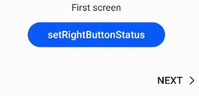
Example
<!-- xxx.hml -->
<div class = "container">
  <stepper class="stepper" id="mystepper" index="0"  onnext="nextclick" onback="backclick">
    <stepper-item class ="stepperItem" label="{{label_1}}">
      <div class = "stepperItemContent" >
        <text class = "text">First screen</text>
      </div>
      <button type="capsule" class ="button" value="setRightButtonStatus" onclick="setRightButton"></button>
    </stepper-item>
    <stepper-item class ="stepperItem" label="{{label_2}}">
      <div class = "stepperItemContent" >
        <text class = "text">Second screen</text>
      </div>
      <button type="capsule" class ="button" value="setRightButtonStatus" onclick="setRightButton"></button>
    </stepper-item>
    <stepper-item class ="stepperItem" label="{{label_3}}">
      <div class = "stepperItemContent" >
        <text class = "text">Third screen</text>
      </div>
      <button type="capsule" class ="button" value="setRightButtonStatus" onclick="setRightButton"></button>
    </stepper-item>
  </stepper>
</div>
/* xxx.css */
.container {
  margin-top: 20px;
  flex-direction: column;
  align-items: center;
  height: 300px;
}
.stepperItem {
  width: 100%;
  flex-direction: column;
  align-items: center;
}
.stepperItemContent {
  color: #0000ff;
  font-size: 50px;
  justify-content: center;
}
.button {
  width: 60%;
  margin-top: 30px;
  justify-content: center;
}
// xxx.js
export default {
  data: {
    label_1:
    {
       prevLabel: 'BACK',
       nextLabel: 'NEXT',
       status: 'normal'
     },
     label_2:
     {
       prevLabel: 'BACK',
       nextLabel: 'NEXT',
       status: 'normal'
     },
     label_3:
     {
        prevLabel: 'BACK',
        nextLabel: 'NEXT',
        status: 'normal'
     },
  },
  setRightButton(e) {
    this.$element('mystepper').setNextButtonStatus({status: 'skip', label: 'SKIP'});
  },
  nextclick(e) {
    var index = {
      pendingIndex: e.pendingIndex
    }
    return index;
  },
  backclick(e) {
    var index = {
        pendingIndex: e.pendingIndex
    }
    return index;
  },
}