Shape
The <Shape> component is the parent component of the drawing components. The attributes described in this topic are universal attributes supported by all the drawing components.
-
Drawing components use <Shape> as their parent to implement the effect similar to SVG.
-
The <Shape> component is used independently to draw a specific shape.
NOTE
This component is supported since API version 7. Updates will be marked with a superscript to indicate their earliest API version.
Child Components
Supported
APIs
Shape(value?: PixelMap)
Parameters
| Name | Type | Mandatory | Default Value | Description |
|---|---|---|---|---|
| value | PixelMap | No | - | Shape to draw. You can draw a shape in the specified PixelMap object. If no object is specified, the shape is drawn in the current drawing target. |
Attributes
In addition to the universal attributes, the following attributes are supported.
| Name | Type | Default Value | Description |
|---|---|---|---|
| viewPort | { x?: number | string, y?: number | string, width?: number | string, height?: number | string } |
{ x:0, y:0, width:0, height:0 } | View port of the shape. |
| fill | ResourceColor | Color.Black | Color of the fill area. |
| fillOpacity | number | string | Resource | 1 | Opacity of the fill area. |
| stroke | ResourceColor | - | Stroke color. If this attribute is not set, no stroke is displayed. |
| strokeDashArray | Array<Length> | [] | Stroke dashes. |
| strokeDashOffset | number | string | 0 | Offset of the start point for drawing the stroke. |
| strokeLineCap | LineCapStyle | LineCapStyle.Butt | Cap style of the stroke. |
| strokeLineJoin | LineJoinStyle | LineJoinStyle.Miter | Join style of the stroke. |
| strokeMiterLimit | number | string | 4 | Limit on the ratio of the miter length to the value of strokeWidth used to draw a miter join. The miter length indicates the distance from the outer tip to the inner corner of the miter. NOTE This attribute must be set to a value greater than or equal to 1 and takes effect when strokeLineJoin is set to LineJoinStyle.Miter. |
| strokeOpacity | number | string | Resource | 1 | Stroke opacity. NOTE The value range is [0.0, 1.0]. If the set value is less than 0.0, 0.0 will be used. If the set value is greater than 1.0, 1.0 will be used. |
| strokeWidth | number | string | 1 | Stroke width. |
| antiAlias | boolean | true | Whether anti-aliasing is enabled. |
| mesh8+ | Array<number>,number,number | [],0,0 | Mesh effect. The first parameter is an array of lengths (column + 1) * (row + 1) * 2, which records the position of each vertex of the distorted bitmap. The second parameter is the number of columns in the mesh matrix. The third parameter is the number of rows in the mesh matrix. |
Example
Example 1
// xxx.ets
@Entry
@Component
struct ShapeExample {
build() {
Column({ space: 10 }) {
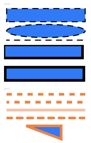
Text('basic').fontSize(11).fontColor(0xCCCCCC).width(320)
// Draw a 300 x 50 rectangle with strokes at (-2, -2). The fill color is 0x317AF7, the stroke color is black, the stroke width is 4, the stroke dash is 20, the offset is 10 to the left, the cap style is rounded, the join style is rounded, and anti-aliasing is enabled (default).
// Draw a 300 x 50 ellipse with strokes at (-2, 58). The fill color is 0x317AF7, the stroke color is black, the stroke width is 4, the stroke dash is 20, the offset is 10 to the left, the cap style is rounded, the join style is rounded, and anti-aliasing is enabled (default).
// Draw a 300 x 10 straight line at (-2, 118). The fill color is 0x317AF7, the stroke color is black, the stroke width is 4, the stroke dash is 20, the offset is 10 to the left, the cap style is rounded, the join style is rounded, and anti-aliasing is enabled (default).
Shape() {
Rect().width(300).height(50)
Ellipse().width(300).height(50).offset({ x: 0, y: 60 })
Path().width(300).height(10).commands('M0 0 L900 0').offset({ x: 0, y: 120 })
}
.viewPort({ x: -2, y: -2, width: 304, height: 130 })
.fill(0x317AF7)
.stroke(Color.Black)
.strokeWidth(4)
.strokeDashArray([20])
.strokeDashOffset(10)
.strokeLineCap(LineCapStyle.Round)
.strokeLineJoin(LineJoinStyle.Round)
.antiAlias(true)
// Draw a 300 x 50 rectangle with strokes at (0, 0) and (-5, -5). The drawing start point is the midpoint of the stroke width by default. To fully display the strokes, you must set the coordinates of the start position of the viewport to negative values so that the viewport is offset by half the stroke width.
Shape() {
Rect().width(300).height(50)
}
.viewPort({ x: 0, y: 0, width: 320, height: 70 })
.fill(0x317AF7)
.stroke(Color.Black)
.strokeWidth(10)
Shape() {
Rect().width(300).height(50)
}
.viewPort({ x: -5, y: -5, width: 320, height: 70 })
.fill(0x317AF7)
.stroke(Color.Black)
.strokeWidth(10)
Text('path').fontSize(11).fontColor(0xCCCCCC).width(320)
// Draw a straight line at (0, -5). The fill color is 0xEE8443, the stroke width is 10, and the stroke dash is 20.
Shape() {
Path().width(300).height(10).commands('M0 0 L900 0')
}
.viewPort({ x: 0, y: -5, width: 300, height: 20 })
.stroke(0xEE8443)
.strokeWidth(10)
.strokeDashArray([20])
// Draw a straight line at (0, -5). The fill color is 0xEE8443, the stroke width is 10, the stroke dash is 20, and the offset is 10 to the left.
Shape() {
Path().width(300).height(10).commands('M0 0 L900 0')
}
.viewPort({ x: 0, y: -5, width: 300, height: 20 })
.stroke(0xEE8443)
.strokeWidth(10)
.strokeDashArray([20])
.strokeDashOffset(10)
// Draw a straight line at (0, -5). The fill color is 0xEE8443, the stroke width is 10, and the stroke opacity is 0.5.
Shape() {
Path().width(300).height(10).commands('M0 0 L900 0')
}
.viewPort({ x: 0, y: -5, width: 300, height: 20 })
.stroke(0xEE8443)
.strokeWidth(10)
.strokeOpacity(0.5)
// Draw a straight line at (0, -5). The fill color is 0xEE8443, the stroke width is 10, the stroke dash is 20, and the cap style is rounded.
Shape() {
Path().width(300).height(10).commands('M0 0 L900 0')
}
.viewPort({ x: 0, y: -5, width: 300, height: 20 })
.stroke(0xEE8443)
.strokeWidth(10)
.strokeDashArray([20])
.strokeLineCap(LineCapStyle.Round)
// Draw a closed path at (-80, -5). The fill color is 0x317AF7, the stroke width is 10, the stroke color is 0xEE8443, and the join style is miter (default value).
Shape() {
Path().width(200).height(60).commands('M0 0 L400 0 L400 150 Z')
}
.viewPort({ x: -80, y: -5, width: 310, height: 90 })
.fill(0x317AF7)
.stroke(0xEE8443)
.strokeWidth(10)
.strokeLineJoin(LineJoinStyle.Miter)
.strokeMiterLimit(5)
}.width('100%').margin({ top: 15 })
}
}
Example 2
// xxx.ets
@Entry
@Component
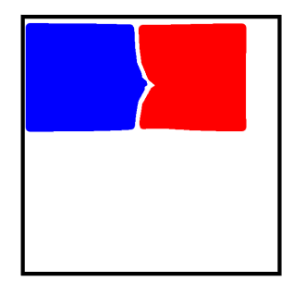
struct ShapeMeshExample {
@State columnVal: number = 0;
@State rowVal: number = 0;
@State count: number = 0;
@State verts: Array<number> = [];
@State shapeWidth: number = 600;
@State shapeHeight: number = 600;
build() {
Column() {
Shape() {
Rect()
.width('250px')
.height('250px')
.radiusWidth('10px')
.radiusHeight('10px')
.stroke('10px')
.margin({ left: '10px', top: '10px' })
.strokeWidth('10px')
.fill(Color.Blue)
Rect()
.width('250px')
.height('250px')
.radiusWidth('10px')
.radiusHeight('10px')
.stroke('10px')
.margin({ left: '270px', top: '10px' })
.strokeWidth('10px')
.fill(Color.Red)
}
.mesh(this.verts, this.columnVal, this.rowVal)
.width(this.shapeWidth + 'px')
.height(this.shapeHeight + 'px')
// The mesh distortion effect is displayed when the component is touched.
.onTouch((event: TouchEvent) => {
var touchX = event.touches[0].x * 2;
var touchY = event.touches[0].y * 2;
this.columnVal = 20;
this.rowVal = 20;
this.count = (this.columnVal + 1) * (this.rowVal + 1);
var orig = [this.count * 2];
var index = 0;
for (var i = 0; i <= this.rowVal; i++) {
var fy = this.shapeWidth * i / this.rowVal;
for (var j = 0; j <= this.columnVal; j++) {
var fx = this.shapeWidth * j / this.columnVal;
orig[index * 2 + 0] = this.verts[index * 2 + 0] = fx;
orig[index * 2 + 1] = this.verts[index * 2 + 1] = fy;
index++;
}
}
for (var k = 0; k < this.count * 2; k += 2) {
var dx = touchX - orig[k + 0];
var dy = touchY - orig[k + 1];
var dd = dx * dx + dy * dy;
var d = Math.sqrt(dd);
var pull = 80000 / (dd * d);
if (pull >= 1) {
this.verts[k + 0] = touchX;
this.verts[k + 1] = touchY;
} else {
this.verts[k + 0] = orig[k + 0] + dx * pull;
this.verts[k + 1] = orig[k + 1] + dy * pull;
}
}
})
}
.width('600px')
.height('600px')
.border({ width: 3, color: Color.Black })
}
}
Below is how the component is displayed when not being touched.
The mesh distortion effect is displayed when the component is touched, as shown below.