Alert Dialog Box
You can set the text content and response callback for an alert dialog box.
NOTE
The APIs of this module are supported since API version 7. Updates will be marked with a superscript to indicate their earliest API version.
Attributes
| Name | Type | Description |
|---|---|---|
| show | AlertDialogParamWithConfirm | AlertDialogParamWithButtons | Shows the <AlertDialog> component. |
AlertDialogParamWithConfirm
| Name | Type | Mandatory | Description |
|---|---|---|---|
| title | string | Resource | No | Title of the dialog box. |
| message | string | Resource | Yes | Content of the dialog box. |
| autoCancel | boolean | No | Whether to close the dialog box when the overlay is clicked. Default value: true |
| confirm | { value: string | Resource, fontColor?: Color | number | string | Resource, backgroundColor?: Color | number | string | Resource, action: () => void } |
No | Text content, text color, background color, and click callback of the confirm button. |
| cancel | () => void | No | Callback invoked when the dialog box is closed after the overlay is clicked. |
| alignment | DialogAlignment | No | Alignment mode of the dialog box in the vertical direction. Default value: DialogAlignment.Default |
| offset | { dx: Length | Resource, dy: Length | Resource } |
No | Offset of the dialog box relative to the alignment position. |
| gridCount | number | No | Number of grid columns occupied by the width of the dialog box. |
AlertDialogParamWithButtons
| Name | Type | Mandatory | Description |
|---|---|---|---|
| title | string | Resource | No | Title of the dialog box. |
| message | string | Resource | Yes | Content of the dialog box. |
| autoCancel | boolean | No | Whether to close the dialog box when the overlay is clicked. Default value: true |
| primaryButton | { value: string | Resource, fontColor?: Color | number | string | Resource, backgroundColor?: Color | number | string | Resource, action: () => void; } |
No | Text content, text color, background color, and click callback of the primary button. |
| secondaryButton | { value: string | Resource, fontColor?: Color | number | string | Resource, backgroundColor?: Color | number | string | Resource, action: () => void; } |
No | Text content, text color, background color, and click callback of the primary button. |
| cancel | () => void | No | Callback invoked when the dialog box is closed after the overlay is clicked. |
| alignment | DialogAlignment | No | Alignment mode of the dialog box in the vertical direction. Default value: DialogAlignment.Default |
| offset | { dx: Length | Resource, dy: Length | Resource } |
No | Offset of the dialog box relative to the alignment position. |
| gridCount | number | No | Number of grid columns occupied by the width of the dialog box. |
Example
// xxx.ets
@Entry
@Component
struct AlertDialogExample {
build() {
Column({ space: 5 }) {
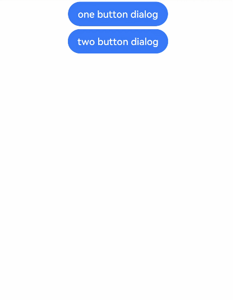
Button('one button dialog')
.onClick(() => {
AlertDialog.show(
{
title: 'title',
message: 'text',
confirm: {
value: 'button',
action: () => {
console.info('Button-clicking callback')
}
},
cancel: () => {
console.info('Closed callbacks')
}
}
)
})
.backgroundColor(0x317aff)
Button('two button dialog')
.onClick(() => {
AlertDialog.show(
{
title: 'title',
message: 'text',
primaryButton: {
value: 'cancel',
action: () => {
console.info('Callback when the first button is clicked')
}
},
secondaryButton: {
value: 'ok',
action: () => {
console.info('Callback when the second button is clicked')
}
},
cancel: () => {
console.info('Closed callbacks')
}
}
)
}).backgroundColor(0x317aff)
}.width('100%').margin({ top: 5 })
}
}