Touch Target
You can set the touch target for components that support universal click events, touch events, and gestures.
NOTE
The APIs of this module are supported since API version 8. Updates will be marked with a superscript to indicate their earliest API version.
Attributes
| Name | Type | Description |
|---|---|---|
| responseRegion | Array<Rectangle> | Rectangle | One or more touch targets, including their location and size. Default value: { x: 0, y: 0, width: '100%', height: '100%' } |
Rectangle
| Name | Type | Mandatory | Description |
|---|---|---|---|
| x | Length | No | X coordinate of the touch point relative to the left edge of the component. Default value: 0vp |
| y | Length | No | Y coordinate of the touch point relative to the left edge of the component. Default value: 0vp |
| width | Length | No | Width of the touch target. Default value: 100% |
| height | Length | No | Height of the touch target. Default value: 100% |
NOTE
x and y can be set to a positive or negative percentage value. For example, when x is set to '100%', the touch target is the offset from the right edge of the component by the component's width. When x is set to '-100%', the touch target is the offset from the left edge of the component by the component's width. When y is set to '100%', the touch target is the offset from the bottom edge of the component by the component's height. When y is set to '-100%', the touch target is the offset from the top edge of the component by the component's height.
width and height can only be set to positive percentage values. When width is set to '100%', the width of the touch target is equal to that of the component; when height is set to '100%', the height of the touch target is equal to that of the component.
The percentage is measured relative to the component itself.
Example
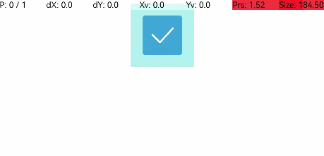
// xxx.ets
@Entry
@Component
struct ResponseRegionExample {
  build() {
    Column() {
        Toggle({ type: ToggleType.Checkbox, isOn: true })
          .selectedColor(0x39a2db)
          .backgroundColor(0xAFEEEE)
          .responseRegion({ x: 1.0, y: 1.0, width: 400, height: 400 })
          .onChange((isOn: boolean) => {
            console.info('Component status:' + isOn)
          })
    }.width('100%').margin({ top: 5 })
  }
}