Creating a Simple Page
In this section, we will develop an infographic food details page, by building custom components through the container components <Stack> and <Flex> as well as basic components <Image> and <Text>.
Building the Stack Layout
-
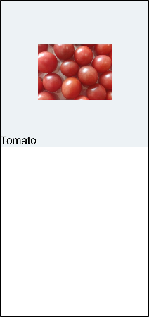
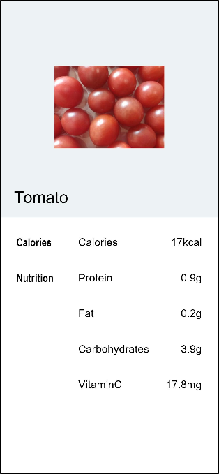
Create a food name.
Delete the code of the build method in the project template, create a <Stack> component, and place the <Text> component in the braces of the <Stack> component. When the <Stack> component contains multiple child components, the latter child component overwrites the former one.
@Entry
@Component
struct MyComponent {
  build() {
    Stack() {
        Text('Tomato')
            .fontSize(26)
            .fontWeight(500)
    }
  }
}
-
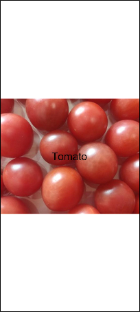
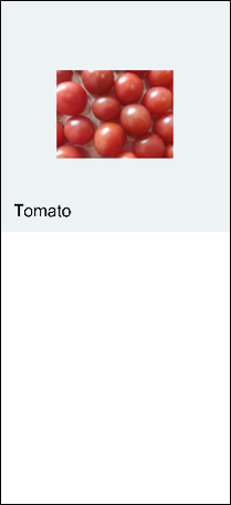
Display food pictures.
Create an <Image> component and specify a URL for it. To display the <Text> component above the <Image> component, declare the <Image> component first. Image resources are stored in the rawfile folder in resources. When referencing the resources in the rawfile folder, use the
$rawfile('filename')format, where filename indicates the relative path of the file in the rawfile folder. Currently,$rawfileonly allows the <Image> component to reference image resources.@Entry @Component struct MyComponent { build() { Stack() { Image($rawfile('Tomato.png')) Text('Tomato') .fontSize(26) .fontWeight(500) } } }
-
Access images through resources.
In addition to specifying the image path, you can also use the media resource symbol $r to reference resources based on the resource qualifier rules in the resources folder. Right-click the resources folder, choose New > Resource Directory from the shortcut menu, and set Resource Type to Media (image resource).
Place Tomato.png in the media folder. You can then reference the application resources in the
$r('app.type.name')format, which is$r('app.media.Tomato')in this example.
@Entry
   @Component
   struct MyComponent {
     build() {
       Stack() {
           Image($r('app.media.Tomato'))
               .objectFit(ImageFit.Contain)
               .height(357)
           Text('Tomato')
               .fontSize(26)
               .fontWeight(500)
       }
     }
   }
-
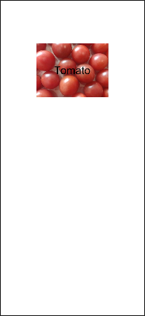
Set the width and height of the image, and set the objectFit attribute of the image to ImageFit.Contain, which means to keep the aspect ratio of the image to ensure that the image is completely displayed within the boundary.
If the image fills the entire screen, the possible causes are as follows:
- The width and height of the image are not set.
- The default attribute of objectFit of the image is ImageFit.Cover, that is, the image is zoomed in or zoomed out to fill the entire display boundary with the aspect ratio locked.
@Entry
   @Component
   struct MyComponent {
     build() {
       Stack() {
           Image($r('app.media.Tomato'))
               .objectFit(ImageFit.Contain)
               .height(357)
           Text('Tomato')
               .fontSize(26)
               .fontWeight(500)
       }
     }
   }
-
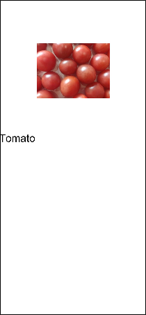
Set the food image and name layout.
Set alignContent of the <Stack> component to Alignment.BottomStart. Similar to FontWeight, Alignment is a built-in enumeration type provided by the framework.
@Entry
   @Component
   struct MyComponent {
     build() {
       Stack({ alignContent: Alignment.BottomStart }) {
           Image($r('app.media.Tomato'))
               .objectFit(ImageFit.Contain)
               .height(357)
            Text('Tomato')
               .fontSize(26)
               .fontWeight(500)
       }
     }
   }
- You can change the background color of the food image by setting the background color of the <Stack> component in any of the following ways:
-
Using a built-in enumeration value of Color provided by the framework. For example, backgroundColor(Color.Red) indicates that the background color is set to red.
-
Using a value of the string type. The supported color formats are rgb, rgba, and HEX. For example, you can set the background color to blue through backgroundColor(??#0000FF??) and set the background color to white through backgroundColor(??rgb(255, 255, 255)??).
-
Using a value of the number type. Hexadecimal color values are supported. For example, backgroundColor(0xFF0000) indicates that the background color is red.
-
Using a value of the Resource type. For details about the Resource type, see Resource Access.
-
@Entry
   @Component
   struct MyComponent {
     build() {
       Stack({ alignContent: Alignment.BottomStart }) {
           Image($r('app.media.Tomato'))
               .objectFit(ImageFit.Contain)
               .height(357)
           Text('Tomato')
               .fontSize(26)
               .fontWeight(500)
       }
       .backgroundColor('#FFedf2f5')
     }
}
- Adjust the left and bottom margin of the <Text> component. Margin is a shorthand attribute. You can specify the margins of the four edges in a unified manner or separately.
-
To set the margins of the four edges in a unified manner, use the Margin(Length) format. For example, margin(20) indicates that the margins of the top, right, bottom, and left edges are all 20.
-
To set the margins of the four edges separately, use the {top?: Length, right?: Length, bottom?: Length, left?:Length} format. For example, margin({ left: 26, bottom: 17.4 }) indicates that the left margin is 26 and the bottom margin is 17.4.
-
@Entry
   @Component
   struct MyComponent {
     build() {
       Stack({ alignContent: Alignment.BottomStart }) {
           Image($r('app.media.Tomato'))
               .objectFit(ImageFit.Contain)
               .height(357)
           Text('Tomato')
               .fontSize(26)
               .fontWeight(500)
               .margin({left: 26, bottom: 17.4})
       }
        .backgroundColor('#FFedf2f5')
     }
   }
-
Adjust the structure between components and semanticize component names. Create the FoodDetail page entry component, create a <Column> component in FoodDetail, and set the alignment to alignItems(HorizontalAlign.Center). Change the name of the MyComponent component to FoodImageDisplay, which is a child component of the FoodDetail component.
The <Column> component is a container whose child components are vertically arranged. It is in linear layout in essence. Therefore, only the alignment in the cross axis direction can be set.
@Component
   struct FoodImageDisplay {
     build() {
       Stack({ alignContent: Alignment.BottomStart }) {
         Image($r('app.media.Tomato'))
           .objectFit(ImageFit.Contain)
         Text('Tomato')
           .fontSize(26)
           .fontWeight(500)
           .margin({ left: 26, bottom: 17.4 })
       }
       .height(357)
       .backgroundColor('#FFedf2f5')
     }
   }

   @Entry
   @Component
   struct FoodDetail {
     build() {
       Column() {
         FoodImageDisplay()
       }
       .alignItems(HorizontalAlign.Center)
     }
   }
Building the Flex Layout
Use the Flex layout to build a food composition table. In this way, cell sizes are flexibly set based on the proportion, eliminating the need for width and height calculation.
- Create a ContentTable component as a child component of the FoodDetail component.
@Component
   struct FoodImageDisplay {
     build() {
       Stack({ alignContent: Alignment.BottomStart }) {
         Image($r('app.media.Tomato'))
           .objectFit(ImageFit.Contain)
           .height(357)
         Text('Tomato')
           .fontSize(26)
           .fontWeight(500)
           .margin({ left: 26, bottom: 17.4 })
       }
       .backgroundColor('#FFedf2f5')
     }
   }

   @Component
   struct ContentTable {
     build() {}
   }

   @Entry
   @Component
   struct FoodDetail {
     build() {
       Column() {
         FoodImageDisplay()
         ContentTable()
       }
       .alignItems(HorizontalAlign.Center)
     }
   }
-
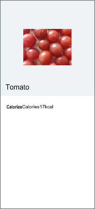
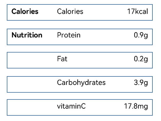
Create a <Flex> component to display two food composition categories in the tomato: Calories and Nutrition.
Calories contains information about calories. Nutrition contains information about protein, fat, carbohydrates, and vitamin C.
Create the Calories class. Create a <Flex> component and set its height to 280, and the top, right, and left margins to 30. The Flex component contains three <Text> child components, which represent the category name (Calories), content name (Calories), and contain value (17 kcal), respectively. By default, child components in the Flex component are arranged horizontally.
In the following example, code of FoodImageDisplay is omitted, and only code of ContentTable is provided.
@Component
   struct ContentTable {
     build() {
       Flex() {
         Text('Calories')
           .fontSize(17.4)
           .fontWeight(FontWeight.Bold)
         Text('Calories')
           .fontSize(17.4)
         Text('17kcal')
           .fontSize(17.4)
       }
       .height(280)
       .padding({ top: 30, right: 30, left: 30 })
     }
   }

   @Entry
   @Component
   struct FoodDetail {
     build() {
       Column() {
         FoodImageDisplay()
         ContentTable()
       }
       .alignItems(HorizontalAlign.Center)
     }
   }
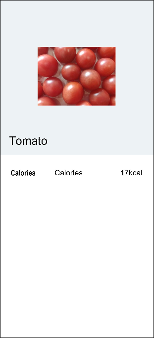
- Adjust the layout and set the proportion (layoutWeight) of each part. Set layoutWeight of the category name to 1, and layoutWeight of the content name and content value to 2. The content name and content value are in a same Flex, and the content name occupies all remaining space flexGrow(1).
@Component
   struct FoodImageDisplay {
     build() {
       Stack({ alignContent: Alignment.BottomStart }) {
         Image($m('Tomato.png'))
           .objectFit(ImageFit.Contain)
           .height(357)
         Text('Tomato')
           .fontSize(26)
           .fontWeight(500)
           .margin({ left: 26, bottom: 17.4 })
       }
       .backgroundColor('#FFedf2f5')
     }
   }

   @Component
   struct ContentTable {
     build() {
       Flex() {
         Text('Calories')
           .fontSize(17.4)
           .fontWeight(FontWeight.Bold)
           .layoutWeight(1)
         Flex() {
           Text('Calories')
             .fontSize(17.4)
             .flexGrow(1)
           Text('17kcal')
             .fontSize(17.4)
         }
         .layoutWeight(2)
       }
       .height(280)
       .padding({ top: 30, right: 30, left: 30 })
     }
   }

   @Entry
   @Component
   struct FoodDetail {
     build() {
       Column() {
         FoodImageDisplay()
         ContentTable()
       }
       .alignItems(HorizontalAlign.Center)
     }
   }
-
Create the Nutrient class in a similar process. Nutrition consists of four parts: Protein, Fat, Carbohydrates, and VitaminC. The names of the last three parts are omitted in the table and represented by spaces.
Set FlexDirection.Column, FlexAlign.SpaceBetween, and ItemAlign.Start.
@Component
   struct ContentTable {
     build() {
       Flex({ direction: FlexDirection.Column, justifyContent: FlexAlign.SpaceBetween, alignItems: ItemAlign.Start }) {
         Flex() {
           Text('Calories')
             .fontSize(17.4)
             .fontWeight(FontWeight.Bold)
             .layoutWeight(1)
           Flex() {
             Text('Calories')
               .fontSize(17.4)
               .flexGrow(1)
             Text('17kcal')
               .fontSize(17.4)
           }
           .layoutWeight(2)
         }
         Flex() {
           Text('Nutrition')
             .fontSize(17.4)
             .fontWeight(FontWeight.Bold)
             .layoutWeight(1)
           Flex() {
             Text('Protein')
               .fontSize(17.4)
               .flexGrow(1)
             Text('0.9g')
               .fontSize(17.4)
           }
           .layoutWeight(2)
         }
         Flex() {
           Text(' ')
             .fontSize(17.4)
             .fontWeight(FontWeight.Bold)
             .layoutWeight(1)
           Flex() {
             Text('Fat')
               .fontSize(17.4)
               .flexGrow(1)
             Text('0.2g')
               .fontSize(17.4)
           }
           .layoutWeight(2)
         }
         Flex() {
           Text(' ')
             .fontSize(17.4)
             .fontWeight(FontWeight.Bold)
             .layoutWeight(1)
           Flex() {
             Text('Carbohydrates')
               .fontSize(17.4)
               .flexGrow(1)
             Text('3.9g')
               .fontSize(17.4)
           }
           .layoutWeight(2)
         }
         Flex() {
           Text(' ')
             .fontSize(17.4)
             .fontWeight(FontWeight.Bold)
             .layoutWeight(1)
           Flex() {
             Text('vitaminC')
               .fontSize(17.4)
               .flexGrow(1)
             Text('17.8mg')
               .fontSize(17.4)
           }
           .layoutWeight(2)
         }
       }
       .height(280)
       .padding({ top: 30, right: 30, left: 30 })
     }
   }

   @Entry
   @Component
   struct FoodDetail {
       build() {
           Column() {
               FoodImageDisplay()
               ContentTable()
           }
           .alignItems(HorizontalAlign.Center)
       }
   }
-
Use the custom constructor @Builder to simplify the code. It can be found that the food groups in each food composition table are actually of the same UI structure.
Currently, all food groups are declared, resulting in code duplication and redundancy. You can use @Builder to build a custom method and abstract the same UI structure declaration. The @Builder decorated method and the build method for the @Component decorated component are used to declare some UI rendering structures and comply with the same ArkTS syntax. You can define one or more methods decorated by @Builder, but a component decorated by @Component can have only one build method.
Declare the IngredientItem method decorated by @Builder in ContentTable to declare the UI descriptions for the category name, content name, and content value.
 @Component
   struct ContentTable {
     @Builder IngredientItem(title:string, name: string, value: string) {
       Flex() {
         Text(title)
           .fontSize(17.4)
           .fontWeight(FontWeight.Bold)
           .layoutWeight(1)
         Flex({ alignItems: ItemAlign.Center }) {
           Text(name)
             .fontSize(17.4)
             .flexGrow(1)
           Text(value)
             .fontSize(17.4)
         }
         .layoutWeight(2)
       }
     }
   }
When the IngredientItem API is called in the build method of ContentTable, this needs to be used to invoke the method in the scope of the component to distinguish the global method call.
@Component
   struct ContentTable {
     ......
     build() {
       Flex({ direction: FlexDirection.Column, justifyContent: FlexAlign.SpaceBetween, alignItems: ItemAlign.Start }) {
         this.IngredientItem('Calories', 'Calories', '17kcal')
         this.IngredientItem('Nutrition', 'Protein', '0.9g')
         this.IngredientItem('', 'Fat', '0.2g')
         this.IngredientItem('', 'Carbohydrates', '3.9g')
         this.IngredientItem('', 'VitaminC', '17.8mg')
       }
       .height(280)
       .padding({ top: 30, right: 30, left: 30 })
     }
   }
The overall code of the ContentTable component is as follows:
@Component
   struct ContentTable {
     @Builder IngredientItem(title:string, name: string, value: string) {
       Flex() {
         Text(title)
           .fontSize(17.4)
           .fontWeight(FontWeight.Bold)
           .layoutWeight(1)
         Flex() {
           Text(name)
             .fontSize(17.4)
             .flexGrow(1)
           Text(value)
             .fontSize(17.4)
         }
         .layoutWeight(2)
       }
     }

 build() {
   Flex({ direction: FlexDirection.Column, justifyContent: FlexAlign.SpaceBetween, alignItems: ItemAlign.Start }) {
     this.IngredientItem('Calories', 'Calories', '17kcal')
     this.IngredientItem('Nutrition', 'Protein', '0.9g')
     this.IngredientItem('', 'Fat', '0.2g')
     this.IngredientItem('', 'Carbohydrates', '3.9g')
     this.IngredientItem('', 'VitaminC', '17.8mg')
   }
   .height(280)
   .padding({ top: 30, right: 30, left: 30 })
 }

   }

   @Entry
   @Component
   struct FoodDetail {
       build() {
           Column() {
               FoodImageDisplay()
               ContentTable()
           }
           .alignItems(HorizontalAlign.Center)
       }
   }
You've learned how to build a simple food details page. Read on to learn how to define the page layout and connection.