Popup Control
You can bind a popup to a component, specifying its content, interaction logic, and display status.
NOTE
This attribute is supported since API version 7. Updates will be marked with a superscript to indicate their earliest API version.
APIs
| Name | Type | Description |
|---|---|---|
| bindPopup | show: boolean, popup: PopupOptions | CustomPopupOptions8+ |
Binds a popup to the component. show: whether to show the popup. The default value is false, indicating that the popup is hidden. popup: parameters of the popup. |
PopupOptions
| Name | Type | Mandatory | Description |
|---|---|---|---|
| message | string | Yes | Content of the popup message. |
| placementOnTop | boolean | No | Whether to display the popup above the component. The default value is false. |
| primaryButton | { value: string, action: () => void } |
No | Primary button. value: text of the primary button in the popup. action: callback for clicking the primary button. |
| secondaryButton | { value: string, action: () => void } |
No | Secondary button. value: text of the secondary button in the popup. action: callback for clicking the secondary button. |
| onStateChange | (event: { isVisible: boolean }) => void | No | Callback for the popup status change event. The parameter isVisible indicates whether the popup is visible. |
CustomPopupOptions8+
| Name | Type | Mandatory | Description |
|---|---|---|---|
| builder | CustomBuilder | Yes | Popup builder. |
| placement | Placement | No | Preferred position of the popup. If the set position is insufficient for holding the popup, it will be automatically adjusted. Default value: Placement.Bottom |
| maskColor | ResourceColor | No | Color of the popup mask. |
| popupColor | ResourceColor | No | Color of the popup. |
| enableArrow | boolean | No | Whether to display an arrow. Since API version 9, if the location set for the popup arrow is not large enough, the arrow will not be displayed. For example, if placement is set to Left and the popup height is less than the arrow width (32 vp), the arrow will not be displayed. Default value: true |
| autoCancel | boolean | No | Whether to automatically close the popup when an operation is performed on the page. Default value: true |
| onStateChange | (event: { isVisible: boolean }) => void | No | Callback for the popup status change event. The parameter isVisible indicates whether the popup is visible. |
Example
// xxx.ets
@Entry
@Component
struct PopupExample {
@State handlePopup: boolean = false
@State customPopup: boolean = false
// Popup builder
@Builder popupBuilder() {
Row({ space: 2 }) {
Image($r("app.media.image")).width(24).height(24).margin({ left: -5 })
Text('Custom Popup').fontSize(10)
}.width(100).height(50).padding(5)
}
build() {
Flex({ direction: FlexDirection.Column }) {
// PopupOptions for setting the popup
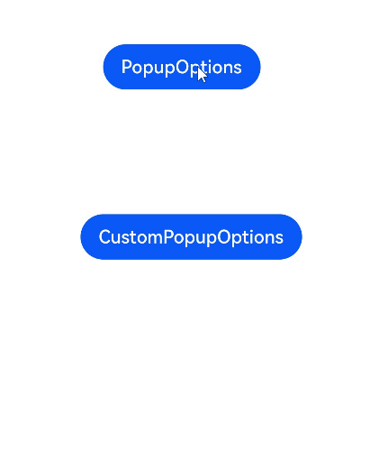
Button('PopupOptions')
.onClick(() => {
this.handlePopup = !this.handlePopup
})
.bindPopup(this.handlePopup, {
message: 'This is a popup with PopupOptions',
placementOnTop: true,
primaryButton: {
value: 'confirm',
action: () => {
this.handlePopup = !this.handlePopup
console.info('confirm Button click')
}
},
// Secondary button
secondaryButton: {
value: 'cancel',
action: () => {
this.handlePopup = !this.handlePopup;
console.info('cancel Button click')
}
},
onStateChange: (e) => {
console.info(e.isVisible.toString())
if (!e.isVisible) {
this.handlePopup = false
}
}
})
.position({ x: 100, y: 50 })
// CustomPopupOptions for setting the popup
Button('CustomPopupOptions')
.onClick(() => {
this.customPopup = !this.customPopup
})
.bindPopup(this.customPopup, {
builder: this.popupBuilder,
placement: Placement.Top,
maskColor: 0x33000000,
popupColor: Color.Yellow,
enableArrow: true,
onStateChange: (e) => {
if (!e.isVisible) {
this.customPopup = false
}
}
})
.position({ x: 80, y: 200 })
}.width('100%').padding({ top: 5 })
}
}