Tabs
The <Tabs> component is a container component that allows users to switch between content views through tabs. Each tab page corresponds to a content view.
NOTE
This component is supported since API version 7. Updates will be marked with a superscript to indicate their earliest API version.
Child Components
This component can contain multiple <TabContent> components.
APIs
Tabs(value?: {barPosition?: BarPosition, index?: number, controller?: TabsController})
Parameters
| Name | Type | Mandatory | Description |
|---|---|---|---|
| barPosition | BarPosition | No | Tab bar position for creating the <Tabs> container component. Default value: BarPosition.Start |
| index | number | No | Initial tab index. Default value: 0 |
| controller | TabsController | No | Tab controller. |
BarPosition
| Name | Description |
|---|---|
| Start | If the vertical attribute is set to true, the tab is on the left of the container. If the vertical attribute is set to false, the tab is on the top of the container. |
| End | If the vertical attribute is set to true, the tab is on the right of the container. If the vertical attribute is set to false, the tab is at the bottom of the container. |
Attributes
Touch target configuration is not supported.
| Name | Type | Description |
|---|---|---|
| vertical | boolean | Whether to use vertical tabs. The value true means to use vertical tabs, and false means to use horizontal tabs. Default value: false |
| scrollable | boolean | Whether the tabs are scrollable. The value true means that the tabs are scrollable, and false means the opposite. Default value: true |
| barMode | BarMode | Tab bar layout mode. For details, see BarMode. Default value: BarMode.Fixed |
| barWidth | Length | Width of the tab bar. |
| barHeight | Length | Height of the tab bar. |
| animationDuration | number | Animation duration of the tab content. Default value: 200 |
BarMode
| Name | Description |
|---|---|
| Scrollable | The width of each tab is defined by its label length. The tabs are scrollable when the total width exceeds the tab bar width. |
| Fixed | The width of each tab is fixed, determined by evenly allocating the tab bar width among the tabs. |
Events
| Name | Description |
|---|---|
| onChange(event: (index: number) => void) | Event triggered when a tab is switched. - index: index of the tab. |
TabsController
Defines a tab controller, which is used to control switching of tabs.
Objects to Import
controller: TabsController = new TabsController()
changeIndex
changeIndex(value: number): void
Switches to the specified tab.
Parameters
| Name | Type | Mandatory | Description |
|---|---|---|---|
| value | number | Yes | Index of the tab. The value starts from 0. |
Example
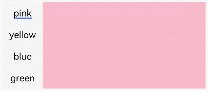
// xxx.ets
@Entry
@Component
struct TabsExample {
  private controller: TabsController = new TabsController()

  build() {
    Column() {
      Tabs({ barPosition: BarPosition.Start, controller: this.controller }) {
        TabContent() {
          Column().width('100%').height('100%').backgroundColor(Color.Pink)
        }.tabBar('pink')

        TabContent() {
          Column().width('100%').height('100%').backgroundColor(Color.Yellow)
        }.tabBar('yellow')

        TabContent() {
          Column().width('100%').height('100%').backgroundColor(Color.Blue)
        }.tabBar('blue')

        TabContent() {
          Column().width('100%').height('100%').backgroundColor(Color.Green)
        }.tabBar('green')
      }
      .vertical(true).scrollable(true).barMode(BarMode.Fixed)
      .barWidth(70).barHeight(150).animationDuration(400)
      .onChange((index: number) => {
        console.info(index.toString())
      })
      .width('90%').backgroundColor(0xF5F5F5)
    }.width('100%').height(150).margin({ top: 5 })
  }
}