Image
The <Image> component is used to render and display images.
NOTE
This component is supported since API version 7. Updates will be marked with a superscript to indicate their earliest API version.
Required Permissions
To use online images, the application must have the ohos.permission.INTERNET permission. For details about how to apply for a permission, see Declaring Permissions.
Child Components
Not supported
APIs
Image(src: string | PixelMap | Resource)
Obtains an image from the specified source for subsequent rendering and display.
Parameters
| Name | Type | Mandatory | Default Value | Description |
|---|---|---|---|---|
| src | string| PixelMap| Resource | Yes | - | Image source. Both local and online images are supported. When using resources referenced using a relative path, for example, Image("common/test.jpg"), the <Image> component cannot be called across bundles or modules. Therefore, you are advised to use $r to reference image resources that need to be used globally.- The following image formats are supported: PNG, JPG, BMP, SVG, GIF. - Base64 strings are supported. The value format is data:image/[png\|jpeg\|bmp\|webp];base64,[base64 data], where [base64 data] is a Base64 string.- The value can also be a path starting with dataability://, which is used to access the image path provided by a Data ability.- Strings with the file:///data/storage prefix are supported, which are used to read image resources in the files folder in the installation directory of the application. Using such strings requires the read permission on the files in the installation directory. |
Attributes
| Name | Type | Default Value | Description |
|---|---|---|---|
| alt | string | Resource | - | Placeholder image displayed during loading. Only local images are supported. |
| objectFit | ImageFit | Cover | Image scale mode. |
| objectRepeat | ImageRepeat | NoRepeat | Whether the image is repeated. NOTE This attribute is not applicable to SVG images. |
| interpolation | ImageInterpolation | None | Interpolation effect of the image. This attribute is intended to alleviate aliasing that occurs when a low-definition image is zoomed in. NOTE This attribute is not applicable to SVG images or PixelMap objects. |
| renderMode | ImageRenderMode | Original | Rendering mode of the image. NOTE This attribute is not applicable to SVG images. |
| sourceSize | { width: number, height: number } |
- | Decoding size of the image. The original image is decoded into an image of the specified size. If the value is of the number type, the unit px is used. NOTE This attribute is not applicable to PixelMap objects. |
| matchTextDirection | boolean | false | Whether to display the image in the system language direction. When this parameter is set to true, the image is horizontally flipped in the right-to-left (RTL) language context. |
| fitOriginalSize | boolean | true | Whether to fit the component to the original size of the image source when the component size is not set. |
| fillColor | ResourceColor | - | Fill color of the image. This attribute only applies to an SVG image. Once set, the fill color will replace that of the SVG image. |
| autoResize | boolean | true | Whether to resize the image source used for drawing based on the size of the display area during image decoding. This resizing can help reduce the memory usage. |
| syncLoad8+ | boolean | false | Whether to load the image synchronously. By default, the image is loaded asynchronously. During synchronous loading, the UI thread is blocked and the placeholder diagram is not displayed. |
NOTE
For SVG images, only the following tags are included in the supported list: svg, rect, circle, ellipse, path, line, polyline, polygon, animate, animateMotion, and animateTransform.
ImageInterpolation
| Name | Description |
|---|---|
| None | Interpolation image data is not used. |
| High | The interpolation image data is used at the high level, which may affect the image rendering speed. |
| Medium | The interpolation image data is used at the medium level. |
| Low | The interpolation image data is used at the low level. |
ImageRenderMode
| Name | Description |
|---|---|
| Original | The image is rendered based on the original image, including the color. |
| Template | The image is rendered as a template image, and its color is ignored. |
Events
| Name | Description |
|---|---|
| onComplete(callback: (event?: { width: number, height: number, componentWidth: number, componentHeight: number, loadingStatus: number }) => void) |
Triggered when an image is successfully loaded. The size of the loaded image is returned. - width: width of the image, in pixels. - height: height of the image, in pixels. - componentWidth: width of the container component, in pixels. - componentHeight: height of the container component, in pixels. - loadingStatus: image loading status. |
| onError(callback: (event?: { componentWidth: number, componentHeight: number }) => void) | Triggered when an exception occurs during image loading. - componentWidth: width of the container component, in pixels. - componentHeight: height of the container component, in pixels. |
| onFinish(event: () => void) | Triggered when the animation playback in the loaded SVG image is complete. If the animation is an infinite loop, this callback is not triggered. |
Example
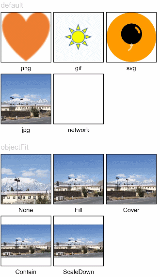
// Image1
@Entry
@Component
struct ImageExample1 {
  private on: string = 'www.example.com'
  @State src: string = this.on

  build() {
    Column() {
      Flex({ direction: FlexDirection.Column, alignItems: ItemAlign.Start }) {
        Text('default').fontSize(16).fontColor(0xcccccc).height(30)
        Row({ space: 5 }) {
          Image($r('app.media.ic_png'))
            .width(110).height(110).border({ width: 1 }).borderStyle(BorderStyle.Dashed)
            .overlay('png', { align: Alignment.Bottom, offset: { x: 0, y: 20 } })
          Image($r('app.media.ic_gif'))
            .width(110).height(110).border({ width: 1 }).borderStyle(BorderStyle.Dashed)
            .overlay('gif', { align: Alignment.Bottom, offset: { x: 0, y: 20 } })
          Image($r('app.media.ic_svg'))
            .width(110).height(110).border({ width: 1 }).borderStyle(BorderStyle.Dashed)
            .overlay('svg', { align: Alignment.Bottom, offset: { x: 0, y: 20 } })
        }
        Row({ space: 5 }) {
          Image($r('app.media.img_example'))
            .width(110).height(110).border({ width: 1 }).borderStyle(BorderStyle.Dashed)
            .overlay('jpg', { align: Alignment.Bottom, offset: { x: 0, y: 20 } })
          Image(this.src)
            .width(110).height(110).border({ width: 1 }).borderStyle(BorderStyle.Dashed)
            .overlay('network', { align: Alignment.Bottom, offset: { x: 0, y: 20 } })
        }.margin({ top: 25, bottom: 10 })
      }

      Flex({ direction: FlexDirection.Column, alignItems: ItemAlign.Start }) {
        Text('objectFit').fontSize(16).fontColor(0xcccccc).height(30)
        Row({ space: 5 }) {
          Image($r('app.media.img_example'))
            .border({ width: 1 }).borderStyle(BorderStyle.Dashed)
            .objectFit(ImageFit.None).width(110).height(110)
            .overlay('None', { align: Alignment.Bottom, offset: { x: 0, y: 20 } })
          Image($r('app.media.img_example'))
            .border({ width: 1 }).borderStyle(BorderStyle.Dashed)
            .objectFit(ImageFit.Fill).width(110).height(110)
            .overlay('Fill', { align: Alignment.Bottom, offset: { x: 0, y: 20 } })
          Image($r('app.media.img_example'))
            .border({ width: 1 }).borderStyle(BorderStyle.Dashed)
            .objectFit(ImageFit.Cover).width(110).height(110)
            .overlay('Cover', { align: Alignment.Bottom, offset: { x: 0, y: 20 } })
        }
        Row({ space: 5 }) {
          Image($r('app.media.img_example_w250'))
            .border({ width: 1 }).borderStyle(BorderStyle.Dashed)
            .objectFit(ImageFit.Contain).width(110).height(110)
            .overlay('Contain', { align: Alignment.Bottom, offset: { x: 0, y: 20 } })
          Image($r('app.media.img_example_w250'))
            .border({ width: 1 }).borderStyle(BorderStyle.Dashed)
            .objectFit(ImageFit.ScaleDown).width(110).height(110)
            .overlay('ScaleDown', { align: Alignment.Bottom, offset: { x: 0, y: 20 } })
        }.margin({ top: 25 })
      }
    }.height(320).width(360).padding({ right: 10, top: 10 })
  }
}
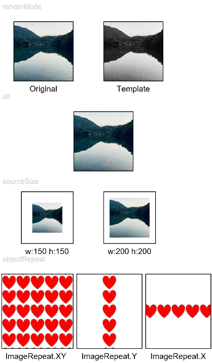
// Image2
@Entry
@Component
struct ImageExample2 {
  @State width: number = 100
  @State height: number = 100

  build() {
    Column({ space: 10 }) {
      Text('renderMode').fontSize(12).fontColor(0xcccccc).width('96%').height(30)
      Row({ space: 50 }) {
        Image($r('app.media.img_example'))
          .renderMode(ImageRenderMode.Original).width(100).height(100)
          .border({ width: 1 }).borderStyle(BorderStyle.Dashed)
          .overlay('Original', { align: Alignment.Bottom, offset: { x: 0, y: 20 } })
        Image($r('app.media.img_example'))
          .renderMode(ImageRenderMode.Template).width(100).height(100)
          .border({ width: 1 }).borderStyle(BorderStyle.Dashed)
          .overlay('Template', { align: Alignment.Bottom, offset: { x: 0, y: 20 } })
      }

      Text('alt').fontSize(12).fontColor(0xcccccc).width('96%').height(30)
      Image('')
        .alt($r('app.media.Image_none'))
        .width(100).height(100).border({ width: 1 }).borderStyle(BorderStyle.Dashed)

      Text('sourceSize').fontSize(12).fontColor(0xcccccc).width('96%')
      Row({ space: 50 }) {
        Image($r('app.media.img_example'))
          .sourceSize({
            width: 150,
            height: 150
          })
          .objectFit(ImageFit.ScaleDown).width('25%').aspectRatio(1)
          .border({ width: 1 }).borderStyle(BorderStyle.Dashed)
          .overlay('w:150 h:150', { align: Alignment.Bottom, offset: { x: 0, y: 20 } })
        Image($r('app.media.img_example'))
          .sourceSize({
            width: 200,
            height: 200
          })
          .objectFit(ImageFit.ScaleDown).width('25%').aspectRatio(1)
          .border({ width: 1 }).borderStyle(BorderStyle.Dashed)
          .overlay('w:200 h:200', { align: Alignment.Bottom, offset: { x: 0, y: 20 } })
      }

      Text('objectRepeat').fontSize(12).fontColor(0xcccccc).width('96%').height(30)
      Row({ space: 5 }) {
        Image($r('app.media.ic_health_heart'))
          .width(120).height(125).border({ width: 1 }).borderStyle(BorderStyle.Dashed)
          .objectRepeat(ImageRepeat.XY).objectFit(ImageFit.ScaleDown)
          .overlay('ImageRepeat.XY', { align: Alignment.Bottom, offset: { x: 0, y: 20 } })
        Image($r('app.media.ic_health_heart'))
          .width(110).height(125).border({ width: 1 }).borderStyle(BorderStyle.Dashed)
          .objectRepeat(ImageRepeat.Y).objectFit(ImageFit.ScaleDown)
          .overlay('ImageRepeat.Y', { align: Alignment.Bottom, offset: { x: 0, y: 20 } })
        Image($r('app.media.ic_health_heart'))
          .width(110).height(125).border({ width: 1 }).borderStyle(BorderStyle.Dashed)
          .objectRepeat(ImageRepeat.X).objectFit(ImageFit.ScaleDown)
          .overlay('ImageRepeat.X', { align: Alignment.Bottom, offset: { x: 0, y: 20 } })
      }
    }.height(150).width('100%').padding({ right: 10 })
  }
}
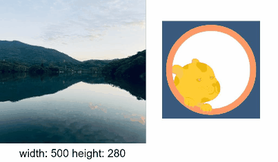
// Image3
@Entry
@Component
struct ImageExample3 {
  @State widthValue: number = 0
  @State heightValue: number = 0
  private on: Resource = $r('app.media.wifi_on')
  private off: Resource = $r('app.media.wifi_off')
  private on2off: Resource = $r('app.media.wifi_on2off')
  private off2on: Resource = $r('app.media.wifi_off2on')
  @State src: Resource = this.on

  build() {
    Column() {
      Row({ space: 20 }) {
        Column() {
          Image($r('app.media.img_example1'))
            .alt($r('app.media.ic_public_picture'))
            .sourceSize({
              width: 900,
              height: 900
            })
            .objectFit(ImageFit.Cover)
            .height(180).width(180)
            .onComplete((msg: { width: number,height: number }) => {
              this.widthValue = msg.width
              this.heightValue = msg.height
            })
            .onError(() => {
              console.log('load image fail')
            })
            .overlay('\nwidth: ' + String(this.widthValue) + ' height: ' + String(this.heightValue), {
              align: Alignment.Bottom,
              offset: { x: 0, y: 20 }
            })
        }

        Image(this.src)
          .width(120).height(120)
          .onClick(() => {
            if (this.src == this.on || this.src == this.off2on) {
              this.src = this.on2off
            } else {
              this.src = this.off2on
            }
          })
          .onFinish(() => {
            if (this.src == this.off2on) {
              this.src = this.on
            } else {
              this.src = this.off
            }
          })
      }
    }.width('100%')
  }
}
Rendering Sandbox Images
import fileio from '@ohos.fileio';
import image from '@ohos.multimedia.image';

const EMPTY_PATH = 'file://';

@Entry
@Component
struct LoadImageExample {
  @State fileContent: string = '';
  @State path: string = EMPTY_PATH;
  @State accountInfoHeadPic: any = '';

  build() {
    Column() {
      Button ('Read Sandbox Image')
        .margin({ bottom: 10 })
        .onClick(() => {
          try {
            this.path = EMPTY_PATH;
            let context = getContext(this);
            let path = context.getApplicationContext().filesDir + '/icon.png';
            console.log(`Read the sandbox image=========>${path}`);
            let fd = fileio.openSync(path, 0o100, 0o666);
            console.log(`create file========>${fd}`);
            let srcPath = context.bundleCodeDir + '/entry/resource/base/media/icon.png';
            fileio.copyFileSync(srcPath, path);
            console.log(`error:=============>${e.message}`);
          }
        })
      Button ('Read Image')
        .margin({ bottom: 10 })
        .onClick(() => {
          this.path = EMPTY_PATH;
          this.path += getContext(this.bundleCodeDir + '/entry/resource/base/media/icon.png');
        })
      Text(`Image pth: ${this.path}`)
        .fontSize(20)
        .margin({ bottom: 10 })
      Image(this.path)
        .width(100)
        .height(100)
    }
    .width('100%').height('100%')
  }
}