Custom Dialog Box
A custom dialog box is a dialog box you customize by using APIs of the CustomDialogController class. You can set the style and content to your preference for a custom dialog box.
NOTE
The APIs of this module are supported since API version 7. Updates will be marked with a superscript to indicate their earliest API version.
APIs
CustomDialogController(value:{builder: CustomDialog, cancel?: () => void, autoCancel?: boolean, alignment?: DialogAlignment, offset?: Offset, customStyle?: boolean, gridCount?: number})
Parameters
| Name | Type | Mandatory | Description |
|---|---|---|---|
| builder | any | Yes | Constructor of the custom dialog box content. |
| cancel | () => void | No | Callback invoked when the dialog box is closed after the overlay exits. |
| autoCancel | boolean | No | Whether to allow users to click the overlay to exit. Default value: true |
| alignment | DialogAlignment | No | Alignment mode of the dialog box in the vertical direction. Default value: DialogAlignment.Default |
| offset | { dx: Length | Resource, dy: Length | Resource } |
No | Offset of the dialog box relative to the alignment position. |
| customStyle | boolean | No | Whether to use a custom style for the dialog box. Default value: false |
| gridCount8+ | number | No | Number of grid columns occupied by the dialog box. |
DialogAlignment
| Name | Description |
|---|---|
| Top | Vertical top alignment. |
| Center | Vertical center alignment. |
| Bottom | Vertical bottom alignment. |
| Default | Default alignment. NOTE This value is equivalent to Center. |
| TopStart8+ | Top left alignment. |
| TopEnd8+ | Top right alignment. |
| CenterStart8+ | Center left alignment. |
| CenterEnd8+ | Center right alignment. |
| BottomStart8+ | Bottom left alignment. |
| BottomEnd8+ | Bottom right alignment. |
CustomDialogController
Objects to Import
dialogController : CustomDialogController = new CustomDialogController(value:{builder: CustomDialog, cancel?: () => void, autoCancel?: boolean})
open()
open(): void
Opens the content of the custom dialog box. If the content has been displayed, this API does not take effect.
close
close(): void
Closes the custom dialog box. If the dialog box is closed, this API does not take effect.
Example
// xxx.ets
@CustomDialog
struct CustomDialogExample {
@Link textValue: string
@Link inputValue: string
controller: CustomDialogController
cancel: () => void
confirm: () => void
build() {
Column() {
Text('Change text').fontSize(20).margin({ top: 10, bottom: 10 })
TextInput({ placeholder: '', text: this.textValue }).height(60).width('90%')
.onChange((value: string) => {
this.textValue = value
})
Text('Whether to change a text?').fontSize(16).margin({ bottom: 10 })
Flex({ justifyContent: FlexAlign.SpaceAround }) {
Button('cancel')
.onClick(() => {
this.controller.close()
this.cancel()
}).backgroundColor(0xffffff).fontColor(Color.Black)
Button('confirm')
.onClick(() => {
this.inputValue = this.textValue
this.controller.close()
this.confirm()
}).backgroundColor(0xffffff).fontColor(Color.Red)
}.margin({ bottom: 10 })
}
}
}
@Entry
@Component
struct CustomDialogUser {
@State textValue: string = ''
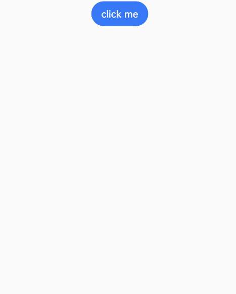
@State inputValue: string = 'click me'
dialogController: CustomDialogController = new CustomDialogController({
builder: CustomDialogExample({ cancel: this.onCancel, confirm: this.onAccept, textValue: $textValue, inputValue: $inputValue }),
cancel: this.existApp,
autoCancel: true
})
onCancel() {
console.info('Callback when the first button is clicked')
}
onAccept() {
console.info('Callback when the second button is clicked')
}
existApp() {
console.info('Click the callback in the blank area')
}
build() {
Column() {
Button(this.inputValue)
.onClick(() => {
this.dialogController.open()
}).backgroundColor(0x317aff)
}.width('100%').margin({ top: 5 })
}
}