Focus Event
A focus event is triggered when the page focus moves between components. It can be used to process related logic within the component.
NOTE
The APIs of this module are supported since API version 8. Updates will be marked with a superscript to indicate their earliest API version.
Currently, only the Tab button and arrow buttons on the external keyboard can be used to trigger the focus event.
| Name | Bubbling Supported | Description |
|---|---|---|
| onFocus(event: () => void) | No | Triggered when the current component obtains focus. |
| onBlur(event:() => void) | No | Triggered when the current component loses focus. |
Example
// xxx.ets
@Entry
@Component
struct FocusEventExample {
@State oneButtonColor: string = '#FFC0CB';
@State twoButtonColor: string = '#87CEFA';
@State threeButtonColor: string = '#90EE90';
build() {
Column({ space: 20 }) {
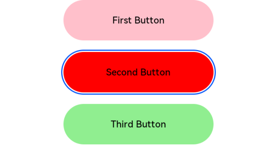
// You can use the up and down arrow keys on an external keyboard to move the focus between the three buttons. When a button gains focus, its color changes. When it loses focus, its color changes back.
Button('First Button')
.backgroundColor(this.oneButtonColor)
.width(260)
.height(70)
.fontColor(Color.Black)
.focusable(true)
.onFocus(() => {
this.oneButtonColor = '#FF0000';
})
.onBlur(() => {
this.oneButtonColor = '#FFC0CB';
})
Button('Second Button')
.backgroundColor(this.twoButtonColor)
.width(260)
.height(70)
.fontColor(Color.Black)
.focusable(true)
.onFocus(() => {
this.twoButtonColor = '#FF0000';
})
.onBlur(() => {
this.twoButtonColor = '#87CEFA';
})
Button('Third Button')
.backgroundColor(this.threeButtonColor)
.width(260)
.height(70)
.fontColor(Color.Black)
.focusable(true)
.onFocus(() => {
this.threeButtonColor = '#FF0000';
})
.onBlur(() => {
this.threeButtonColor = '#90EE90';
})
}.width('100%').margin({ top: 20 })
}
}