Navigation
Navigation组件一般作为Page页面的根容器,通过属性设置来展示页面的标题、工具栏、菜单。
说明:
该组件从API Version 8开始支持。后续版本如有新增内容,则采用上角标单独标记该内容的起始版本。
子组件
可以包含子组件。
接口
Navigation()
创建可以根据属性设置,自动展示导航栏、标题、工具栏的组件。
属性
除支持通用属性外,还支持以下属性:
| 名称 | 参数类型 | 描述 |
|---|---|---|
| title | string | CustomBuilder8+ | 页面标题。 |
| subTitle | string | 页面副标题。 |
| menus | Array<NavigationMenuItem> | CustomBuilder8+ | 页面右上角菜单。 |
| titleMode | NavigationTitleMode | 页面标题栏显示模式。 默认值:NavigationTitleMode.Free |
| toolBar | object | CustomBuilder8+ | 设置工具栏内容。 items: 工具栏所有项。 |
| hideToolBar | boolean | 隐藏工具栏: 默认值:false true: 隐藏工具栏。 false: 显示工具栏。 |
| hideTitleBar | boolean | 隐藏标题栏。 默认值:false true: 隐藏标题栏。 false: 显示标题栏。 |
| hideBackButton | boolean | 隐藏返回键。 默认值:false true: 隐藏返回键。 false: 显示返回键。 |
NavigationMenuItem类型说明
| 名称 | 类型 | 必填 | 描述 |
|---|---|---|---|
| value | string | 是 | 菜单栏单个选项的显示文本。 |
| icon | string | 否 | 菜单栏单个选项的图标资源路径。 |
| action | () => void | 否 | 当前选项被选中的事件回调。 |
object类型说明
| 名称 | 类型 | 必填 | 描述 |
|---|---|---|---|
| value | string | 是 | 工具栏单个选项的显示文本。 |
| icon | string | 否 | 工具栏单个选项的图标资源路径。 |
| action | () => void | 否 | 当前选项被选中的事件回调。 |
NavigationTitleMode枚举说明
| 名称 | 描述 |
|---|---|
| Free | 当内容为可滚动组件时,标题随着内容向上滚动而缩小(子标题的大小不变、淡出)。向下滚动内容到顶时则恢复原样。 |
| Mini | 固定为小标题模式(图标+主副标题)。 |
| Full | 固定为大标题模式(主副标题)。 |
说明: 目前可滚动组件只支持List。
事件
| 名称 | 功能描述 |
|---|---|
| onTitleModeChange(callback: (titleMode: NavigationTitleMode) => void) | 当titleMode为NavigationTitleMode.Free时,随着可滚动组件的滑动标题栏模式发生变化时触发此回调。 |
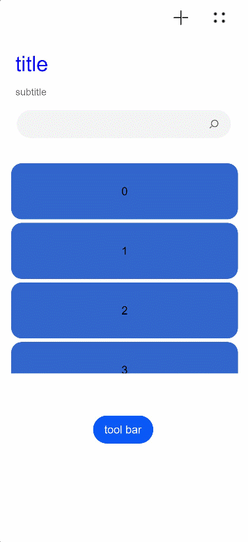
示例
// xxx.ets
@Entry
@Component
struct NavigationExample {
  private arr: number[] = [0, 1, 2, 3, 4, 5, 6, 7, 8, 9]
  @State hideBar: boolean = true

  @Builder NavigationTitle() {
    Column() {
      Text('title')
        .width(80)
        .height(60)
        .fontColor(Color.Blue)
        .fontSize(30)
    }
    .onClick(() => {
      console.log("title")
    })
  }

  @Builder NavigationMenus() {
    Row() {
      Image('images/add.png')
        .width(25)
        .height(25)
      Image('comment/more.png')
        .width(25)
        .height(25)
        .margin({ left: 30 })
    }.width(100)
  }

  build() {
    Column() {
      Navigation() {
        Search({ value: '', placeholder: "" }).width('85%').margin(26)
        List({ space: 5, initialIndex: 0 }) {
          ForEach(this.arr, (item) => {
            ListItem() {
              Text('' + item)
                .width('90%')
                .height(80)
                .backgroundColor('#3366CC')
                .borderRadius(15)
                .fontSize(16)
                .textAlign(TextAlign.Center)
            }.editable(true)
          }, item => item)
        }
        .listDirection(Axis.Vertical)
        .height(300)
        .margin({ top: 10, left: 18 })
        .width('100%')

        Button(this.hideBar ? "tool bar" : "hide bar")
          .onClick(() => {
            this.hideBar = !this.hideBar
          })
          .margin({ left: 135, top: 60 })
      }
      .title(this.NavigationTitle)
      .subTitle('subtitle')
      .menus(this.NavigationMenus)
      .titleMode(NavigationTitleMode.Free)
      .hideTitleBar(false)
      .hideBackButton(false)
      .onTitleModeChange((titleModel: NavigationTitleMode) => {
        console.log('titleMode')
      })
      .toolBar({ items: [
        { value: 'app', icon: 'images/grid.svg', action: () => {
          console.log("app")
        } },
        { value: 'add', icon: 'images/add.svg', action: () => {
          console.log("add")
        } },
        { value: 'collect', icon: 'images/collect.svg', action: () => {
          console.log("collect")
        } }] })
      .hideToolBar(this.hideBar)
    }
  }
}
// xxx.ets
@Entry
@Component
struct ToolbarBuilderExample {
  @State currentIndex: number = 0
  @State Build: Array<Object> = [
    {
      icon: $r('app.media.ic_public_add'),
      icon_after: $r('app.media.ic_public_addcolor'),
      text: 'add',
      num: 0
    },
    {
      icon: $r('app.media.ic_public_app'),
      icon_after: $r('app.media.ic_public_appcolor'),
      text: 'app',
      num: 1
    },
    {
      icon: $r('app.media.ic_public_collect'),
      icon_after: $r('app.media.ic_public_collectcolor'),
      text: 'collect',
      num: 2
    }
  ]

  @Builder NavigationToolbar() {
    Row() {
      ForEach(this.Build, item => {
        Column() {
          Image(this.currentIndex == item.num ? item.icon_after : item.icon)
            .width(25)
            .height(25)
          Text(item.text)
            .fontColor(this.currentIndex == item.num ? "#ff7500" : "#000000")
        }
        .onClick(() => {
          this.currentIndex = item.num
        })
        .margin({ left: 70 })
      })
    }
  }

  build() {
    Column() {
      Navigation() {
        Flex() {
        }
      }
      .toolBar(this.NavigationToolbar)
    }
  }
}