Swiper
The <Swiper> component provides a container that allows users to switch among child components using swipe gestures.
NOTE
This component is supported since API version 7. Updates will be marked with a superscript to indicate their earliest API version.
Child Components
This component can contain child components.
APIs
Swiper(controller?: SwiperController)
Parameters
| Name | Type | Mandatory | Description |
|---|---|---|---|
| controller | SwiperController | No | Controller bound to the component to control the page switching. |
Attributes
Menu control is not supported.
| Name | Type | Description |
|---|---|---|
| index | number | Index of the child component currently displayed in the container. Default value: 0 |
| autoPlay | boolean | Whether to enable automatic playback for child component switching. If this attribute is true, the navigation dots indicator does not take effect. Default value: false |
| interval | number | Interval for automatic playback, in ms. Default value: 3000 |
| indicator | boolean | Whether to enable the navigation dots indicator. Default value: true |
| loop | boolean | Whether to enable loop playback. The value true means to enable loop playback. When LazyForEach is used, it is recommended that the number of the components to load exceed 5. Default value: true |
| duration | number | Duration of the animation for switching child components, in ms. Default value: 400 |
| vertical | boolean | Whether vertical swiping is used. Default value: false |
| itemSpace | number | string | Space between child components. Default value: 0 |
| displayMode | SwiperDisplayMode | Mode in which child components are displayed. Default value: SwiperDisplayMode.Stretch |
| cachedCount8+ | number | Number of child components to be cached. Default value: 1 |
| disableSwipe8+ | boolean | Whether to disable the swipe feature. Default value: false |
| displayCount8+ | number|string | Number of child components to display per page. The value auto is equivalent to SwiperDisplayMode.AutoLinear. Default value: 1 |
| effectMode8+ | EdgeEffect | Swipe effect. Default value: EdgeEffect.Spring |
| curve8+ | Curve | string | Animation curve. The ease-in/ease-out curve is used by default. For details about common curves, see Curve. You can also create custom curves (interpolation curve objects) by using the API provided by the interpolation calculation module. Default value: Curve.Ease |
| indicatorStyle8+ | { left?: Length, top?: Length, right?: Length, bottom?: Length, size?: Length, mask?: boolean, color?: ResourceColor, selectedColor?: ResourceColor } |
Style of the navigation dots indicator. - left: distance between the navigation dots indicator and the left edge of the <Swiper> component. - top: distance between the navigation dots indicator and the top edge of the <Swiper> component. - right: distance between the navigation dots indicator and the right edge of the <Swiper> component. - bottom: distance between the navigation dots indicator and the bottom edge of the <Swiper> component. - size: diameter of the navigation dots indicator. - mask: whether to enable the mask for the navigation dots indicator. - color: color of the navigation dots indicator. - selectedColor: color of the selected navigation dot. |
SwiperDisplayMode
| Name | Description |
|---|---|
| Stretch | The slide width of the <Swiper> component is equal to the width of the component. |
| AutoLinear | The slide width of the <Swiper> component is equal to that of the child component with the maximum width. |
EdgeEffect
| Name | Description |
|---|---|
| Spring | Spring effect. When sliding to one edge, the component can move beyond the bounds through touches, and produce a bounce effect when the user releases their finger. |
| Fade | Fade effect. When sliding to one edge, the component can move beyond the bounds through touches, and produce a fade effect along the way; when the user releases their finger, the fade changes. |
| None | No effect. When sliding to one edge, the component cannot move beyond the bounds. |
SwiperController
Controller of the <Swiper> component. You can bind this object to the
showNext
showNext(): void
Turns to the next page.
showPrevious
showPrevious(): void
Turns to the previous page.
finishAnimation
finishAnimation(callback?: () => void): void
Stops an animation.
Parameters
| Name | Type | Mandatory. | Description |
|---|---|---|---|
| callback | () => void | Yes | Callback invoked when the animation stops. |
Events
onChange
onChange(event: (index: number) => void)
Triggered when the index of the currently displayed child component changes.
NOTE
When the <Swiper> component is used together with LazyForEach, the subpage UI cannot be refreshed in the onChange event.
Parameters
| Name | Type | Mandatory. | Description |
|---|---|---|---|
| index | number | Yes | Index of the currently displayed child component. |
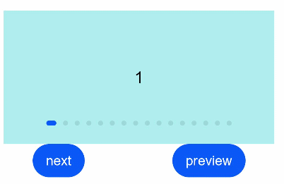
Example
// xxx.ets
class MyDataSource implements IDataSource {
  private list: number[] = []
  private listener: DataChangeListener

  constructor(list: number[]) {
    this.list = list
  }

  totalCount(): number {
    return this.list.length
  }

  getData(index: number): any {
    return this.list[index]
  }

  registerDataChangeListener(listener: DataChangeListener): void {
    this.listener = listener
  }

  unregisterDataChangeListener() {
  }
}

@Entry
@Component
struct SwiperExample {
  private swiperController: SwiperController = new SwiperController()
  private data: MyDataSource = new MyDataSource([])

  aboutToAppear(): void {
    let list = []
    for (var i = 1; i <= 10; i++) {
      list.push(i.toString());
    }
    this.data = new MyDataSource(list)
  }

  build() {
    Column({ space: 5 }) {
      Swiper(this.swiperController) {
        LazyForEach(this.data, (item: string) => {
          Text(item).width('90%').height(160).backgroundColor(0xAFEEEE).textAlign(TextAlign.Center).fontSize(20)
        }, item => item)
      }
      .cachedCount(2)
      .index(1)
      .autoPlay(true)
      .interval(4000)
      .indicator(true) // Navigation dots are enabled by default.
      .loop(false) // Loop playback is enabled by default.
      .duration(1000)
      .vertical(false) // Horizontal swiping is enabled by default.
      .itemSpace(0)
      .curve(Curve.Linear) // Animation curve.
      .onChange((index: number) => {
        console.info(index.toString())
      })

      Flex({ justifyContent: FlexAlign.SpaceAround }) {
        Button('next')
          .onClick(() => {
            this.swiperController.showNext()
          })
        Button('preview')
          .onClick(() => {
            this.swiperController.showPrevious()
          })
      }
    }.margin({ top: 5 })
  }
}