Circle
圆形绘制组件。
说明:
该组件从API Version 7开始支持。后续版本如有新增内容,则采用上角标单独标记该内容的起始版本。
权限列表
无
子组件
无
接口
Circle(options?: {width?: string | number, height?: string | number})
参数:
| 参数名 | 参数类型 | 必填 | 默认值 | 参数描述 |
|---|---|---|---|---|
| width | string | number | 否 | 0 | 宽度。 |
| height | string | number | 否 | 0 | 高度。 |
属性
除支持通用属性外,还支持以下属性:
| 名称 | 类型 | 默认值 | 描述 |
|---|---|---|---|
| fill | ResourceColor | Color.Black | 设置填充区域颜色。 |
| fillOpacity | number | string | Resource | 1 | 设置填充区域透明度。 |
| stroke | ResourceColor | - | 设置边框颜色,不设置时,默认没有边框。 |
| strokeDashArray | Array<Length> | [] | 设置边框间隙。 |
| strokeDashOffset | number | string | 0 | 边框绘制起点的偏移量。 |
| strokeLineCap | LineCapStyle | LineCapStyle.Butt | 设置边框端点绘制样式。 |
| strokeLineJoin | LineJoinStyle | LineJoinStyle.Miter | 设置边框拐角绘制样式。 |
| strokeMiterLimit | number | string | 4 | 设置斜接长度与边框宽度比值的极限值。 说明: Circle组件无法设置尖角图形,该属性设置无效。 |
| strokeOpacity | number | string | Resource | 1 | 设置边框透明度。 说明: 该属性的取值范围是[0.0, 1.0],若给定值小于0.0,则取值为0.0;若给定值大于1.0,则取值为1.0。 |
| strokeWidth | Length | 1 | 设置边框宽度。 |
| antiAlias | boolean | true | 是否开启抗锯齿效果。 |
示例
// xxx.ets
@Entry
@Component
struct CircleExample {
build() {
Column({ space: 10 }) {
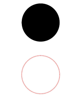
// 绘制一个直径为150的圆
Circle({ width: 150, height: 150 })
// 绘制一个直径为150、线条为红色虚线的圆环(宽高设置不一致时以短边为直径)
Circle()
.width(150)
.height(200)
.fillOpacity(0)
.strokeWidth(3)
.stroke(Color.Red)
.strokeDashArray([1, 2])
}.width('100%')
}
}