Progress
The <Progress> component is used to provide a progress indicator that displays the progress of content loading or an operation.
NOTE
This component is supported since API version 7. Updates will be marked with a superscript to indicate their earliest API version.
Child Components
Not supported
APIs
Progress(options: {value: number, total?: number, style?: ProgressStyle, type?: ProgressType})
Creates a progress indicator.
Parameters
| Name | Type | Mandatory | Description |
|---|---|---|---|
| value | number | Yes | Current progress. |
| total | number | No | Total progress. Default value: 100 |
| type8+ | ProgressType | No | Type of the progress indicator. Default value: ProgressType.Linear |
| styledeprecated | ProgressStyle | No | Style the progress indicator. This parameter is deprecated since API version 8. You are advised to use type instead. Default value: ProgressStyle.Linear |
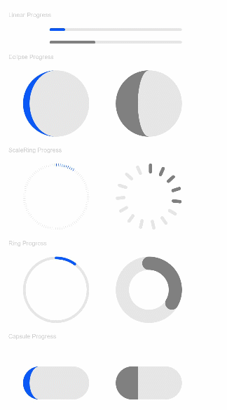
ProgressType
| Name | Description |
|---|---|
| Linear | Linear type. |
| Ring8+ | Indeterminate ring type. The ring fills up as the progress increases. |
| Eclipse | Eclipse type, which visualizes the progress in a way similar to the moon waxing from new to full. |
| ScaleRing8+ | Determinate ring type, which is similar to the clock scale. |
| Capsule8+ | Capsule type. At both ends, the progress indicator works in a same manner as the eclipse type. In the middle part of the capsule, the progress indicator works in a same manner as the linear type. |
ProgressStyle
| Name | Description |
|---|---|
| Linear | Linear type. |
| Ring | Indeterminate ring type. The ring fills up as the progress increases. |
| Eclipse | Eclipse type, which visualizes the progress in a way similar to the moon waxing from new to full. |
| ScaleRing | Determinate ring type, which is similar to the clock scale. |
| Capsule | Capsule type. At both ends, the progress indicator works in a same manner as the eclipse type. In the middle part of the capsule, the progress indicator works in a same manner as the linear type. |
Attributes
| Name | Type | Description |
|---|---|---|
| value | number | Current progress. |
| color | ResourceColor | Background color of the progress indicator. |
| style8+ | { strokeWidth?: Length, scaleCount?: number, scaleWidth?: Length } |
Component style. - strokeWidth: stroke width of the progress indicator. - scaleCount: number of divisions on the determinate ring-type process indicator. - scaleWidth: scale bar width of the determinate ring-type process indicator. If it is greater than the progress indicator width, the default value is used instead. |
Example
// xxx.ets
@Entry
@Component
struct ProgressExample {
  build() {
    Column({ space: 15 }) {
      Text('Linear Progress').fontSize(9).fontColor(0xCCCCCC).width('90%')
      Progress({ value: 10, type: ProgressType.Linear }).width(200)
      Progress({ value: 20, total: 150, type: ProgressType.Linear }).color(Color.Grey).value(50).width(200)

      Text('Eclipse Progress').fontSize(9).fontColor(0xCCCCCC).width('90%')
      Row({ space: 40 }) {
        Progress({ value: 10, type: ProgressType.Eclipse }).width(100)
        Progress({ value: 20, total: 150, type: ProgressType.Eclipse }).color(Color.Grey).value(50).width(100)
      }

      Text('ScaleRing Progress').fontSize(9).fontColor(0xCCCCCC).width('90%')
      Row({ space: 40 }) {
        Progress({ value: 10, type: ProgressType.ScaleRing }).width(100)
        Progress({ value: 20, total: 150, type: ProgressType.ScaleRing })
          .color(Color.Grey).value(50).width(100)
          .style({ strokeWidth: 15, scaleCount: 15, scaleWidth: 5 })
      }

      Text('Ring Progress').fontSize(9).fontColor(0xCCCCCC).width('90%')
      Row({ space: 40 }) {
        Progress({ value: 10, type: ProgressType.Ring }).width(100)
        Progress({ value: 20, total: 150, type: ProgressType.Ring })
          .color(Color.Grey).value(50).width(100)
          .style({ strokeWidth: 20, scaleCount: 30, scaleWidth: 20 })
      }

      Text('Capsule Progress').fontSize(9).fontColor(0xCCCCCC).width('90%')
      Row({ space: 40 }) {
        Progress({ value: 10, type: ProgressType.Capsule }).width(100).height(50)
        Progress({ value: 20, total: 150, type: ProgressType.Capsule })
          .color(Color.Grey)
          .value(50)
          .width(100)
          .height(50)
      }
    }.width('100%').margin({ top: 30 })
  }
}