Slider
The <Slider> component is used to quickly adjust settings, such as the volume and brightness.
NOTE
This component is supported since API version 7. Updates will be marked with a superscript to indicate their earliest API version.
Child Components
Not supported
APIs
Slider(options?: {value?: number, min?: number, max?: number, step?: number, style?: SliderStyle, direction?: Axis, reverse?: boolean})
Parameters
| Name | Type | Mandatory | Description |
|---|---|---|---|
| value | number | No | Current progress. Default value: 0 |
| min | number | No | Minimum value. Default value: 0 |
| max | number | No | Maximum value. Default value: 100 |
| step | number | No | Step of the slider. Default value: 1 Value range: [0.01, max] |
| style | SliderStyle | No | Style of the slider thumb and track. Default value: SliderStyle.OutSet |
| direction8+ | Axis | No | Whether the slider moves horizontally or vertically. Default value: Axis.Horizontal |
| reverse8+ | boolean | No | Whether the slider values are reversed. By default, the values increase from left to right for a horizontal slider and from top to bottom for a vertical slider. Default value: false |
SliderStyle
| Name | Description |
|---|---|
| OutSet | The slider is on the slider track. |
| InSet | The slider is in the slider track. |
Attributes
Except touch target attributes, the universal attributes are supported.
| Name | Type | Description |
|---|---|---|
| blockColor | ResourceColor | Color of the slider. |
| trackColor | ResourceColor | Background color of the slider. |
| selectedColor | ResourceColor | Color of the selected part of the slider track. |
| showSteps | boolean | Whether to display the current step. Default value: false |
| showTips | boolean | Whether to display a bubble to indicate the percentage when the user drags the slider. Default value: false |
| trackThickness | Length | Track thickness of the slider. |
| maxLabel | string | Maximum label. |
| minLabel | string | Minimum label. |
Events
In addition to the OnAppear and OnDisAppear universal events, the following events are supported.
| Name | Description |
|---|---|
| onChange(callback: (value: number, mode: SliderChangeMode) => void) | Invoked when the slider slides. value: current slider value. If the return value contains decimals, you can use Math.toFixed() to process the data to the desired precision. mode: dragging state. |
SliderChangeMode
| Name | Value | Description |
|---|---|---|
| Begin | 0 | The user starts to drag the slider. |
| Moving | 1 | The user is dragging the slider. |
| End | 2 | The user stops dragging the slider. |
| Click | 3 | The user moves the slider by touching the slider track. |
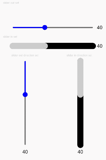
Example
// xxx.ets
@Entry
@Component
struct SliderExample {
  @State outSetValueOne: number = 40;
  @State inSetValueOne: number = 40;
  @State outSetValueTwo: number = 40;
  @State inSetValueTwo: number = 40;
  @State vOutSetValueOne: number = 40;
  @State vInSetValueOne: number = 40;
  @State vOutSetValueTwo: number = 40;
  @State vInSetValueTwo: number = 40;

  build() {
    Column({ space: 8 }) {
      Text('outset slider').fontSize(9).fontColor(0xCCCCCC).width('90%').margin(15)
      Row() {
        Slider({
          value: this.outSetValueOne,
          min: 0,
          max: 100,
          style: SliderStyle.OutSet
        })
          .showTips(true)
          .onChange((value: number, mode: SliderChangeMode) => {
            this.outSetValueOne = value;
            console.info('value:' + value + 'mode:' + mode.toString());
          })
        // toFixed(0) converts the return value of the slider to an integer.
        Text(this.outSetValueOne.toFixed(0)).fontSize(12)
      }
      .width('80%')
      Row() {
        Slider({
          value: this.outSetValueTwo,
          step: 10,
          style: SliderStyle.OutSet
        })
          .showSteps(true)
          .onChange((value: number, mode: SliderChangeMode) => {
            this.outSetValueTwo = value;
            console.info('value:' + value + 'mode:' + mode.toString());
          })
        Text(this.outSetValueTwo.toFixed(0)).fontSize(12)
      }
      .width('80%')

      Text('inset slider').fontSize(9).fontColor(0xCCCCCC).width('90%').margin(15)
      Row() {
        Slider({
          value: this.inSetValueOne,
          min: 0,
          max: 100,
          style: SliderStyle.InSet
        })
          .blockColor('#191970')
          .trackColor('#ADD8E6')
          .selectedColor('#4169E1')
          .showTips(true)
          .onChange((value: number, mode: SliderChangeMode) => {
            this.inSetValueOne = value;
            console.info('value:' + value + 'mode:' + mode.toString());
          })
        Text(this.inSetValueOne.toFixed(0)).fontSize(12)
      }
      .width('80%')
      Row() {
        Slider({
          value: this.inSetValueTwo,
          step: 10,
          style: SliderStyle.InSet
        })
          .blockColor('#191970')
          .trackColor('#ADD8E6')
          .selectedColor('#4169E1')
          .showSteps(true)
          .onChange((value: number, mode: SliderChangeMode) => {
            this.inSetValueTwo = value;
            console.info('value:' + value + 'mode:' + mode.toString());
          })
        Text(this.inSetValueTwo.toFixed(0)).fontSize(12)
      }
      .width('80%')

      Row() {
        Column() {
          Text('vertical outset slider').fontSize(9).fontColor(0xCCCCCC).width('50%').margin(15)
          Row() {
            Slider({
              value: this.vOutSetValueOne,
              style: SliderStyle.OutSet,
              direction: Axis.Vertical
            })
              .blockColor('#191970')
              .trackColor('#ADD8E6')
              .selectedColor('#4169E1')
              .showTips(true)
              .onChange((value: number, mode: SliderChangeMode) => {
                this.vOutSetValueOne = value
                console.info('value:' + value + 'mode:' + mode.toString())
              })
            Slider({
              value: this.vOutSetValueTwo,
              step: 10,
              style: SliderStyle.OutSet,
              direction: Axis.Vertical
            })
              .blockColor('#191970')
              .trackColor('#ADD8E6')
              .selectedColor('#4169E1')
              .showSteps(true)
              .onChange((value: number, mode: SliderChangeMode) => {
                this.vOutSetValueTwo = value;
                console.info('value:' + value + 'mode:' + mode.toString());
              })
          }
        }.width('50%').height(300)

        Column() {
          Text('vertical inset slider').fontSize(9).fontColor(0xCCCCCC).width('50%').margin(15)
          Row() {
            Slider({
              value: this.vInSetValueOne,
              style: SliderStyle.InSet,
              direction: Axis.Vertical,
              reverse: true // By default, at the top of the vertical slider is the min value and at the bottom is the max value. Therefore, if you want to slide from bottom to top, set reverse to true.
            })
              .showTips(true)
              .onChange((value: number, mode: SliderChangeMode) => {
                this.vInSetValueOne = value;
                console.info('value:' + value + 'mode:' + mode.toString());
              })
            Slider({
              value: this.vInSetValueTwo,
              step: 10,
              style: SliderStyle.InSet,
              direction: Axis.Vertical,
              reverse: true
            })
              .showSteps(true)
              .onChange((value: number, mode: SliderChangeMode) => {
                this.vInSetValueTwo = value;
                console.info('value:' + value + 'mode:' + mode.toString());
              })
          }
        }.width('50%').height(300)
      }
    }.width('100%')
  }
}