Text Style
The text style attributes are used to set the style for text in a component.
NOTE
The APIs of this module are supported since API version 7. Updates will be marked with a superscript to indicate their earliest API version.
Attributes
| Name | Type | Description |
|---|---|---|
| fontColor | Color | Font color. |
| fontSize | Length | Font size. If the value is of the number type, the unit fp is used. |
| fontStyle | FontStyle | Font style. Default value: FontStyle.Normal |
| fontWeight | number | FontWeight | Font weight. For the number type, the value ranges from 100 to 900, at an interval of 100. The default value is 400. A larger value indicates a larger font weight. Default value: FontWeight.FontWeightNormal |
| fontFamily | string | Font family. Use commas (,) to separate multiple fonts, for example, 'Arial, sans-serif'. The priority of the fonts is the sequence in which they are placed. |
Example
// xxx.ets
@Entry
@Component
struct TextStyleExample {
build() {
Column({ space: 5 }) {
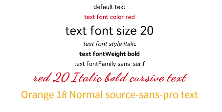
Text('default text')
Text('text font color red')
.fontColor(Color.Red)
Text('text font size 20')
.fontSize(20)
Text('text font style Italic')
.fontStyle(FontStyle.Italic)
Text('text fontWeight bold')
.fontWeight(700)
Text('text fontFamily sans-serif')
.fontFamily('sans-serif')
Text('red 20 Italic bold cursive text')
.fontColor(Color.Red)
.fontSize(20)
.fontStyle(FontStyle.Italic)
.fontWeight(700)
.fontFamily('cursive')
.textAlign(TextAlign.Center)
.width('90%')
Text('Orange 18 Normal source-sans-pro text')
.fontColor(Color.Orange)
.fontSize(18)
.fontStyle(FontStyle.Normal)
.fontWeight(400)
.fontFamily('source-sans-pro,cursive,sans-serif')
}.width('100%')
}
}