Badge
The <Badge> component is a container that can be attached to another component for tagging.
NOTE
This component is supported since API version 7. Updates will be marked with a superscript to indicate their earliest API version.
Child Components
This component supports only one child component.
APIs
API 1: Badge(value: {count: number, position?: BadgePosition, maxCount?: number, style: BadgeStyle})
Creates a badge.
Parameters
| Name | Type | Mandatory | Default Value | Description |
|---|---|---|---|---|
| count | number | Yes | - | Number of notifications. |
| position | BadgePosition | No | BadgePosition.RightTop | Position to display the badge relative to the parent component. |
| maxCount | number | No | 99 | Maximum number of notifications. When the maximum number is reached, only maxCount+ is displayed. |
| style | BadgeStyle | Yes | - | Style of the badge, including the font color, font size, badge color, and badge size. |
API 2: Badge(value: {value: string, position?: BadgePosition, style: BadgeStyle})
Creates a badge based on the given string.
Parameters
| Name | Type | Mandatory | Default Value | Description |
|---|---|---|---|---|
| value | string | Yes | - | Prompt content. |
| position | BadgePosition | No | BadgePosition.RightTop | Position to display the badge relative to the parent component. |
| style | BadgeStyle | Yes | - | Style of the badge, including the font color, font size, badge color, and badge size. |
BadgePosition
| Name | Description |
|---|---|
| RightTop | The badge is displayed in the upper right corner of the parent component. |
| Right | The badge is vertically centered on the right of the parent component. |
| Left | The badge is vertically centered on the left of the parent component. |
BadgeStyle
| Name | Type | Mandatory | Default Value | Description |
|---|---|---|---|---|
| color | ResourceColor | No | Color.White | Font color. |
| fontSize | number | string | No | 10 | Font size, in vp. |
| badgeSize | number | string | No | 16 | Badge size, in vp. This parameter cannot be set in percentage. If it is set to an invalid value, the default value is used. |
| badgeColor | ResourceColor | No | Color.Red | Badge color. |
Example
// xxx.ets
@Entry
@Component
struct BadgeExample {
@State counts: number = 1;
@State message: string = 'new';
build() {
Column() {
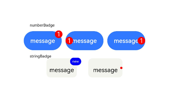
Text('numberBadge').width('80%')
Row({ space: 10 }) {
// Number badge in the upper right corner. The default value of maxCount is 99. If the number of notifications exceeds 99, 99+ is displayed.
Badge({
count: this.counts,
maxCount: 99,
position: BadgePosition.RightTop,
style: { color: 0xFFFFFF, fontSize: 16, badgeSize: 20, badgeColor: Color.Red }
}) {
Button('message')
.onClick(() => {
this.counts++;
})
.width(100).height(50).backgroundColor(0x317aff)
}.width(100).height(50)
// Number badge on the left.
Badge({
count: this.counts,
maxCount: 99,
position: BadgePosition.Left,
style: { color: 0xFFFFFF, fontSize: 16, badgeSize: 20, badgeColor: Color.Red }
}) {
Button('message')
.onClick(() => {
this.counts++;
})
.width(100).height(50).backgroundColor(0x317aff)
}.width(100).height(50)
// Number badge on the right.
Badge({
count: this.counts,
maxCount: 99,
position: BadgePosition.Right,
style: { color: 0xFFFFFF, fontSize: 16, badgeSize: 20, badgeColor: Color.Red }
}) {
Button('message')
.onClick(() => {
this.counts++;
})
.width(100).height(50).backgroundColor(0x317aff)
}.width(100).height(50)
}.margin(10)
Text('stringBadge').width('80%')
Row({ space: 30 }) {
Badge({
value: this.message,
style: { color: 0xFFFFFF, fontSize: 9, badgeSize: 20, badgeColor: Color.Blue }
}) {
Text('message')
.width(80)
.height(50)
.fontSize(16)
.lineHeight(37)
.borderRadius(10)
.textAlign(TextAlign.Center)
.backgroundColor(0xF3F4ED)
}.width(80).height(50)
// When value is null, the dot-style badge is used.
Badge({
value: '',
position: BadgePosition.Right,
style: { badgeSize: 6, badgeColor: Color.Red }
}) {
Text('message')
.width(90)
.height(50)
.fontSize(16)
.lineHeight(37)
.borderRadius(10)
.textAlign(TextAlign.Center)
.backgroundColor(0xF3F4ED)
}.width(90).height(50)
}.margin(10)
}
}
}