GridItem
NOTE This component is supported since API version 7. Updates will be marked with a superscript to indicate their earliest API version.
The <GridItem> component provides a single item in a grid.
Required Permissions
None
Child Components
This component can contain child components.
APIs
GridItem()
Attributes
| Name | Type | Default Value | Description |
|---|---|---|---|
| rowStart | number | - | Start row number of the component. |
| rowEnd | number | - | End row number of the component. |
| columnStart | number | - | Start column number of the component. |
| columnEnd | number | - | End column number of the component. |
| forceRebuild | boolean | false | Whether to re-create this node when the component is being built. |
| selectable8+ | boolean | true | Whether the current <GridItem> is selectable by the mouse. > NOTE> This attribute takes effect only when mouse frame selection is enabled for the parent <Grid> container. |
Events
| Name | Description |
|---|---|
| onSelect(callback: (isSelected: boolean) => any)8+ | Triggered when the selected state of the <GridItem> changes. isSelected: Returns true if the <GridItem> is selected by the mouse; returns false otherwise. |
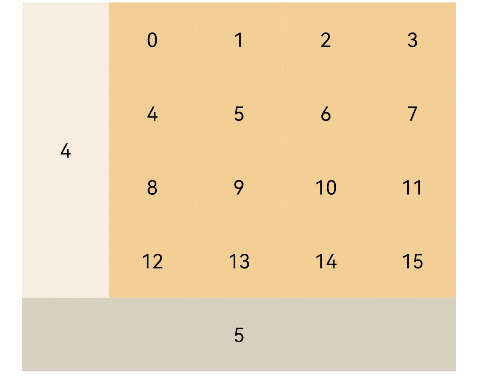
Example
@Entry
@Component
struct GridItemExample {
  @State numbers: string[] = Array.apply(null, Array(16)).map(function (item, i) { return i.toString() })

  build() {
    Column() {
      Grid() {
        GridItem() {
          Text('4')
            .fontSize(16).backgroundColor(0xFAEEE0)
            .width('100%').height('100%').textAlign(TextAlign.Center)
        }.rowStart(1).rowEnd(4)

        ForEach(this.numbers, (item) => {
          GridItem() {
            Text(item)
              .fontSize(16).backgroundColor(0xF9CF93)
              .width('100%').height('100%').textAlign(TextAlign.Center)
          }.forceRebuild(false)
        }, item => item)

        GridItem() {
          Text('5')
            .fontSize(16).backgroundColor(0xDBD0C0)
            .width('100%').height('100%').textAlign(TextAlign.Center)
        }.columnStart(1).columnEnd(5)
      }
      .columnsTemplate('1fr 1fr 1fr 1fr 1fr')
      .rowsTemplate('1fr 1fr 1fr 1fr 1fr')
      .width('90%').height(300)
    }.width('100%').margin({ top: 5 })
  }
}