Navigation
The <Navigation> component typically functions as the root container of a page and displays the page title, toolbar, and menu based on the attribute settings.
NOTE
This component is supported since API version 8. Updates will be marked with a superscript to indicate their earliest API version.
Child Components
Supported
APIs
Navigation()
Creates a component that can automatically display the navigation bar, title, and toolbar based on the attribute settings.
Attributes
| Name | Type | Description |
|---|---|---|
| title | string | CustomBuilder8+ | Page title. |
| subtitle | string | Subtitle of the page. |
| menus | Array<NavigationMenuItem> | CustomBuilder8+ | Menu in the upper right corner of the page. |
| titleMode | NavigationTitleMode | Display mode of the page title bar. Default value: NavigationTitleMode.Free |
| toolBar | object | CustomBuilder8+ | Content of the toolbar. items: all items on the toolbar. |
| hideToolBar | boolean | Whether to hide the toolbar. Default value: false true: Hide the toolbar. false: Show the toolbar. |
| hideTitleBar | boolean | Whether to hide the title bar. Default value: false |
| hideBackButton | boolean | Whether to hide the back button. Default value: false |
NavigationMenuItem
| Name | Type | Mandatory | Description |
|---|---|---|---|
| value | string | Yes | Text of a menu item. |
| icon | string | No | Icon path of a menu item. |
| action | () => void | No | Callback invoked when a menu item is selected. |
object
| Name | Type | Mandatory | Description |
|---|---|---|---|
| value | string | Yes | Text of an option on the toolbar. |
| icon | string | No | Icon path of an option on the toolbar. |
| action | () => void | No | Callback invoked when an option is selected. |
NavigationTitleMode
| Name | Description |
|---|---|
| Free | When the content is a scrollable component, the main title shrinks as the content scrolls down (the subtitle fades out with its size remaining unchanged) and restores when the content scrolls up to the top. |
| Mini | The icon, main title, and subtitle are in mini mode. |
| Full | The main title and subtitle are in full mode. |
NOTE
Currently, the scrollable component can only be <List>.
Events
| Name | Description |
|---|---|
| onTitleModeChange(callback: (titleMode: NavigationTitleMode) => void) | Triggered when titleMode is set to NavigationTitleMode.Free and the title bar mode changes as content scrolls. |
Example
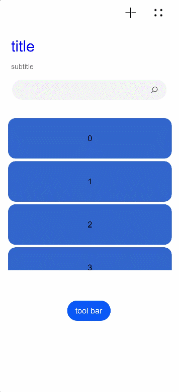
// Example 01
@Entry
@Component
struct NavigationExample {
  private arr: number[] = [0, 1, 2, 3, 4, 5, 6, 7, 8, 9]
  @State hideBar: boolean = true

  @Builder NavigationTitle() {
    Column() {
      Text('title')
        .width(80)
        .height(60)
        .fontColor(Color.Blue)
        .fontSize(30)
    }
    .onClick(() => {
      console.log("title")
    })
  }

  @Builder NavigationMenus() {
    Row() {
      Image('images/add.png')
        .width(25)
        .height(25)
      Image('comment/more.png')
        .width(25)
        .height(25)
        .margin({ left: 30 })
    }.width(100)
  }

  build() {
    Column() {
      Navigation() {
        Search({ value: '', placeholder: "" }).width('85%').margin(26)
        List({ space: 5, initialIndex: 0 }) {
          ForEach(this.arr, (item) => {
            ListItem() {
              Text('' + item)
                .width('90%')
                .height(80)
                .backgroundColor('#3366CC')
                .borderRadius(15)
                .fontSize(16)
                .textAlign(TextAlign.Center)
            }.editable(true)
          }, item => item)
        }
        .listDirection(Axis.Vertical)
        .height(300)
        .margin({ top: 10, left: 18 })
        .width('100%')

        Button(this.hideBar ? "tool bar" : "hide bar")
          .onClick(() => {
            this.hideBar = !this.hideBar
          })
          .margin({ left: 135, top: 60 })
      }
      .title(this.NavigationTitle)
      .subTitle('subtitle')
      .menus(this.NavigationMenus)
      .titleMode(NavigationTitleMode.Free)
      .hideTitleBar(false)
      .hideBackButton(false)
      .onTitleModeChange((titleModel: NavigationTitleMode) => {
        console.log('titleMode')
      })
      .toolBar({ items: [
        { value: 'app', icon: 'images/grid.svg', action: () => {
          console.log("app")
        } },
        { value: 'add', icon: 'images/add.svg', action: () => {
          console.log("add")
        } },
        { value: 'collect', icon: 'images/collect.svg', action: () => {
          console.log("collect")
        } }] })
      .hideToolBar(this.hideBar)
    }
  }
}
// Example 02
@Entry
@Component
struct ToolbarBuilderExample {
  @State currentIndex: number = 0
  @State Build: Array<Object> = [
    {
      icon: $r('app.media.ic_public_add'),
      icon_after: $r('app.media.ic_public_addcolor'),
      text: 'add',
      num: 0
    },
    {
      icon: $r('app.media.ic_public_app'),
      icon_after: $r('app.media.ic_public_appcolor'),
      text: 'app',
      num: 1
    },
    {
      icon: $r('app.media.ic_public_collect'),
      icon_after: $r('app.media.ic_public_collectcolor'),
      text: 'collect',
      num: 2
    }
  ]

  @Builder NavigationToolbar() {
    Row() {
      ForEach(this.Build, item => {
        Column() {
          Image(this.currentIndex == item.num ? item.icon_after : item.icon)
            .width(25)
            .height(25)
          Text(item.text)
            .fontColor(this.currentIndex == item.num ? "#ff7500" : "#000000")
        }
        .onClick(() => {
          this.currentIndex = item.num
        })
        .margin({ left: 70 })
      })
    }
  }

  build() {
    Column() {
      Navigation() {
        Flex() {
        }
      }
      .toolBar(this.NavigationToolbar)
    }
  }
}